
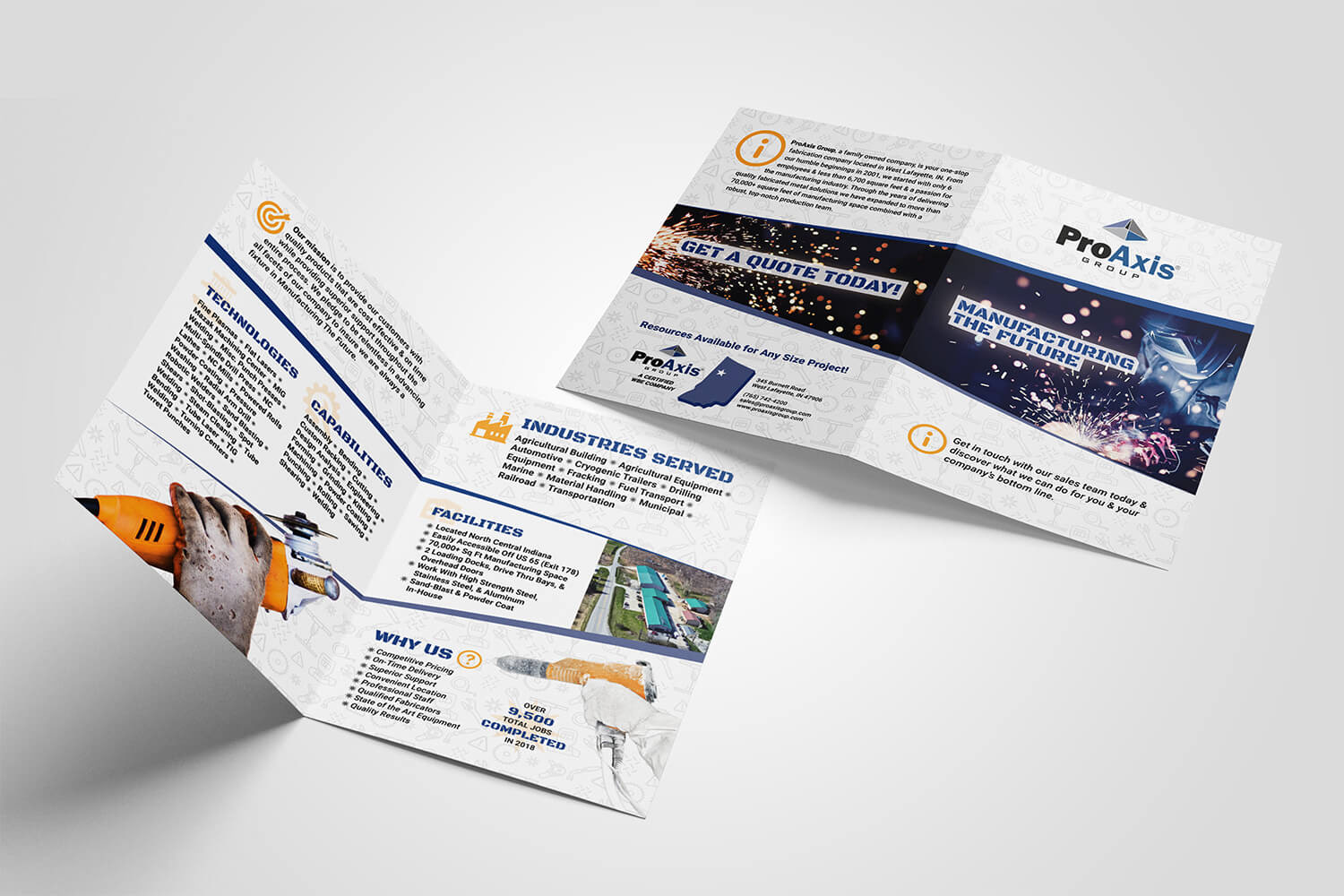
The old ProAxis Group brochures were overloaded with text and cluttered visuals, making them hard to read and navigate. Long paragraphs needed to be condensed into bullet points, and the design elements had to be simplified for better clarity.
The new design uses diagonal lines, consistent font sizes, and a streamlined color palette to create a natural flow and clear hierarchy. A subtle background pattern adds texture, giving the layout depth, while yellow icons help guide the eye and connect the images to the overall design.