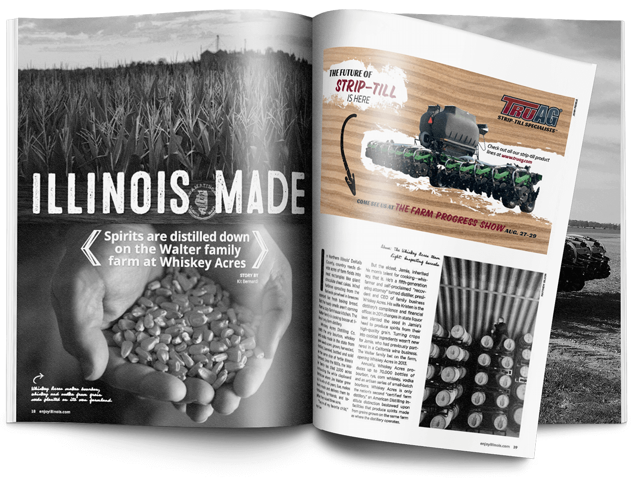
TruAG Print Advertisements
For this print ad, I refreshed TruAG’s older, cluttered layout and replaced it with a cleaner, modern design that puts the strip-till equipment front and center. I used a stronger visual hierarchy, simplified the messaging, and introduced updated graphics so the ad communicates quickly and looks more aligned with the brand’s current direction.
Comparing it with the previous version, the redesign is sharper, clearer, and far more professional—reflecting TruAG’s updated identity and giving the ad more impact in print.
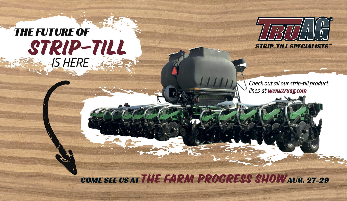
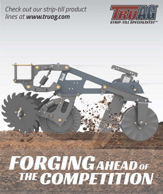
I designed this quarter-page ad to show the power and motion of TruAG’s strip-till row unit within a very limited space. A dynamic image with flying debris helps convey performance, while a clean layout keeps everything readable at magazine scale.
With such a small footprint, I focused on a strong headline, minimal text, and straightforward hierarchy. The final piece stands out on the page and delivers a quick, confident message that reinforces TruAG’s branding.

TruAG Web Advertisements
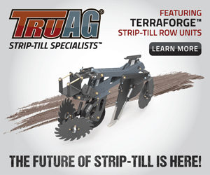
I created animated GIF ads that highlighted the different configuration options for TruAG’s strip-till units. Each animation cycles through the various setups so customers can instantly see how the system can be customized.
Designed for industry sites like Strip-Till Farmer, the ads use clear visuals, tight messaging, and consistent branding to stay legible at small sizes. The animations helped draw attention, communicate versatility quickly, and encourage viewers to click through for more information.