Field Museum

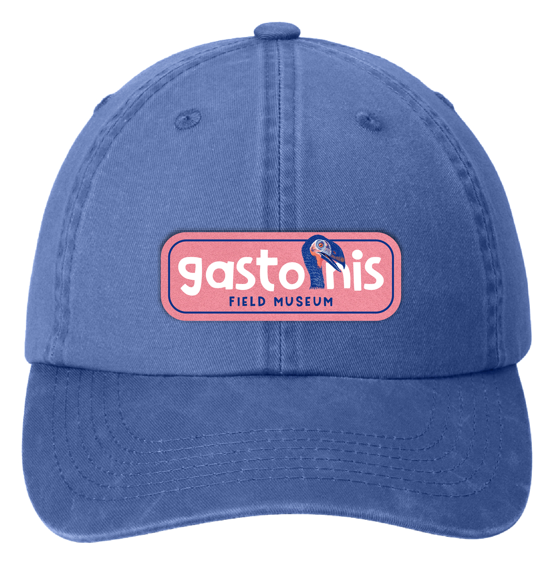
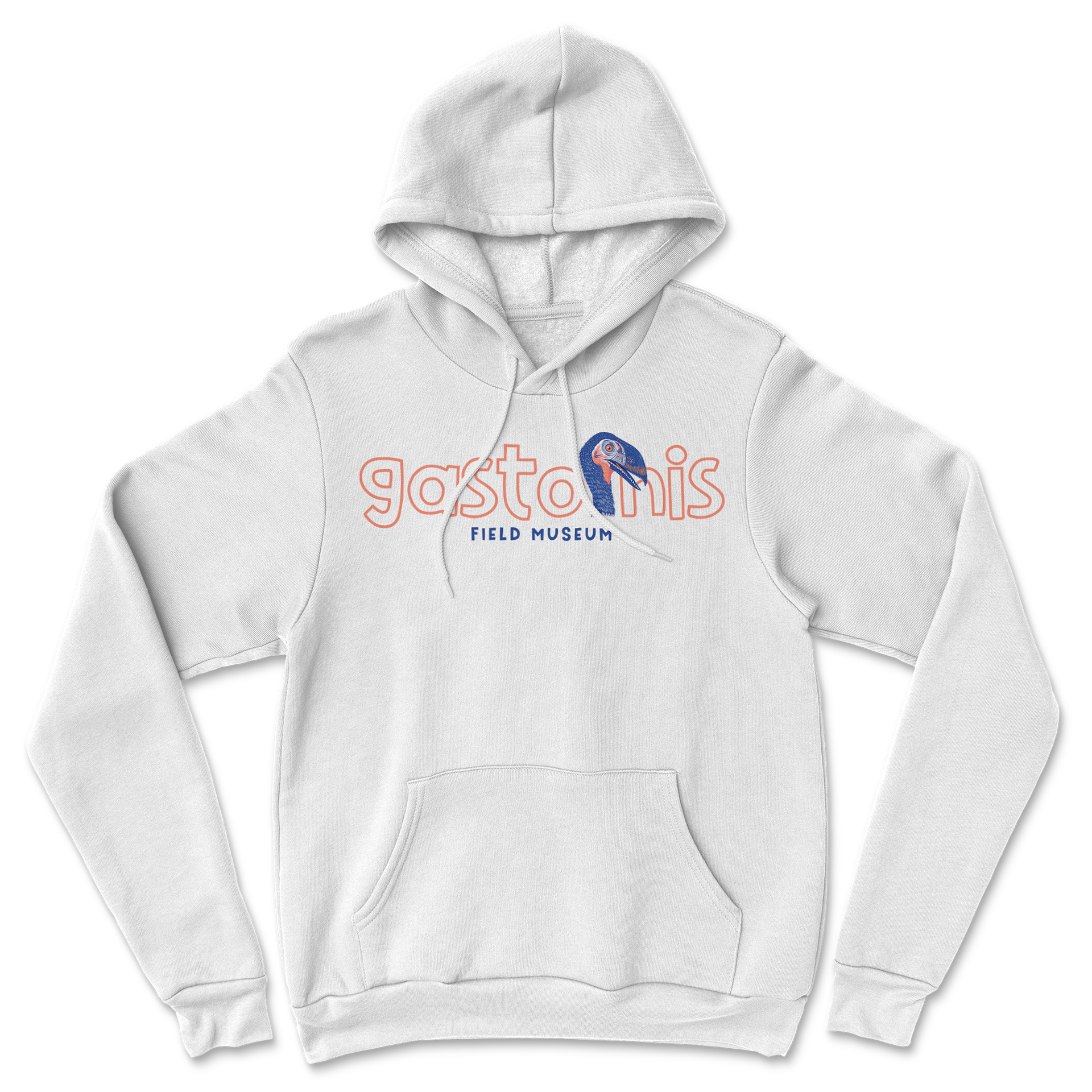
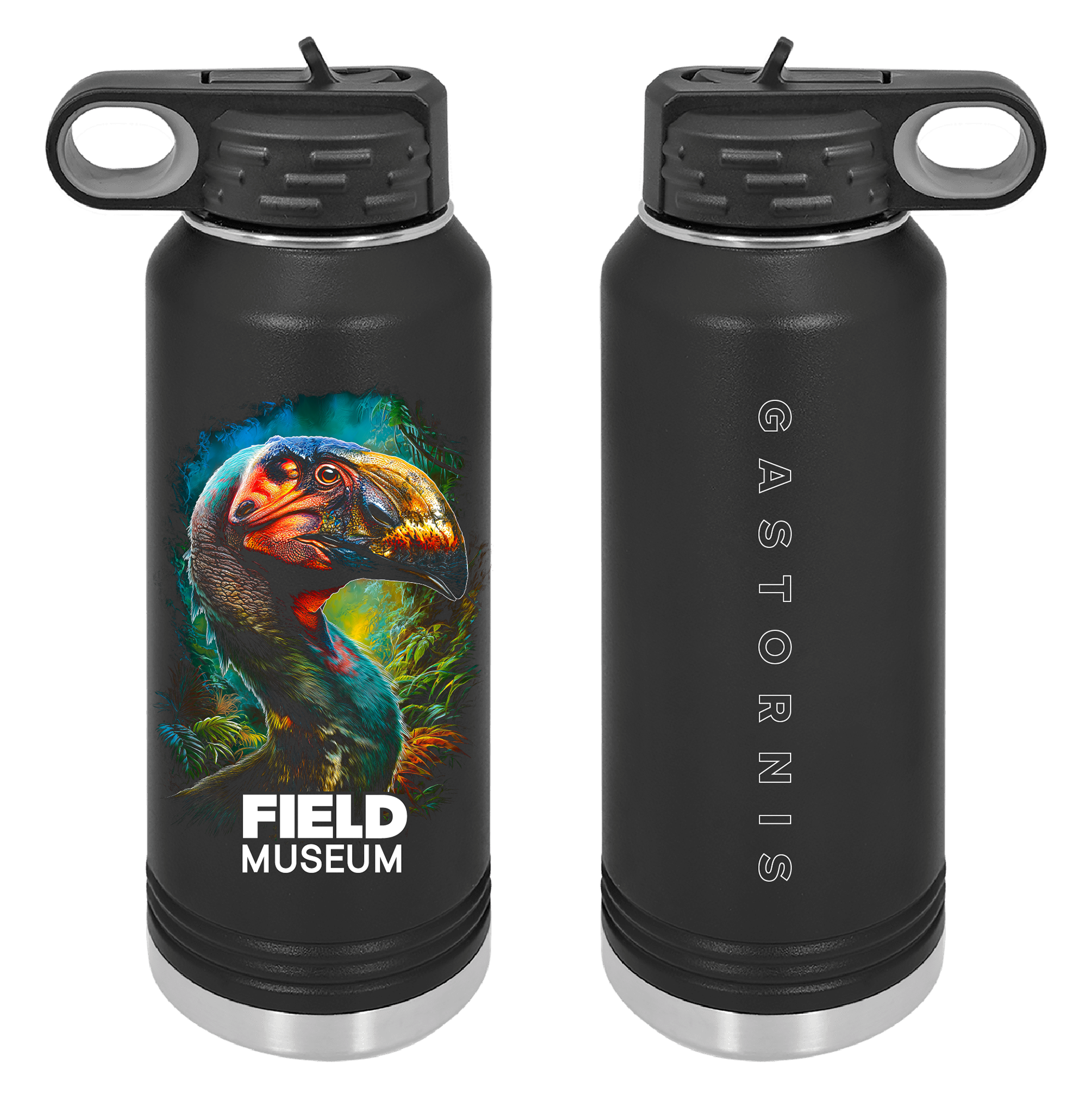
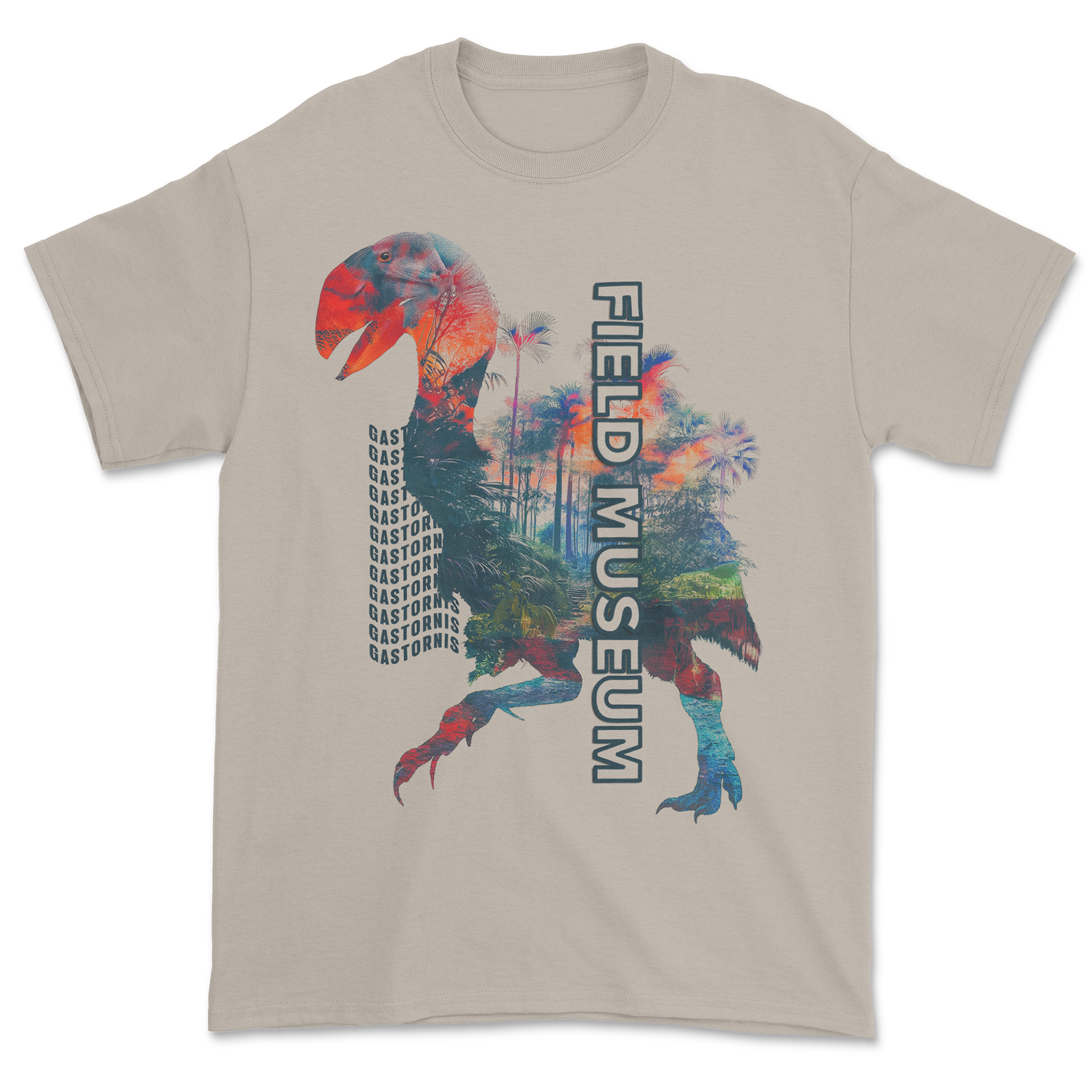
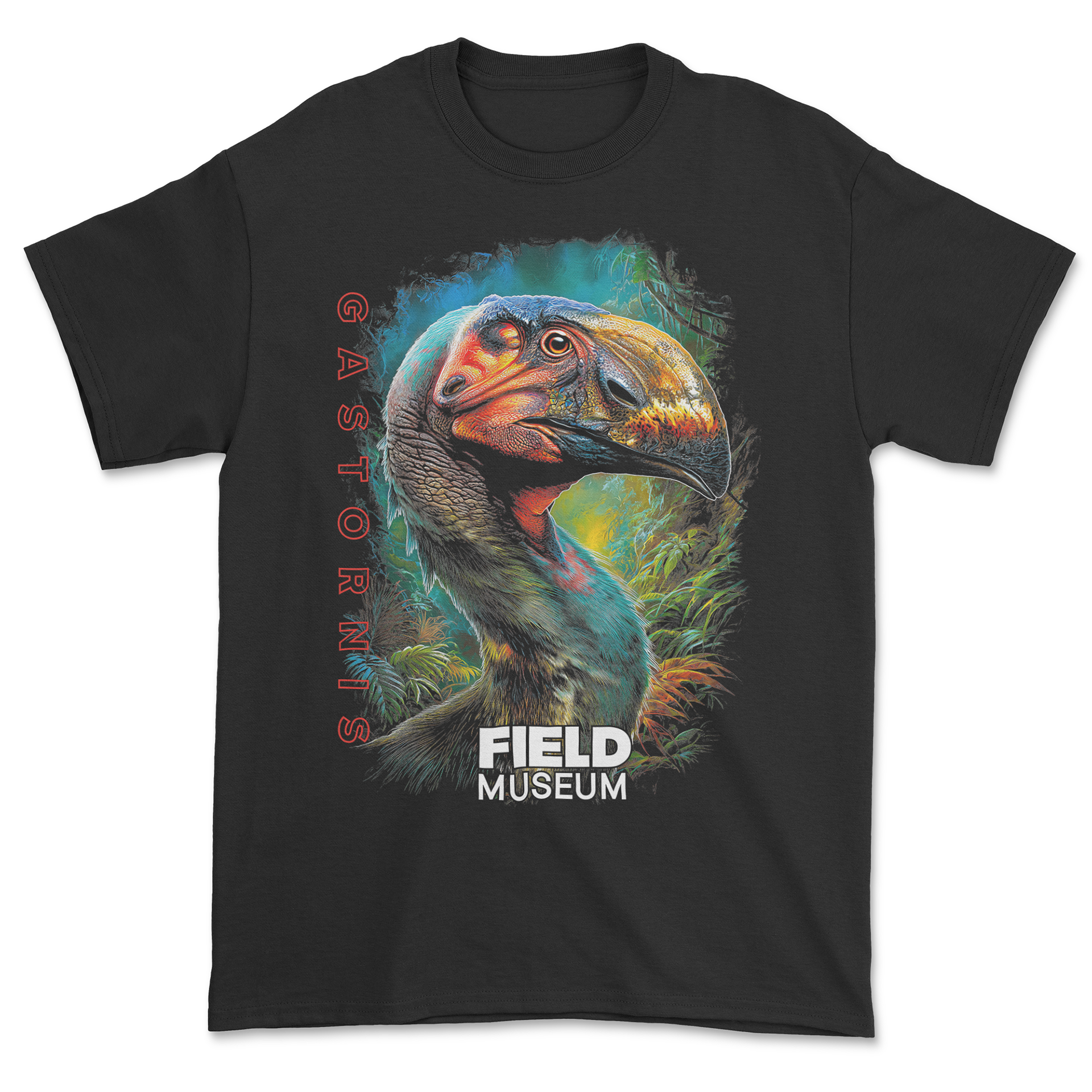
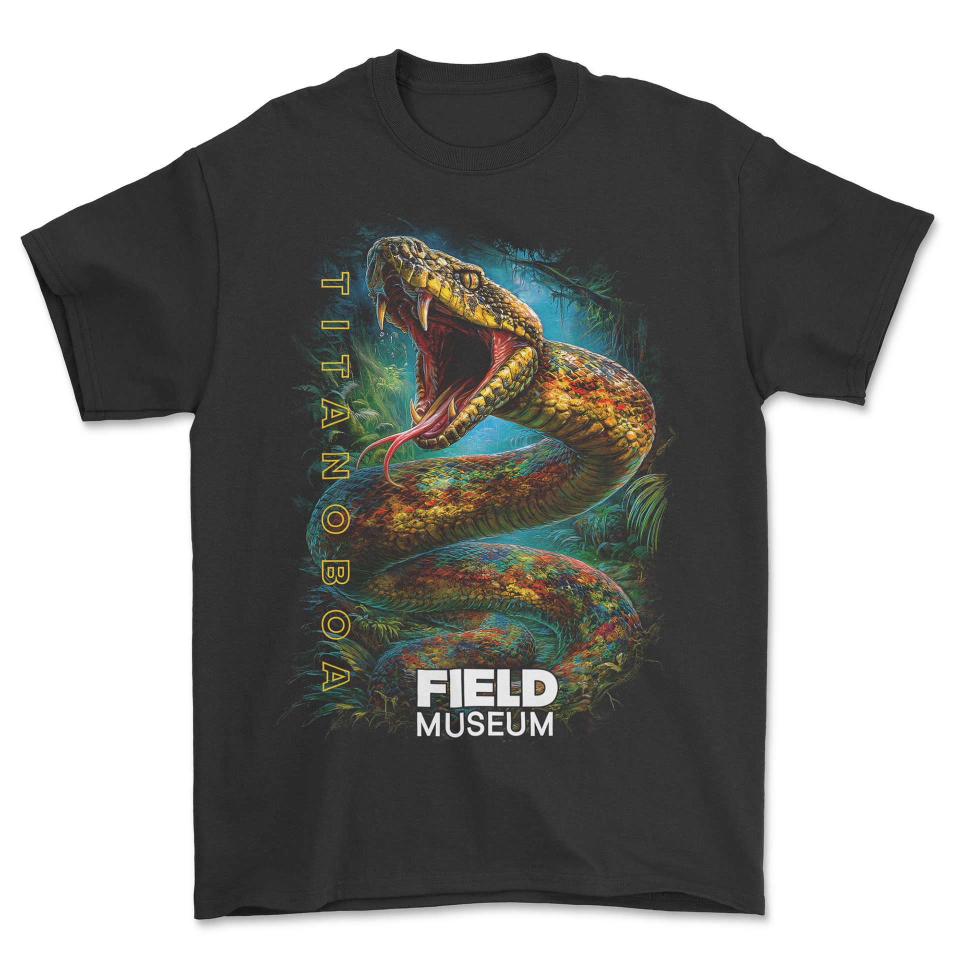
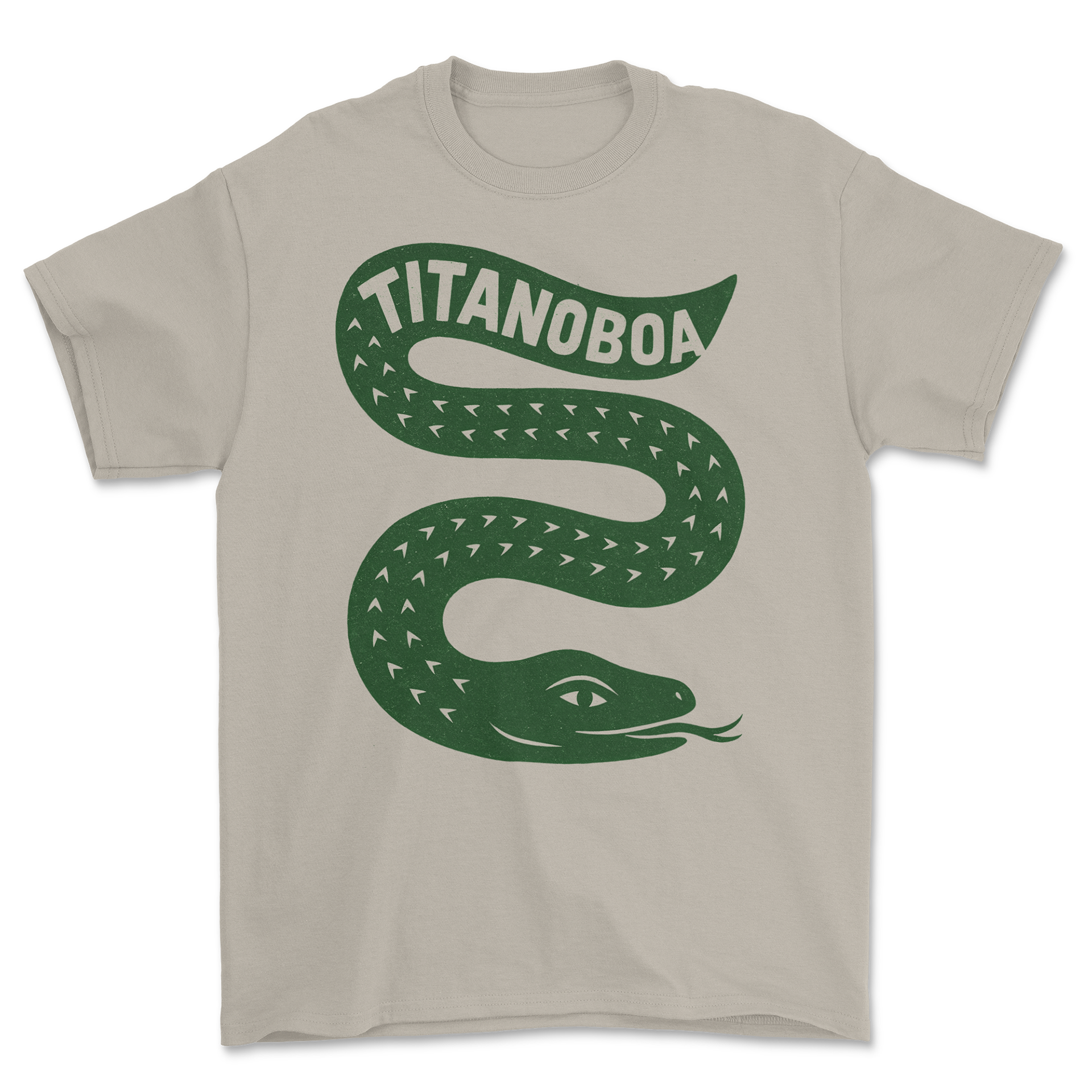
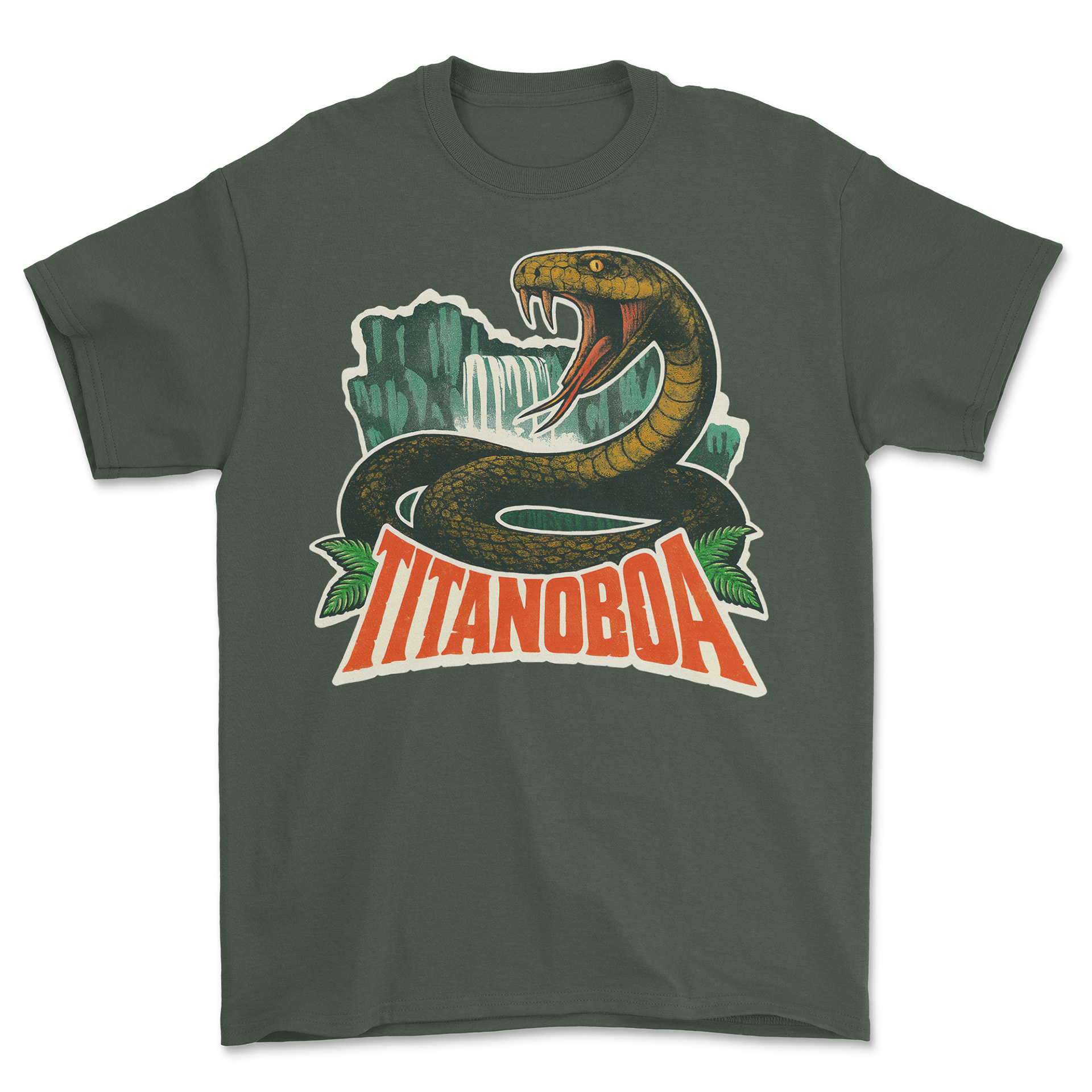
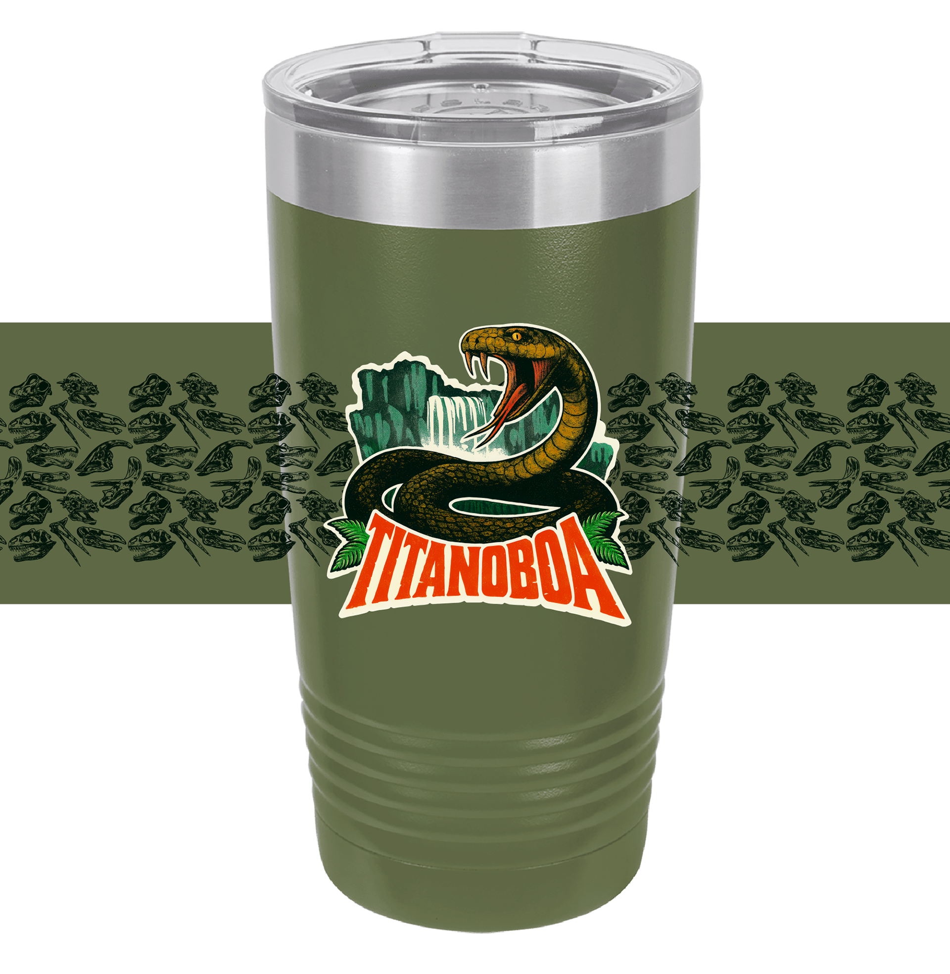
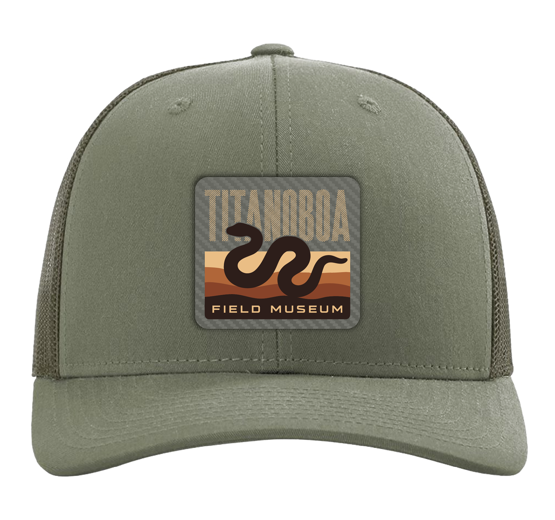
For this Field Museum project, I focused on creating bold, high-impact artwork that matched the scale and personality of prehistoric animals like Titanoboa and Gastornis. I explored a range of styles—from painterly paleo-art to more graphic interpretations—and used AI during concepting to quickly test compositions, lighting, and mood. This helped lock in visuals that felt accurate, exciting, and museum-appropriate.
To keep everything cohesive across apparel, hats, and drinkware, I built flexible layouts and tailored color palettes that stayed clear and readable at different sizes. The final work includes scalable shirt graphics, patch designs, and wrap-around tumbler art. Overall, it’s a versatile set that feels true to the subject matter while standing out in a retail environment.
Houston Zoo
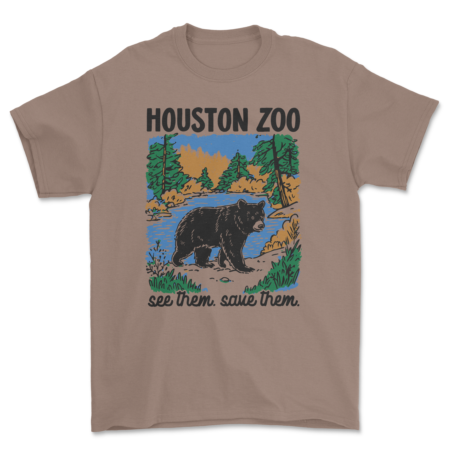
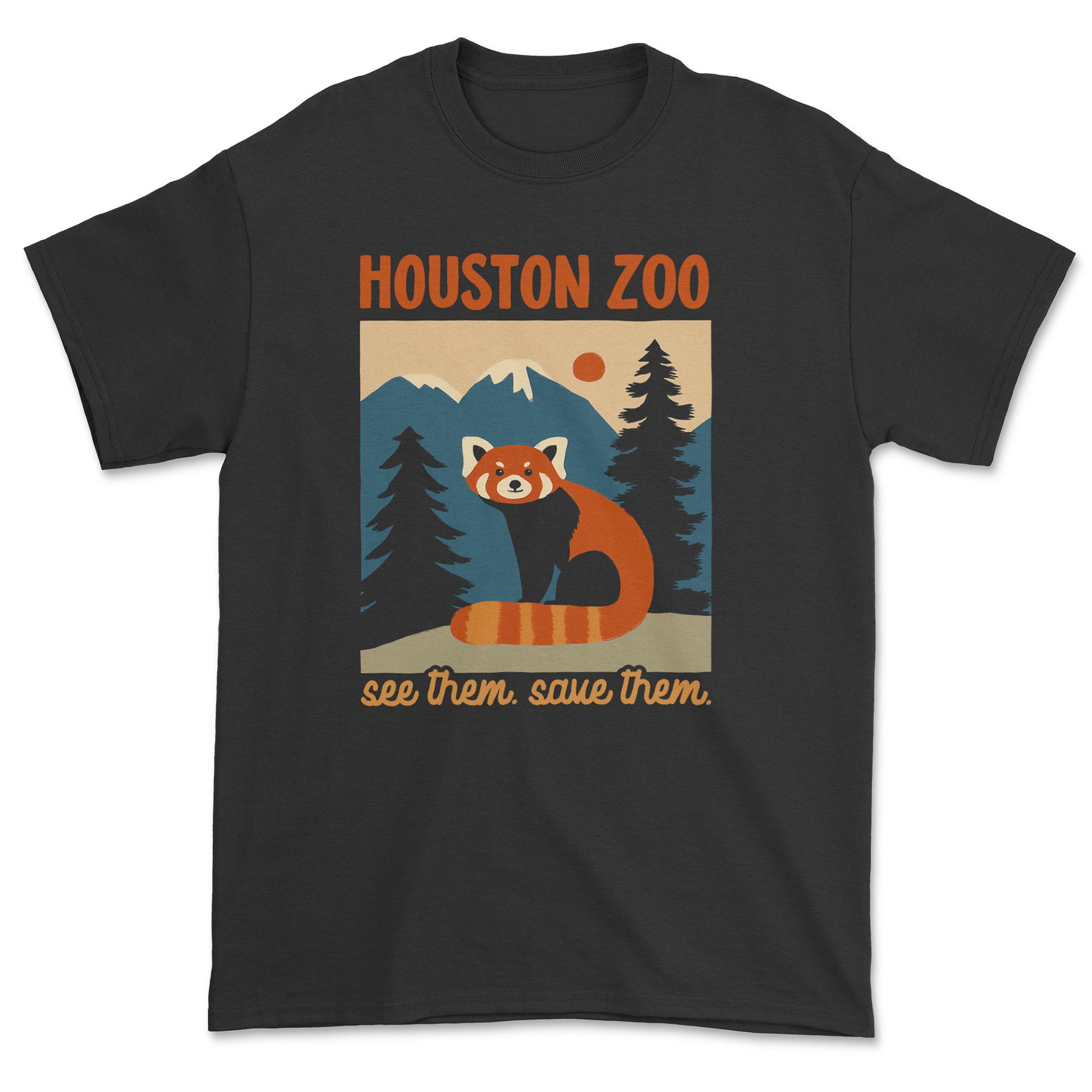
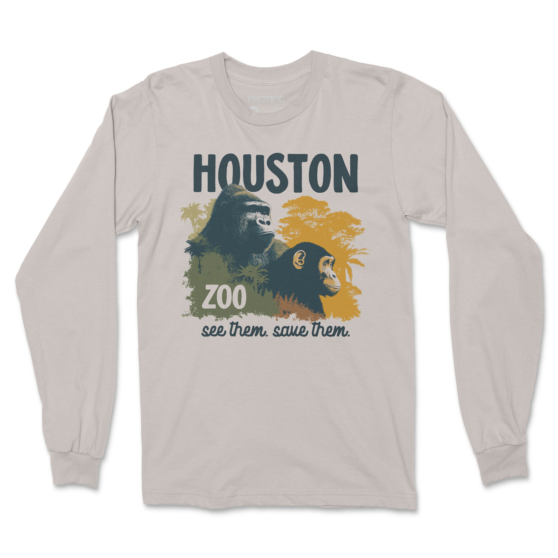
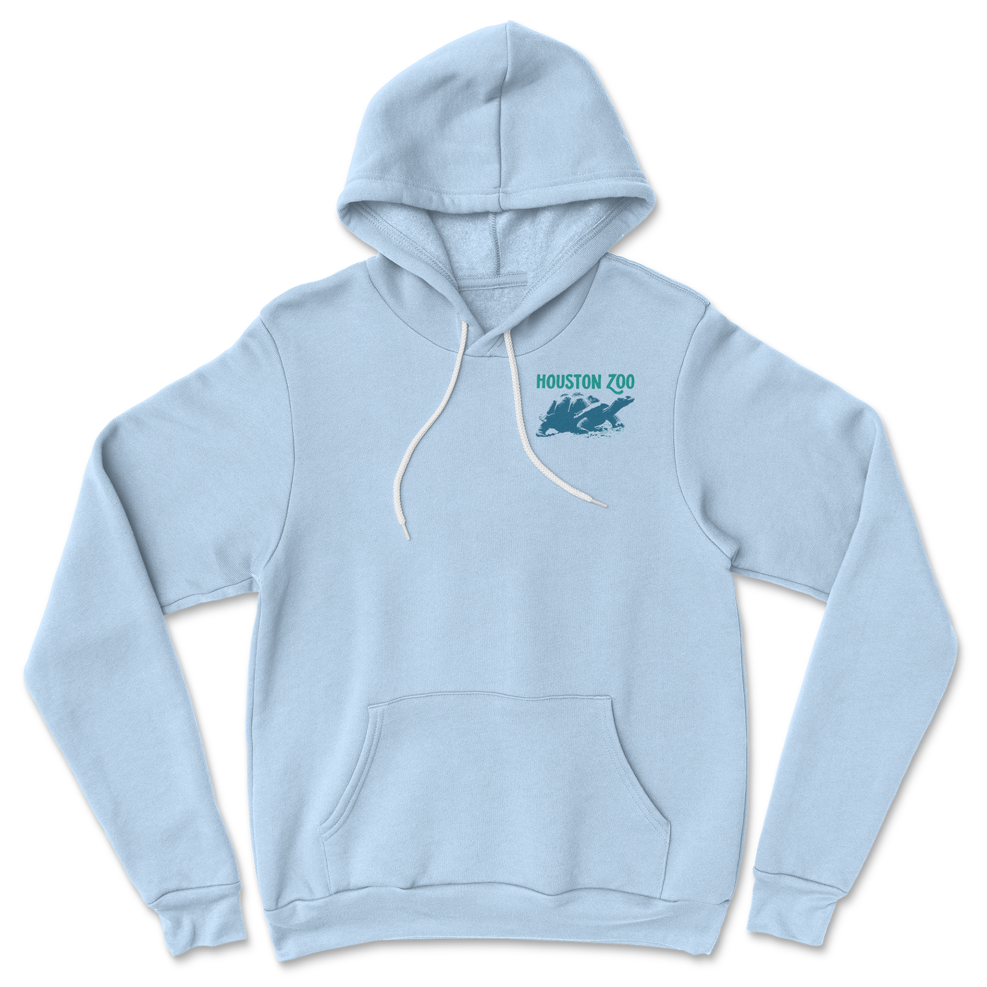
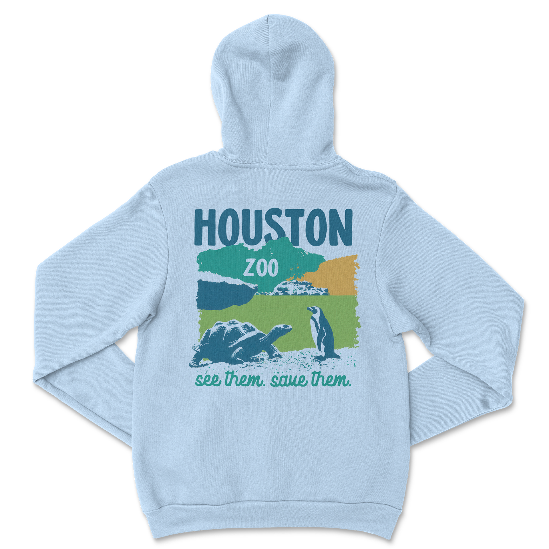
For the Houston Zoo, I created illustrated graphics that strike a balance between education, conservation themes, and strong retail appeal. I researched each animal and built compositions around expressive poses in the habitat they live in, using a bold, textured style inspired by vintage park posters. I also created a few stylistic variations—some more flat and vector, some with more realism—so the zoo had multiple directions to choose from.
To unify the art for apparel, I developed a consistent color system and flexible layouts that worked for tees, fleece, and different print sizes. Each graphic was refined for clarity and print efficiency, giving them a polished, cohesive feel. The result is a lineup that pairs solid illustration work with thoughtful brand alignment.
Wonders of Wildlife
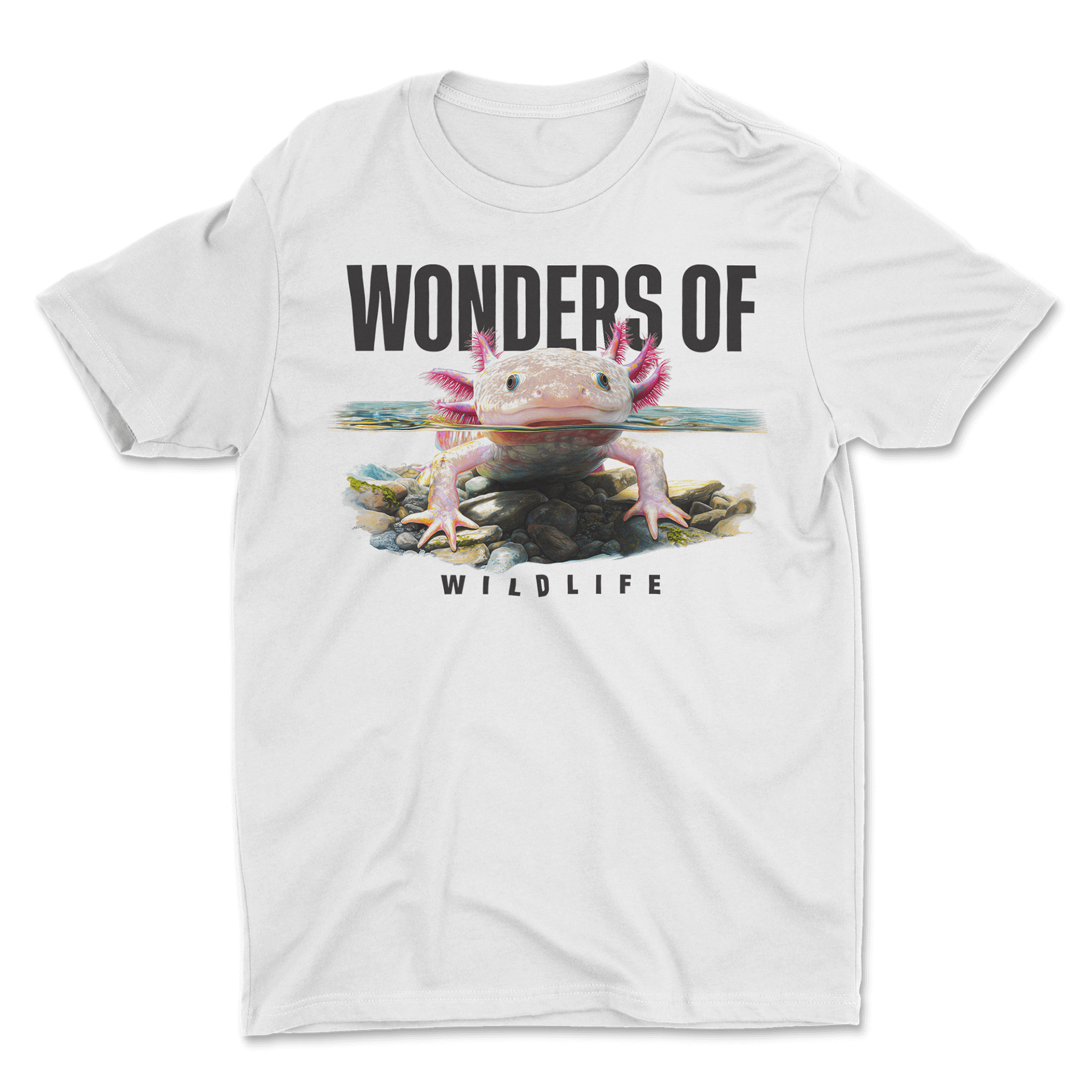
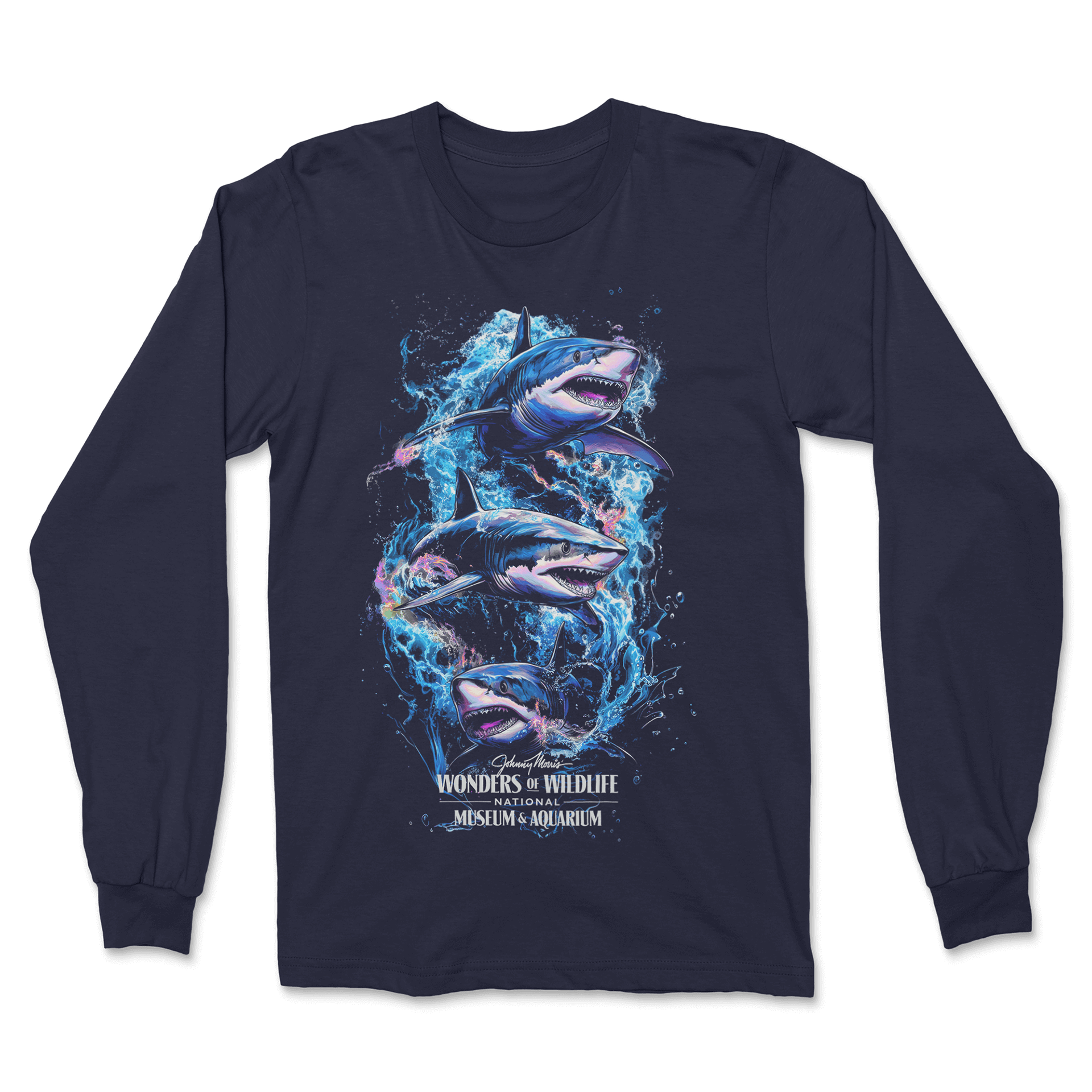
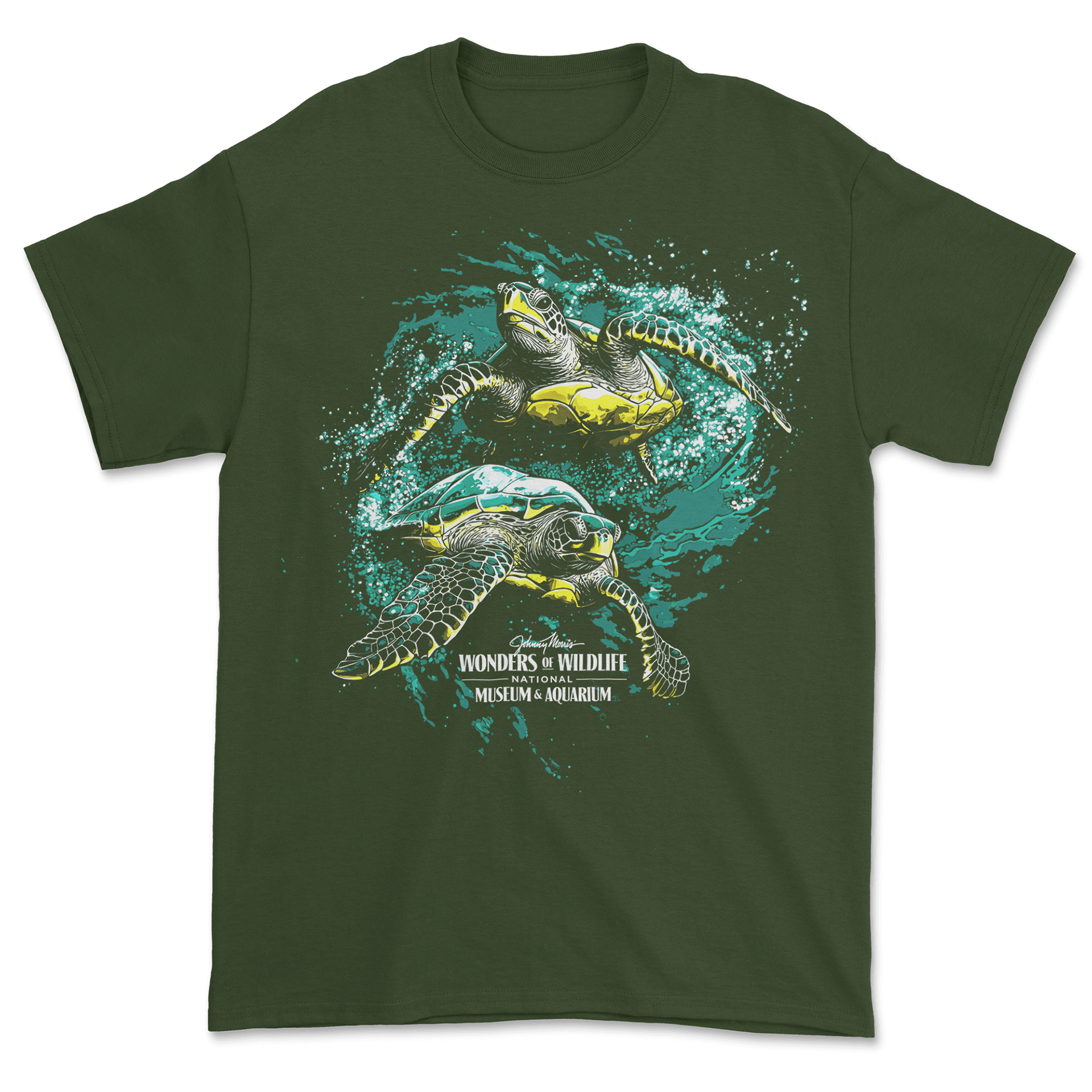
This collection called for realistic, recognizable animals, so I focused heavily on accuracy and detail. I used Midjourney to explore poses and lighting options, then refined each illustration by hand to capture the unique textures and movement of species like axolotls, sharks, and sea turtles. The goal was to make every animal feel lifelike while still delivering bold, engaging artwork.
I tailored each design to the garment colors and printing needs to keep the visuals sharp and eye-catching. The finished pieces feel authentic to the animals and work well within a museum retail setting.
National Underground Railroad
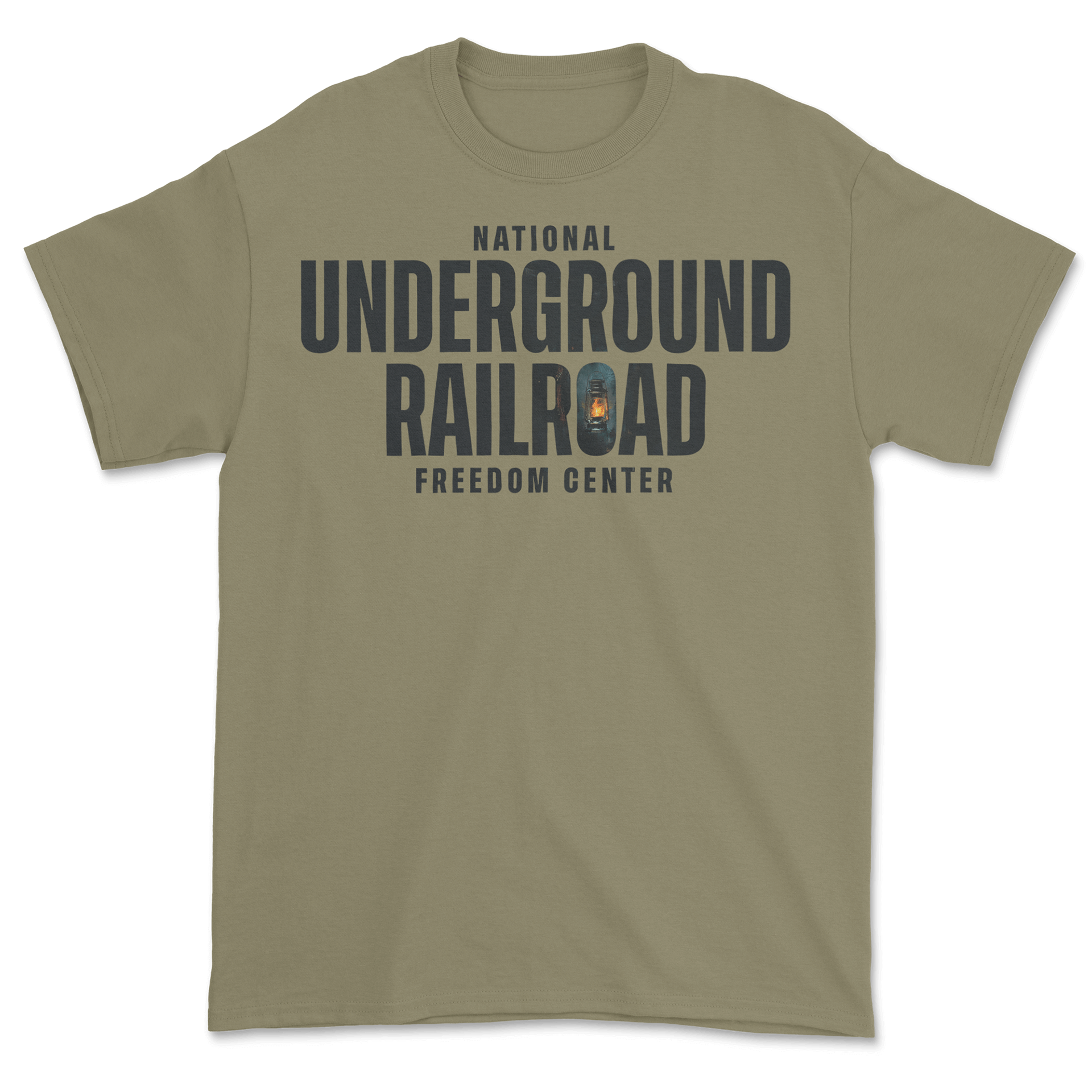
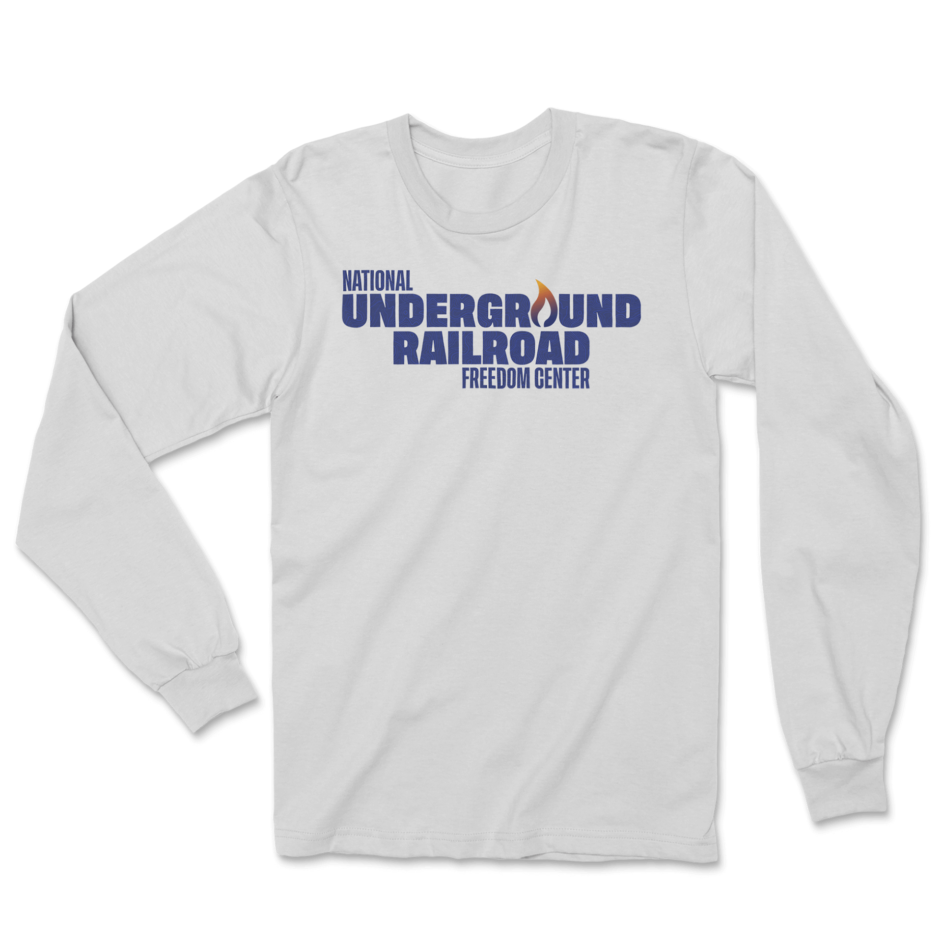
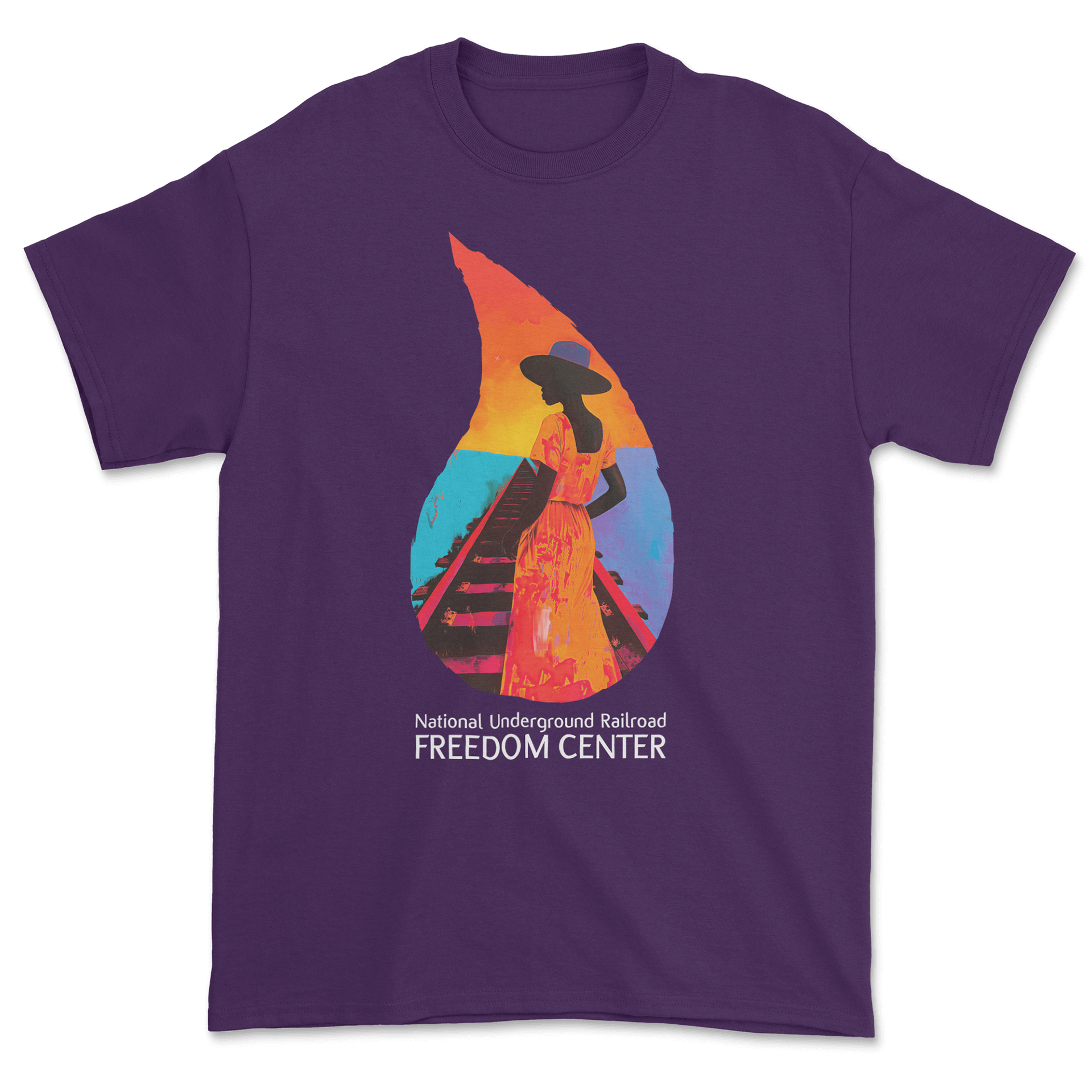
For the Freedom Center, I wanted the designs to feel meaningful and respectful, so I leaned on clean typography and symbolic imagery. The core shirts use bold type paired with a single lantern—a key historical symbol—to create strong, understated designs. I also developed a more expressive option featuring a stylized figure walking along the tracks, using warm color to communicate hope and forward movement.
Together, the designs offer both a classic identity piece and a more artistic interpretation, giving the museum flexibility in how they tell their story through apparel.
Cincinnati Zoo
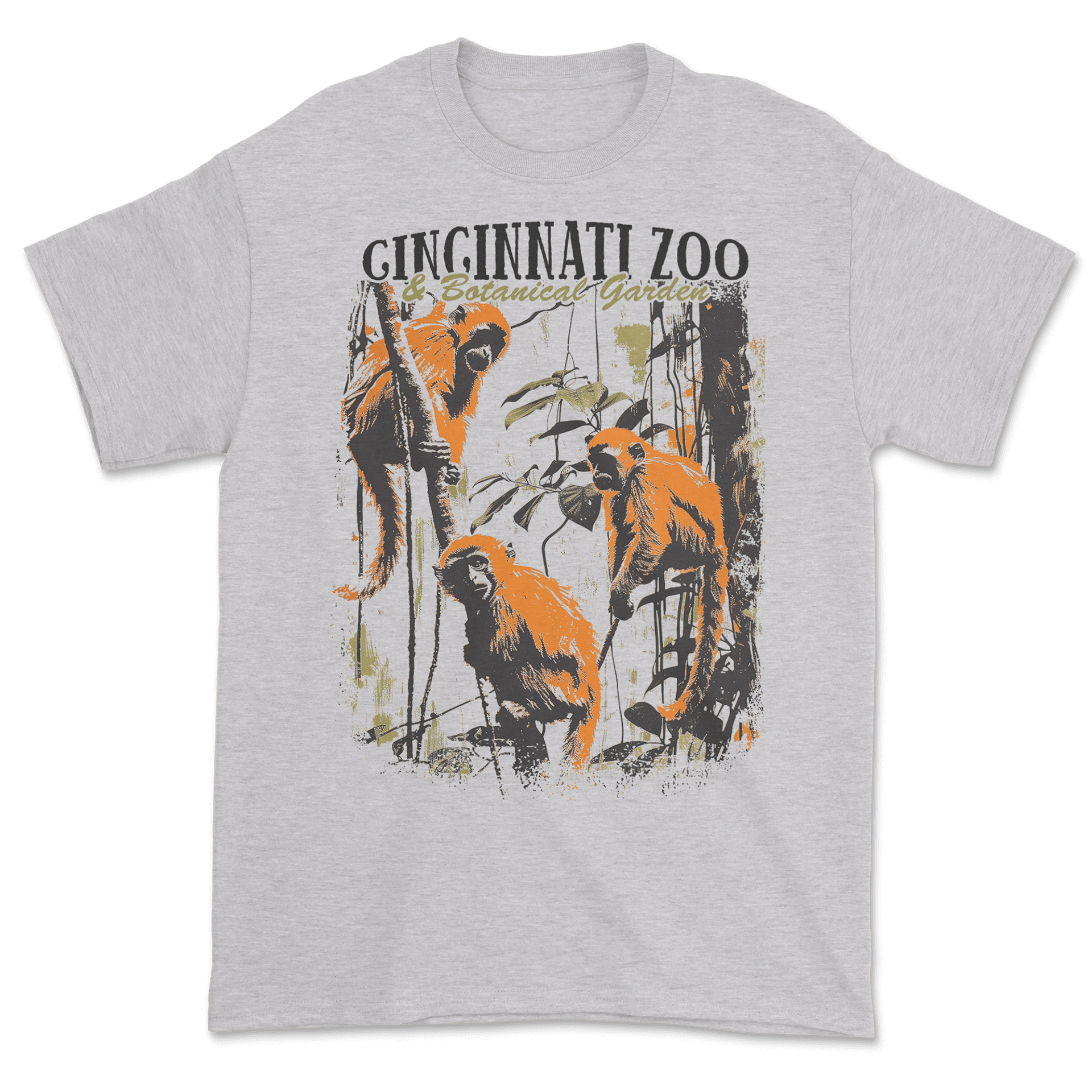
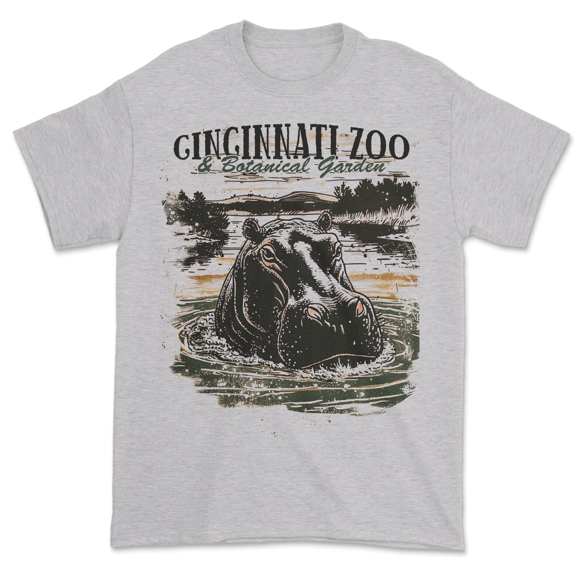
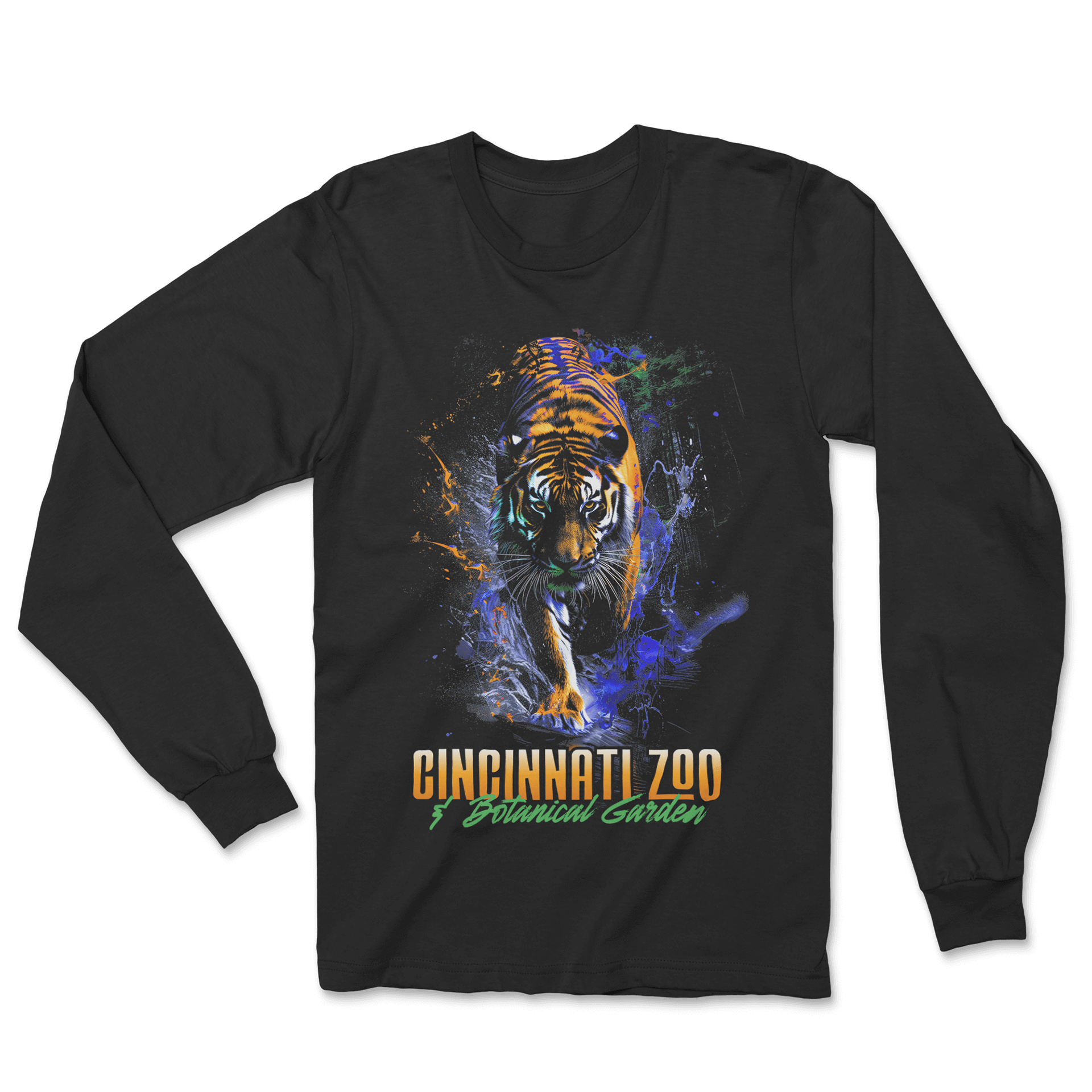
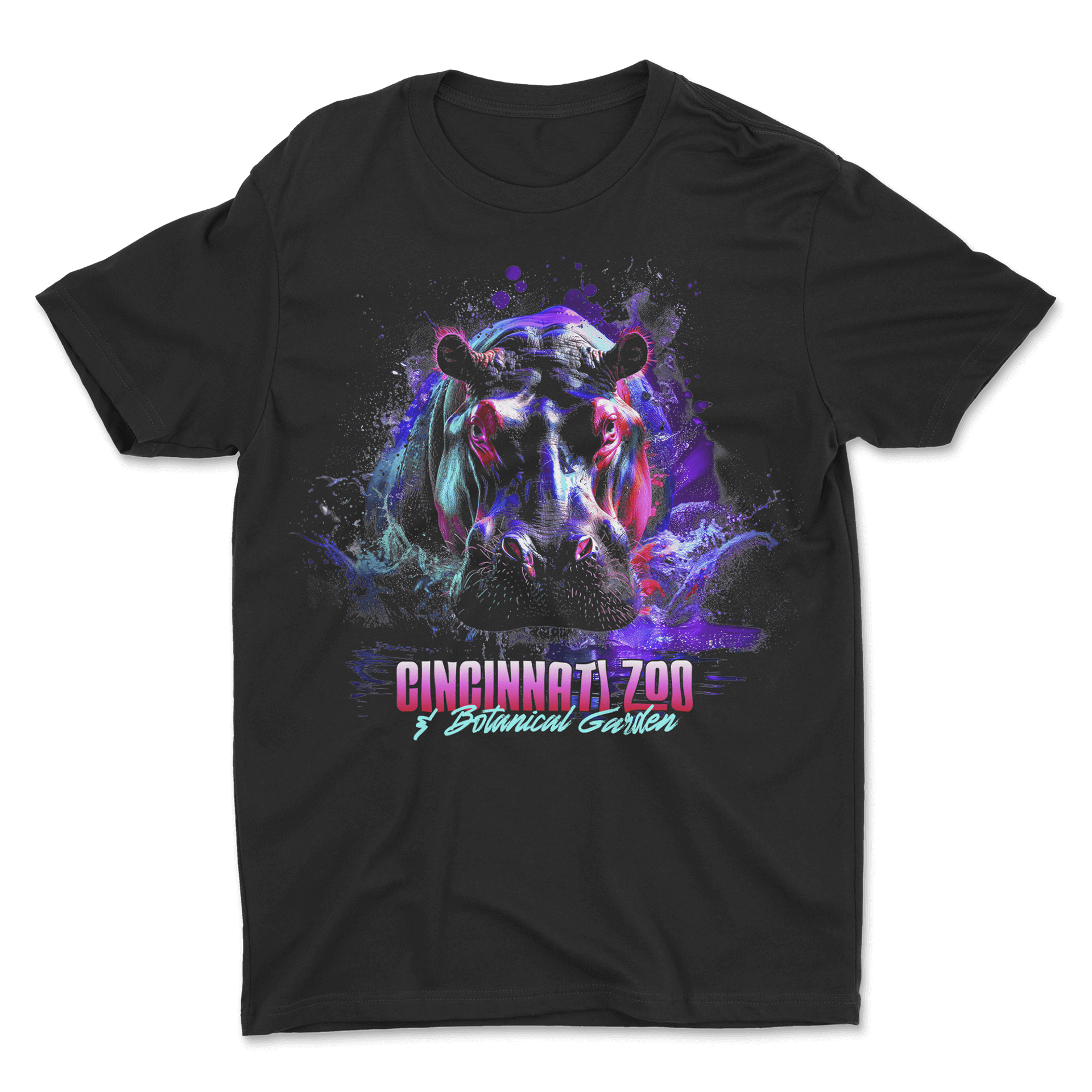
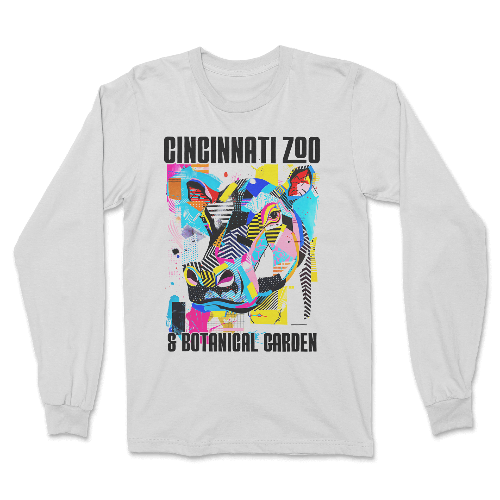
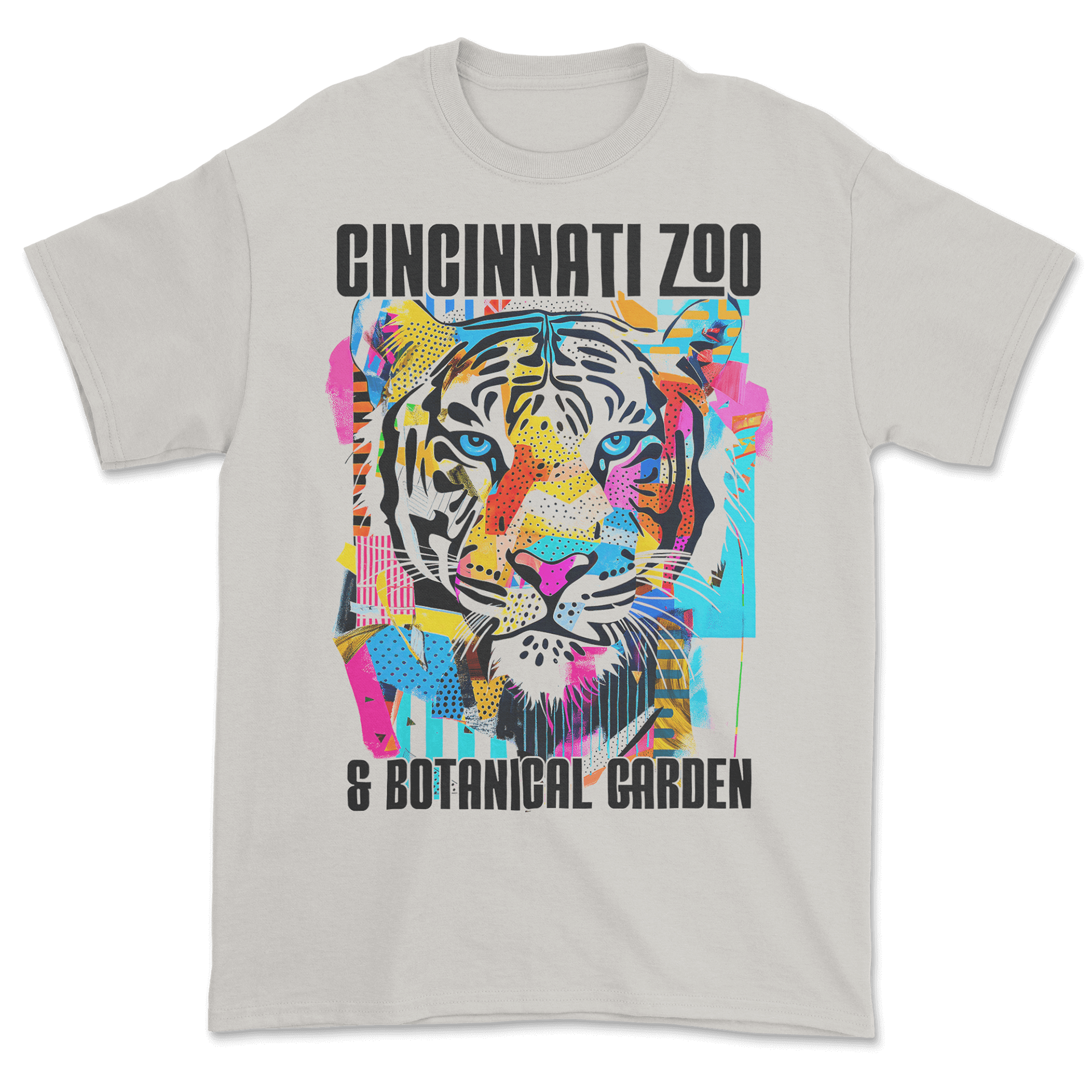
This Cincinnati Zoo series was designed to showcase range, since it helped establish a broader partnership with multiple zoos. I created everything from vintage-style illustrations to neon, high-energy graphics and memphis, abstract style layouts—giving the client a clear sense of the different audiences and retail trends I can design for. AI tools helped speed up ideation by letting me test colors, lighting, and compositions before refining everything into the final artwork.
The full set shows versatility, adaptability, and an understanding of how to turn varied concepts into clean, print-ready merch that still lines up with the zoo’s brand.
Miscellaneous Designs
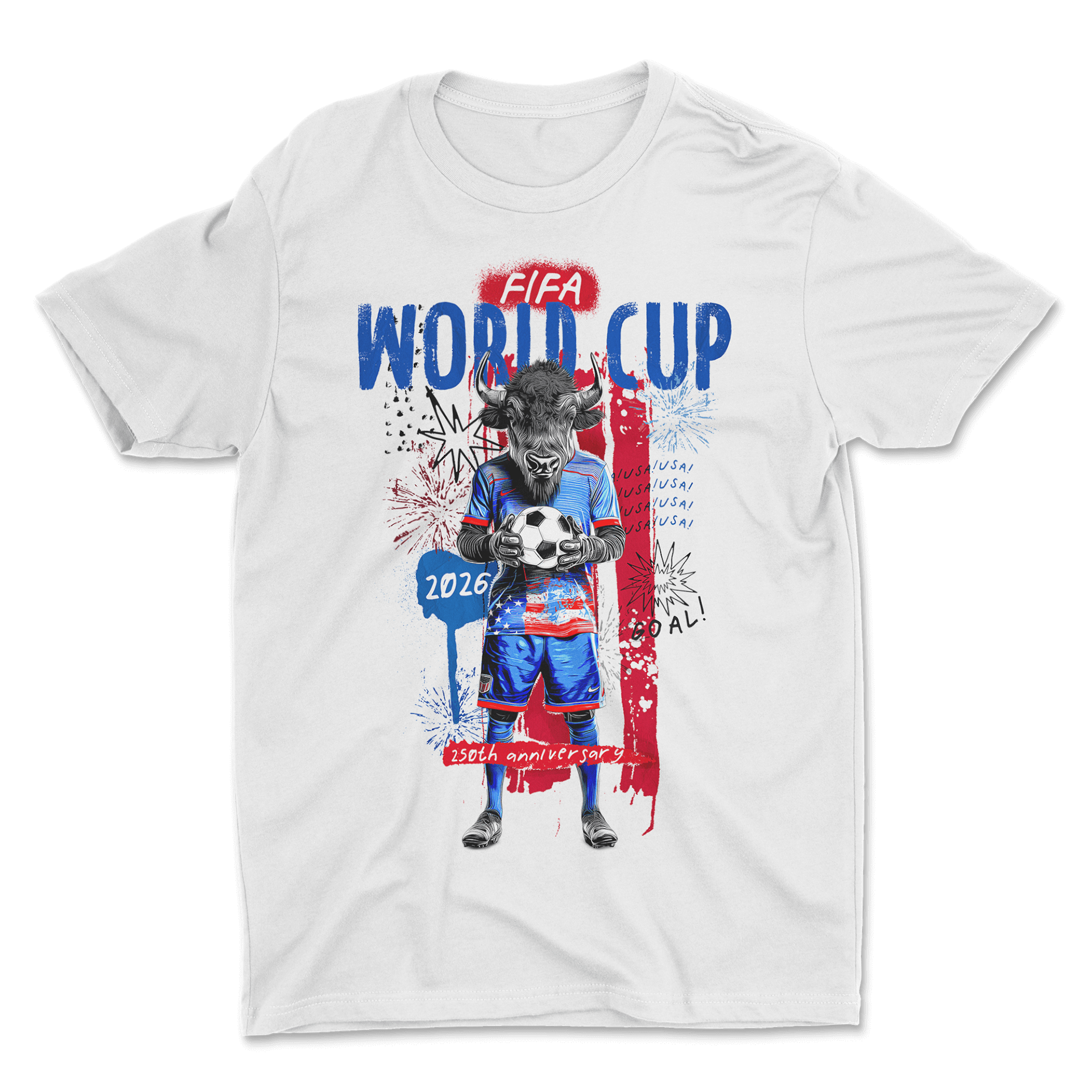
For this potential World Cup tie-in, I created a fun, energetic concept that blended the zoo’s identity with the excitement of FIFA 2026. I built the idea around a patriotic, athletic buffalo character that feels both uniquely American and instantly marketable. I used AI to explore poses and personality traits, then refined the final illustration into a polished character graphic.
Bold red, white, and blue elements, hand-drawn details, and celebratory motifs help tie it into the World Cup theme. The final design feels lively and collectible—positioning the zoo as a playful, unexpected partner for the event.