Purdue Boilermakers
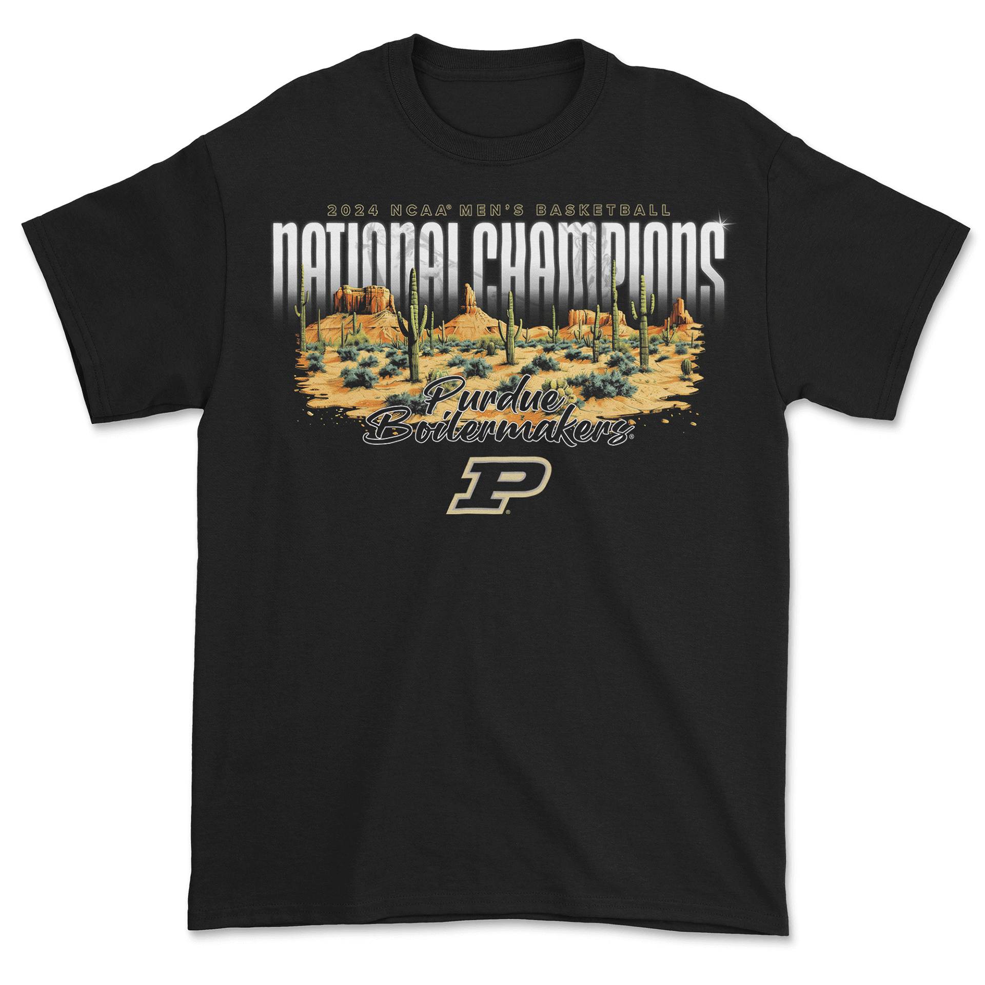
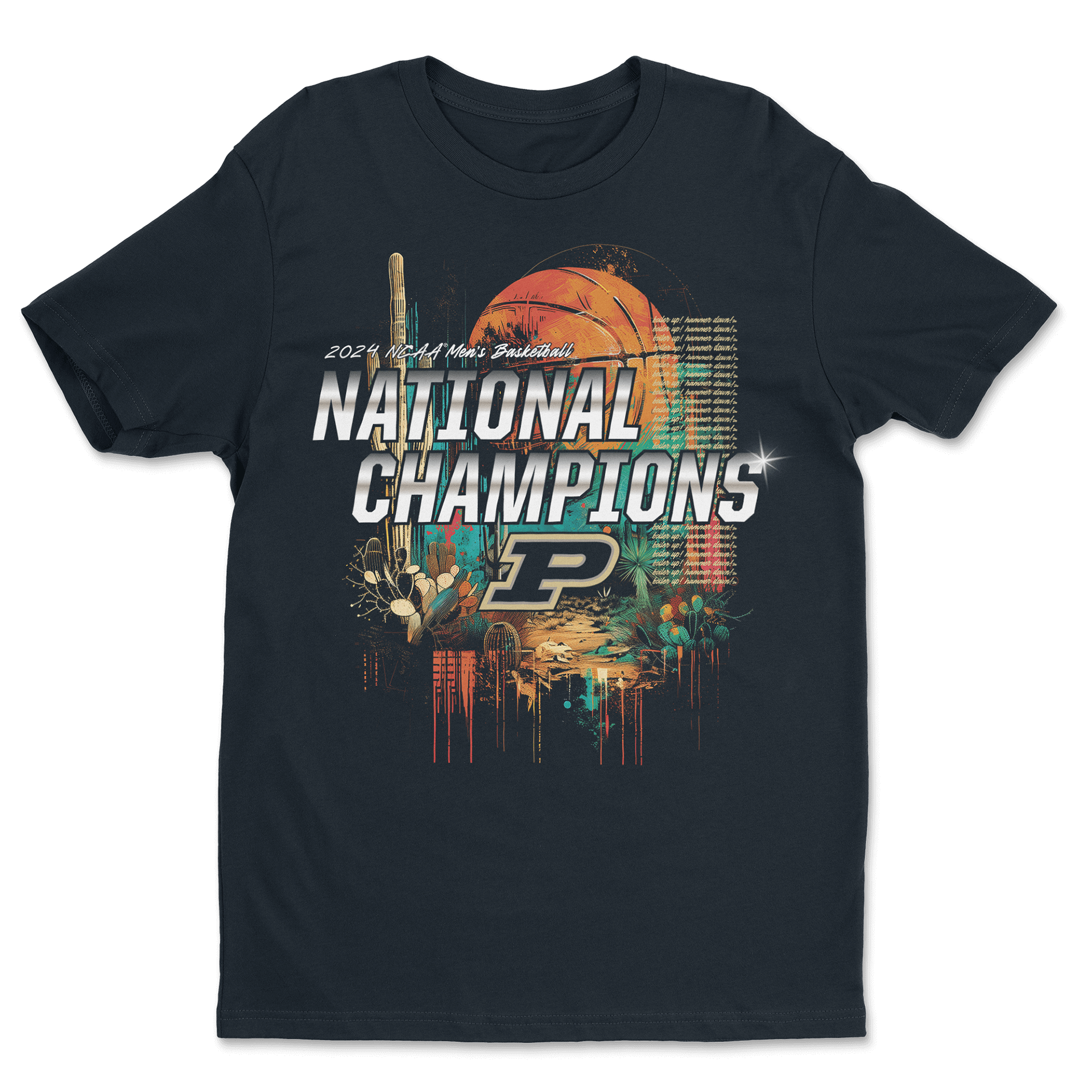
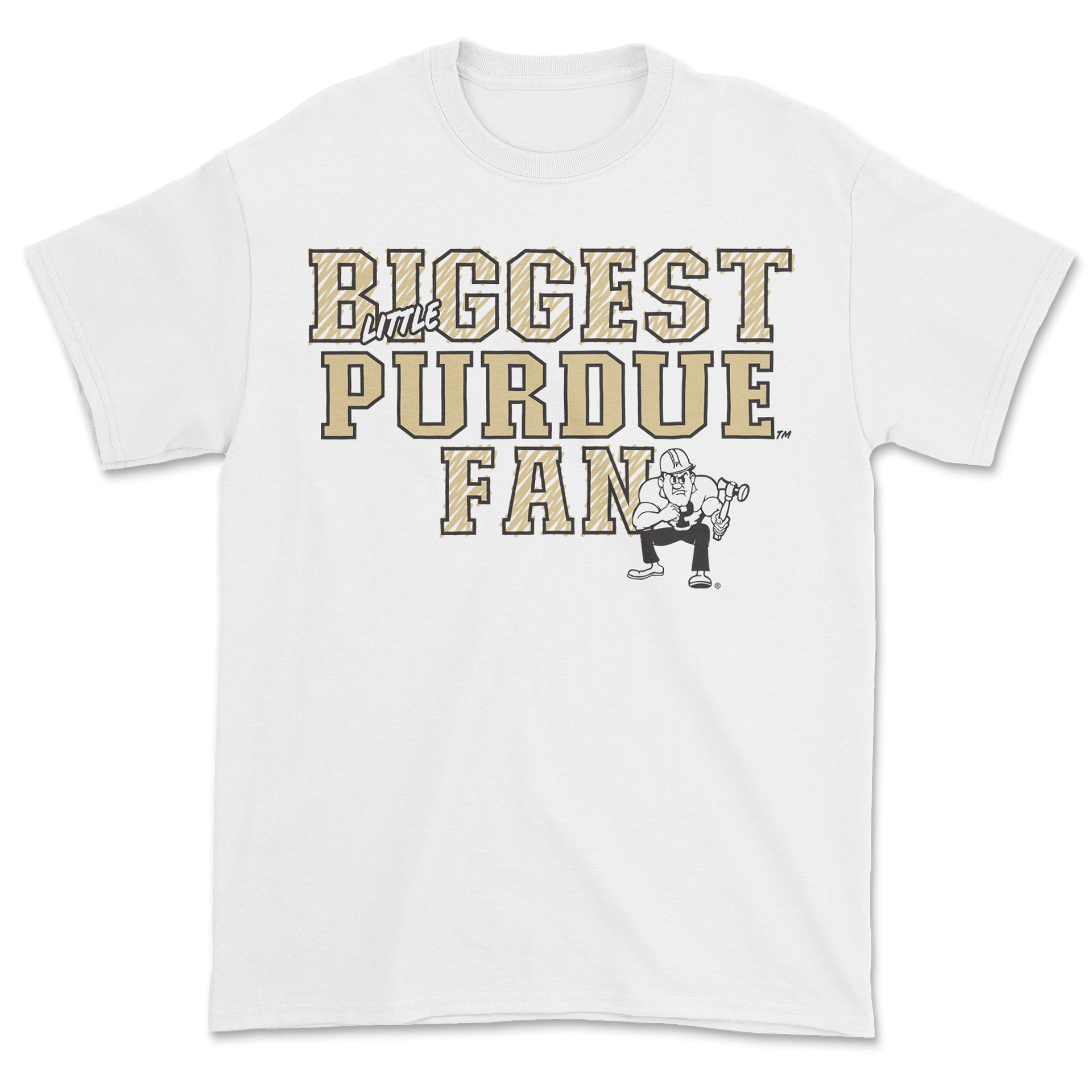
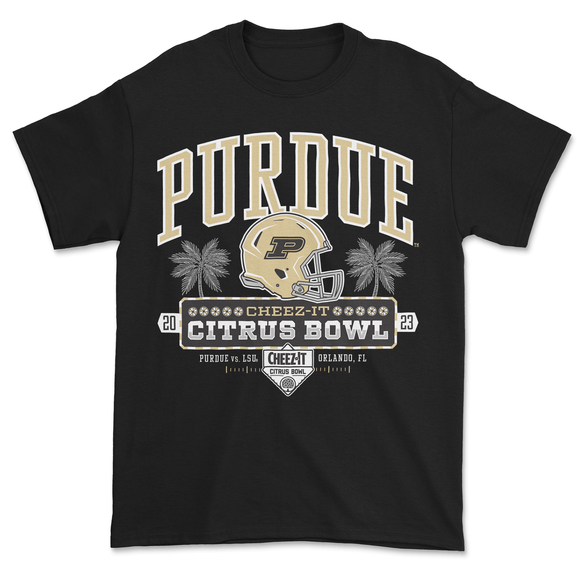
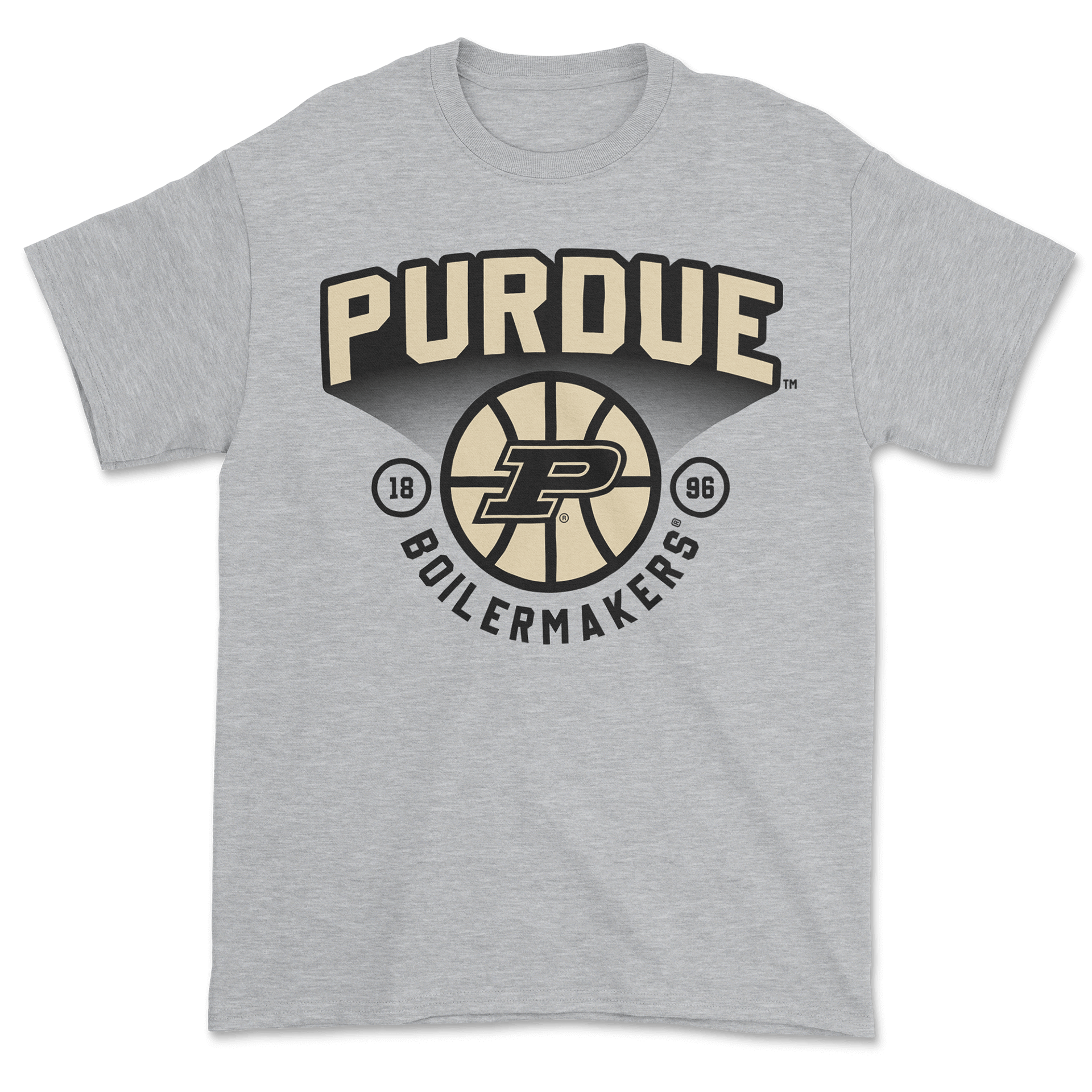
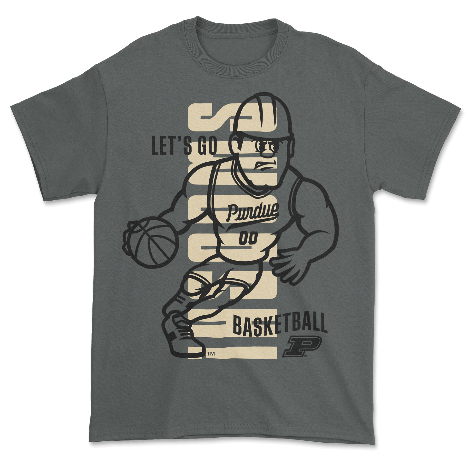
These Purdue pieces consist of AI-assisted concepts with clean vector designs to create merch that stands out in a crowded collegiate space. The championship graphics started with AI explorations of desert textures and dramatic atmospheres—tying into the game’s location in Arizona—and then were refined into bold, retail-ready artwork. The rest of the designs focus on classic athletic branding with strong lettering and layouts built to print consistently across different apparel types.
Indiana Pacers
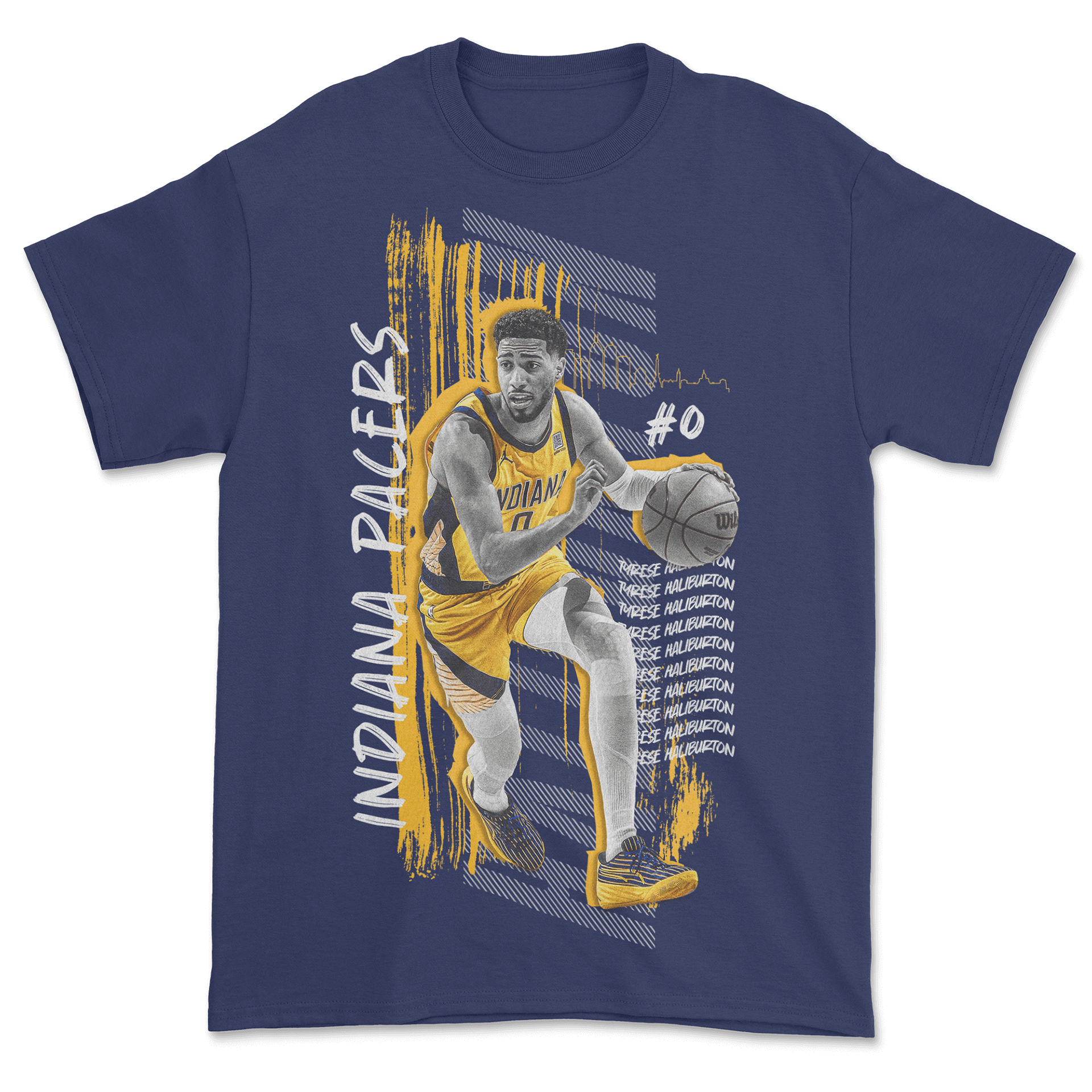
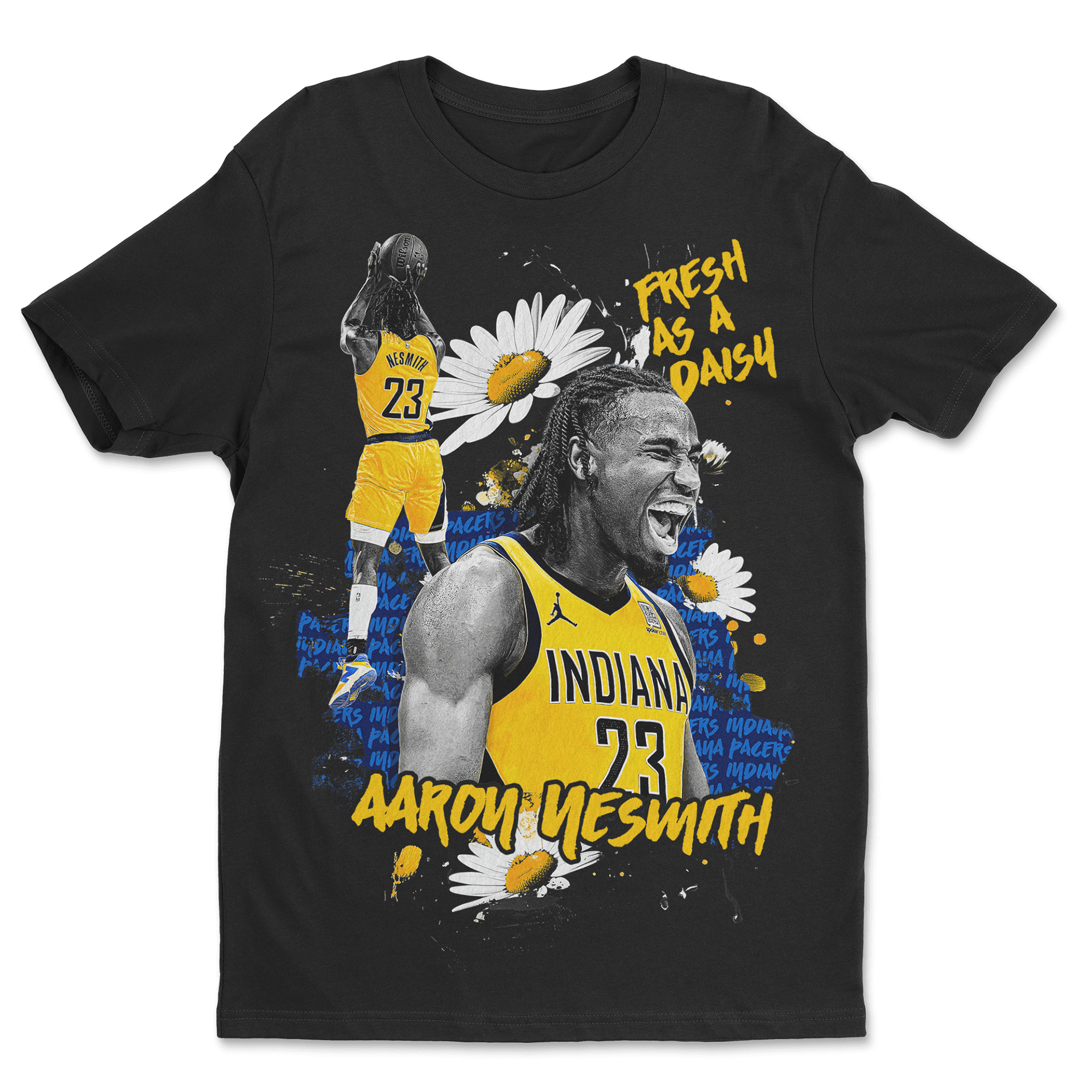
These Pacers concepts were built to show off what we could do from a print and design standpoint—big color, layered textures, and dynamic artwork. The Haliburton design leans into brush strokes and movement, while the Nesmith “Fresh as a Daisy” piece mixes playful elements with gritty photo textures. Together, they highlight a wide creative range and were designed to give the Pacers a clear look at the kind of high-quality merch direction we could bring to a future partnership.
Vintage Mascots
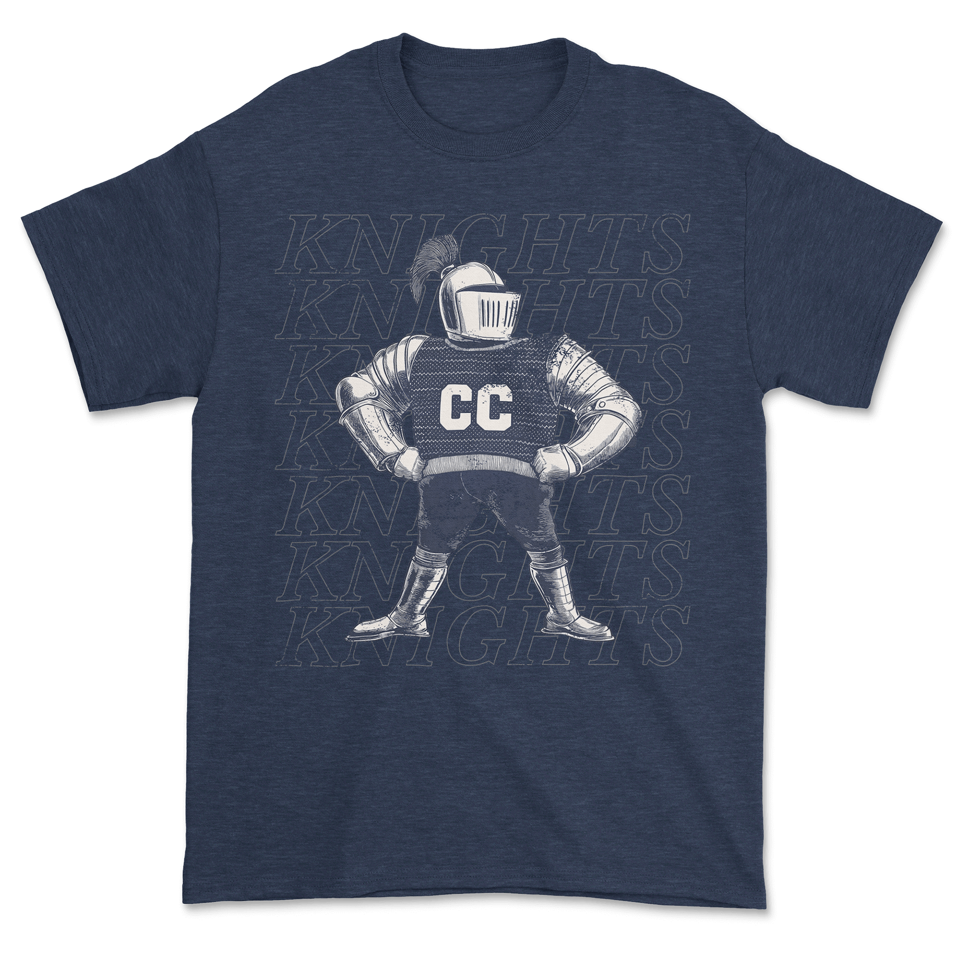
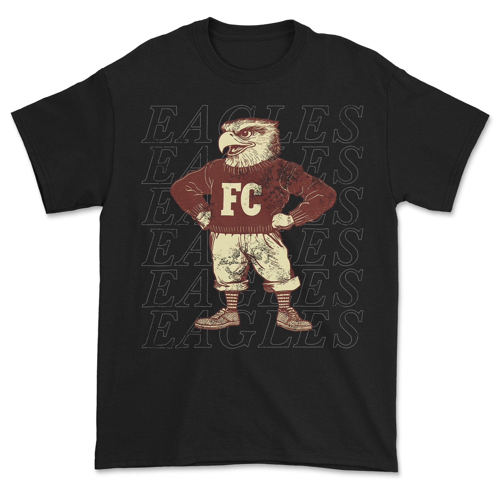
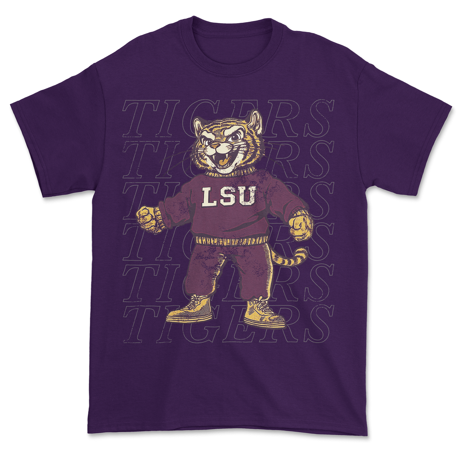
For these mascot designs, I aimed for a classic, old-school look while still keeping everything fresh for modern merch. I used AI to explore poses and retro textures, then refined the art so it felt authentic and print-clean. With the subtle distressing, simple palettes, and background text treatments, these pieces became a strong way to approach high schools and colleges—showing how their mascots could be updated in a nostalgic style that still feels current and wearable.
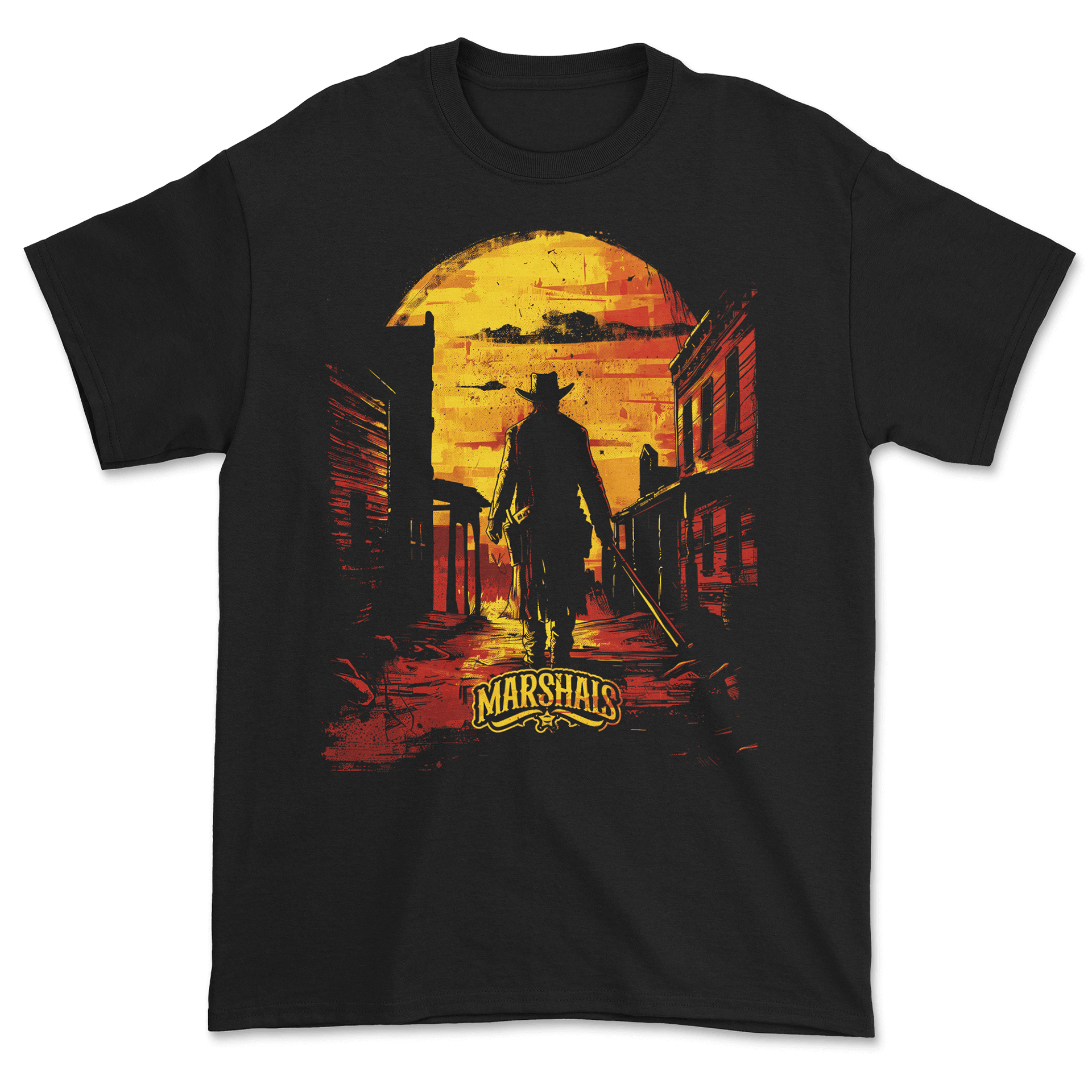
Mascots Reimagined
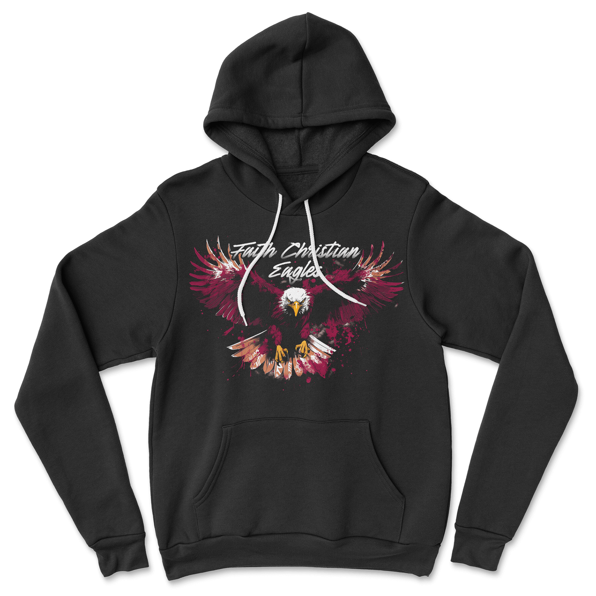
These mascot pieces lean into a high-energy, more aggressive style. I used AI to test dramatic poses, neon lighting, and splash effects, then refined the artwork to keep it sharp and detailed. The final designs range from bright, electric visuals to heavier, textured illustrations, giving the group a bold look without sacrificing clarity. It’s a good example of pushing into louder styles while keeping the artwork intentional.
Norfolk Admirals Hockey
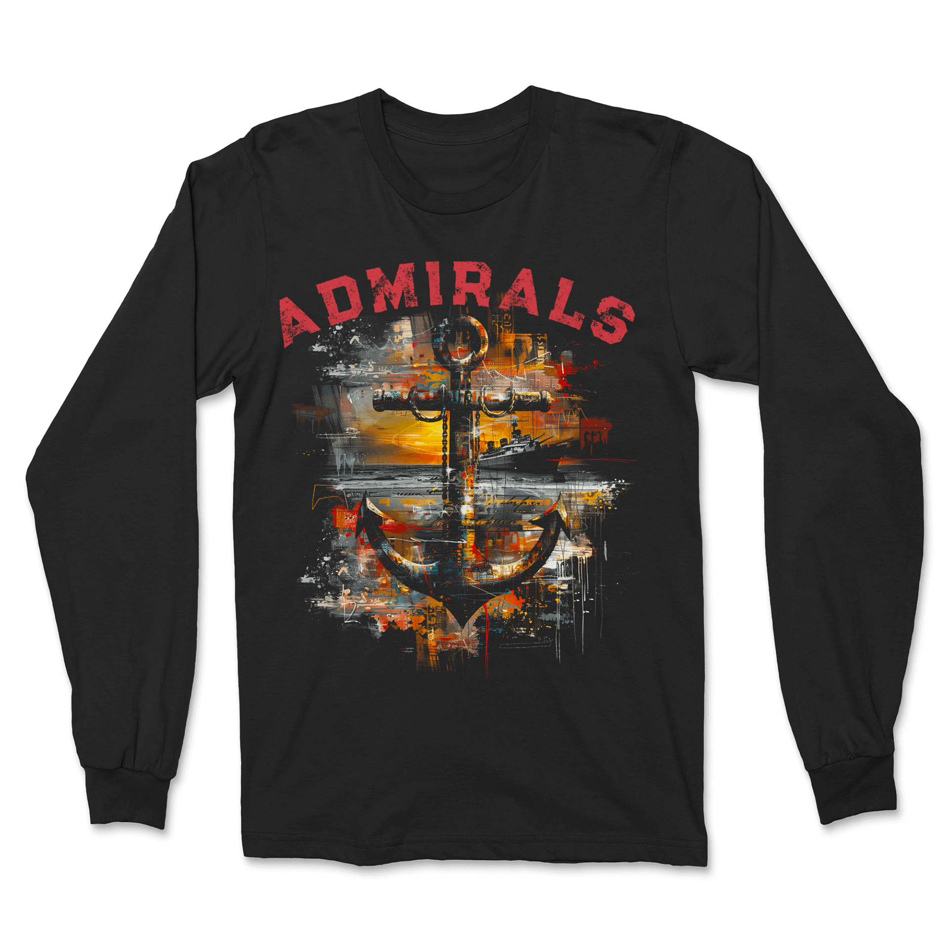
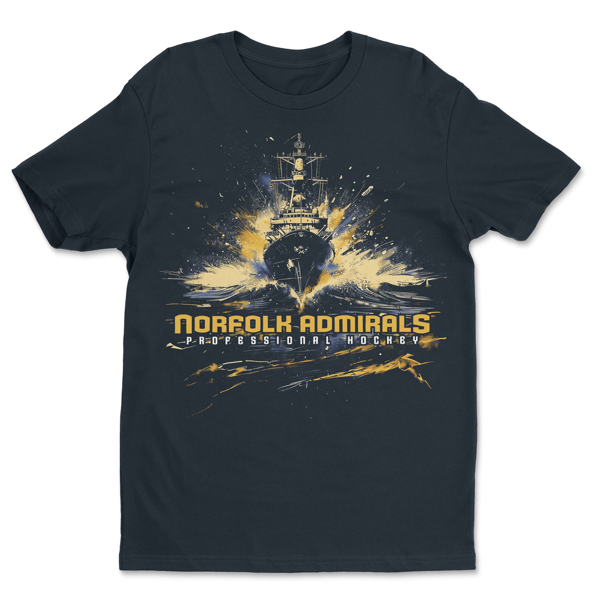
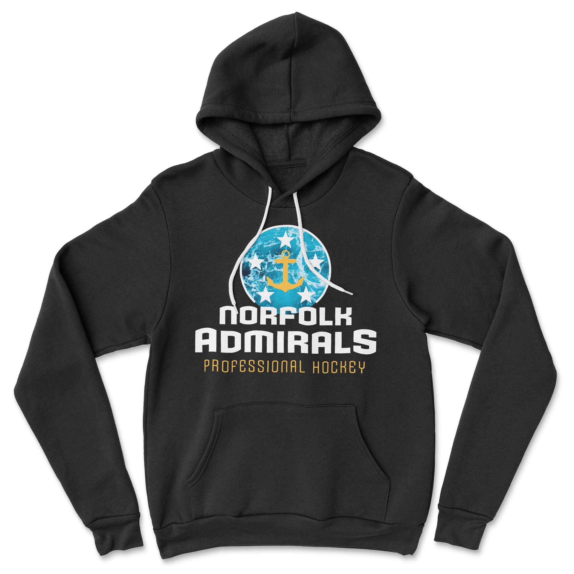
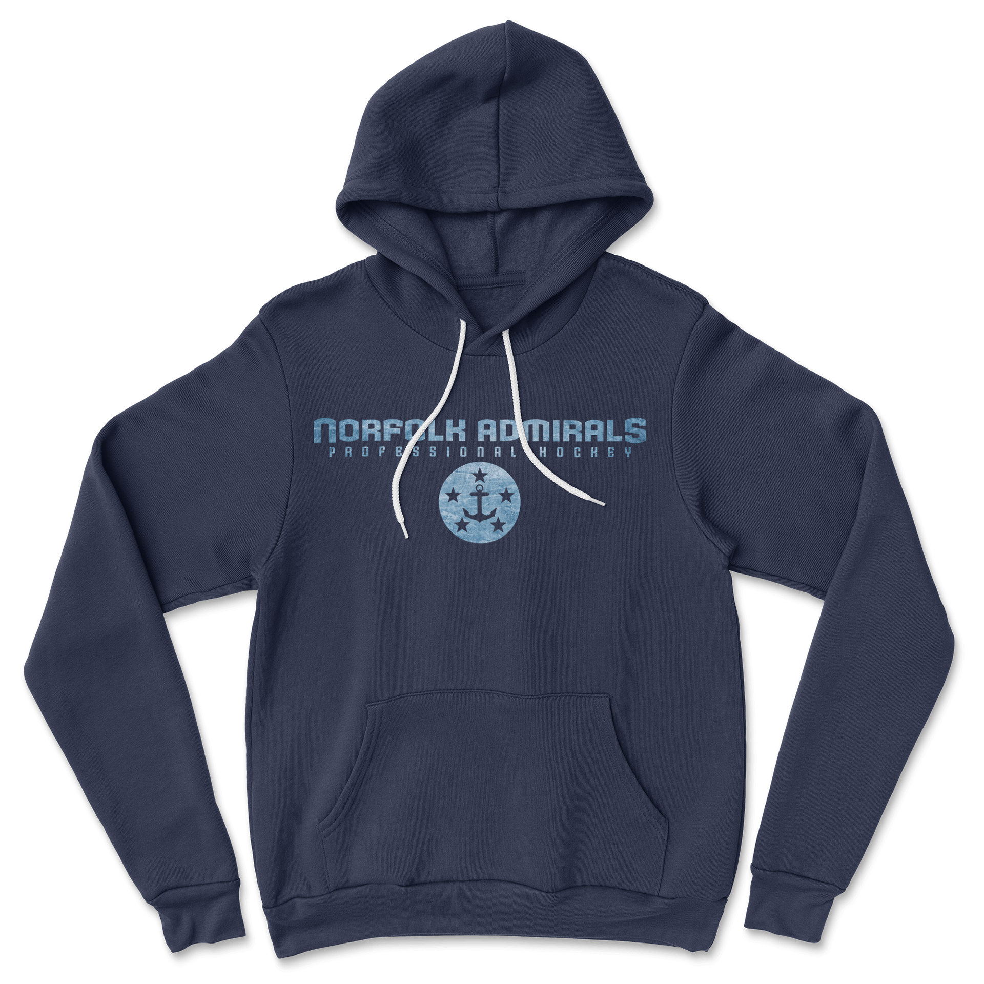
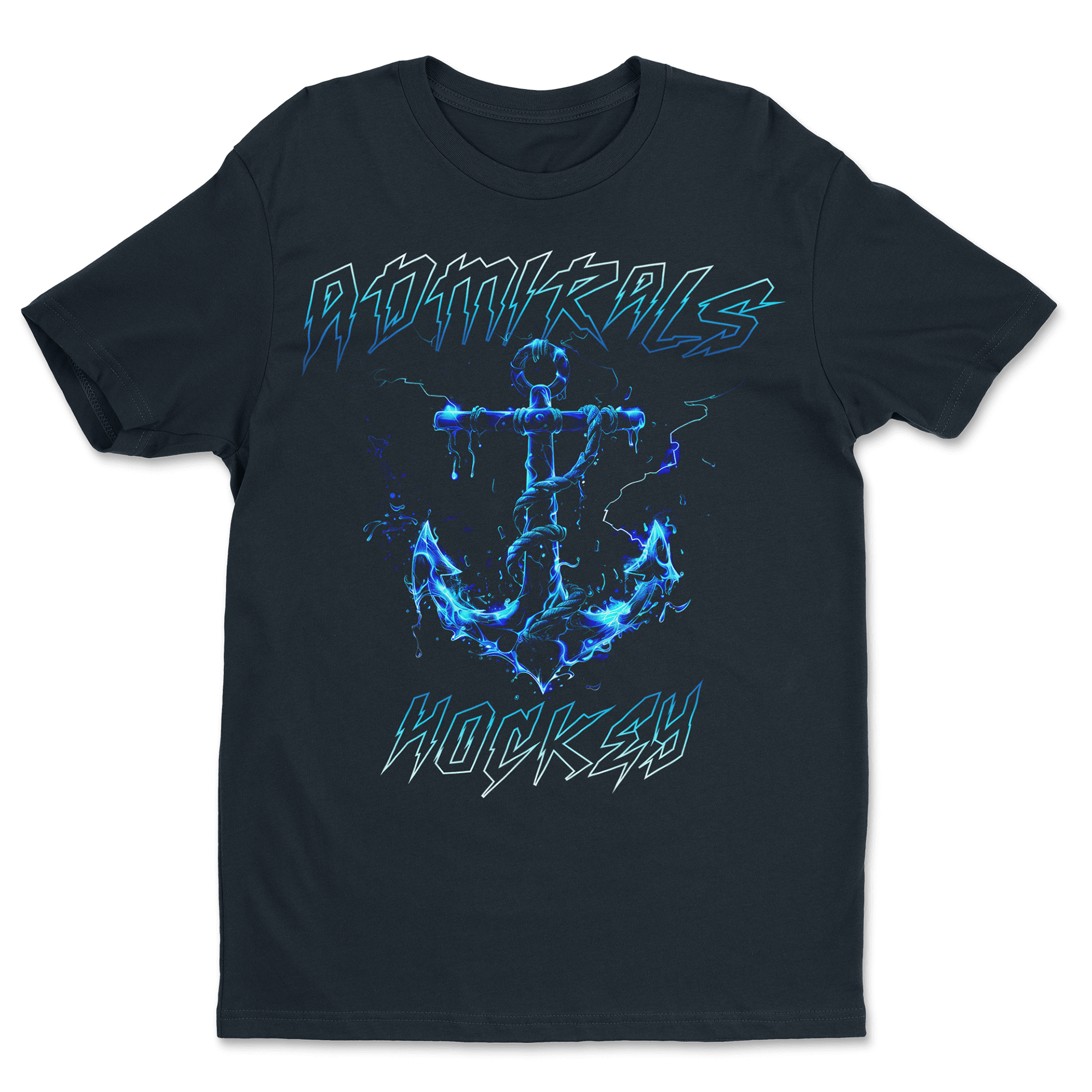
These Admirals designs let me explore different moods while staying true to the team’s nautical identity. I used AI to play with water textures, bold lighting, and dramatic anchor compositions, then tightened everything so it translated well on tees and hoodies. Some graphics are gritty and textured, while others lean more clean and logo-driven—but all were built to feel on-brand and visually strong for a pro sports audience.
The Badlands
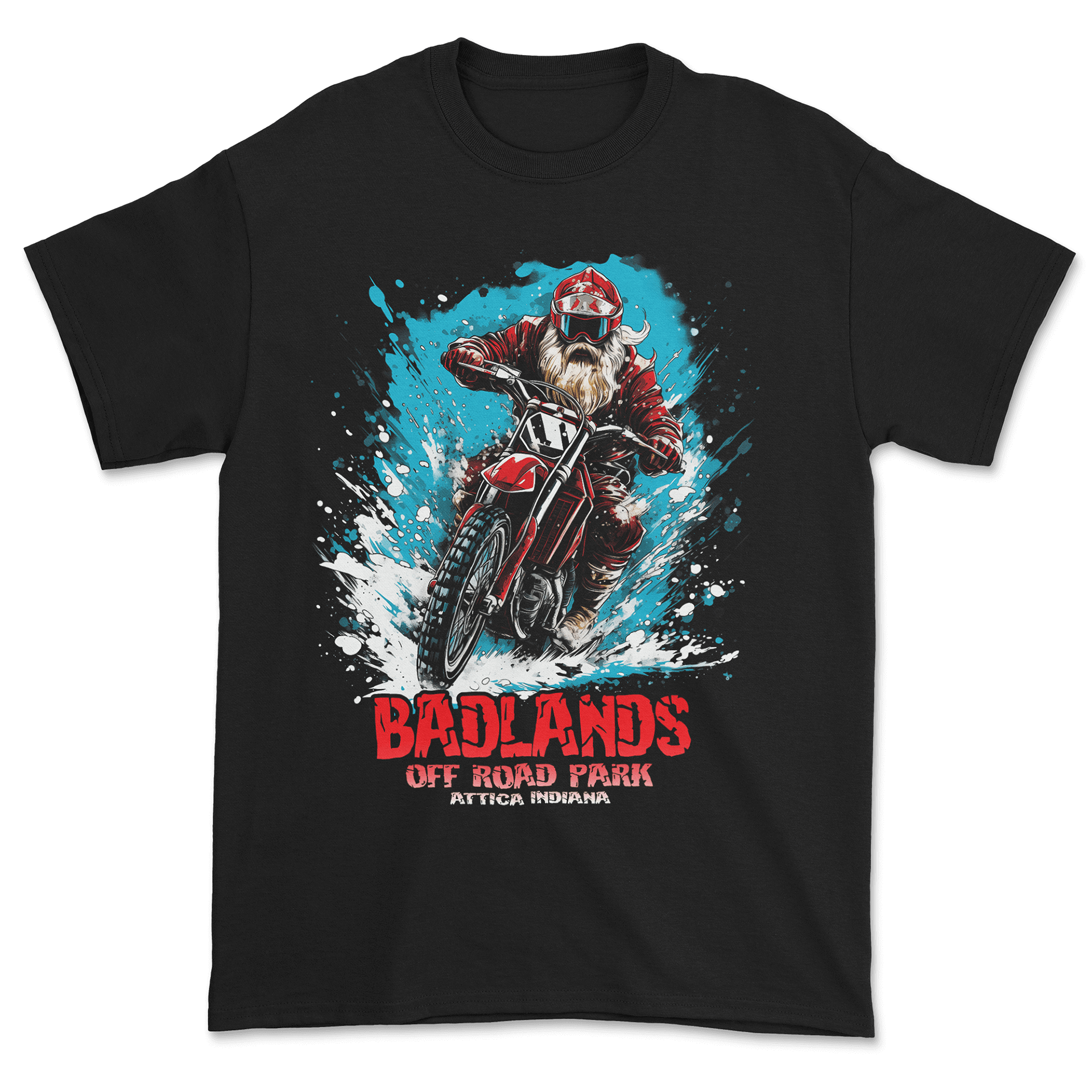
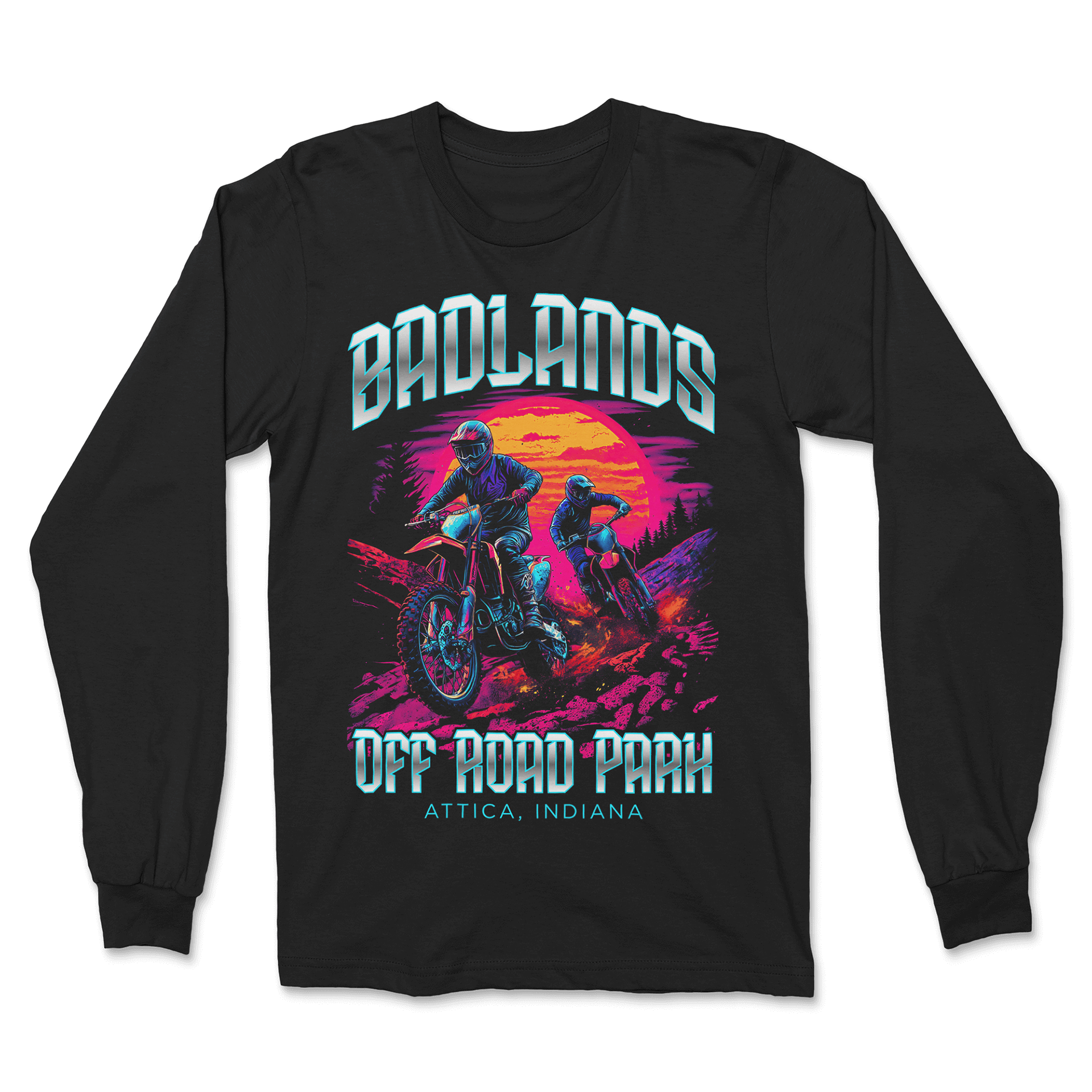
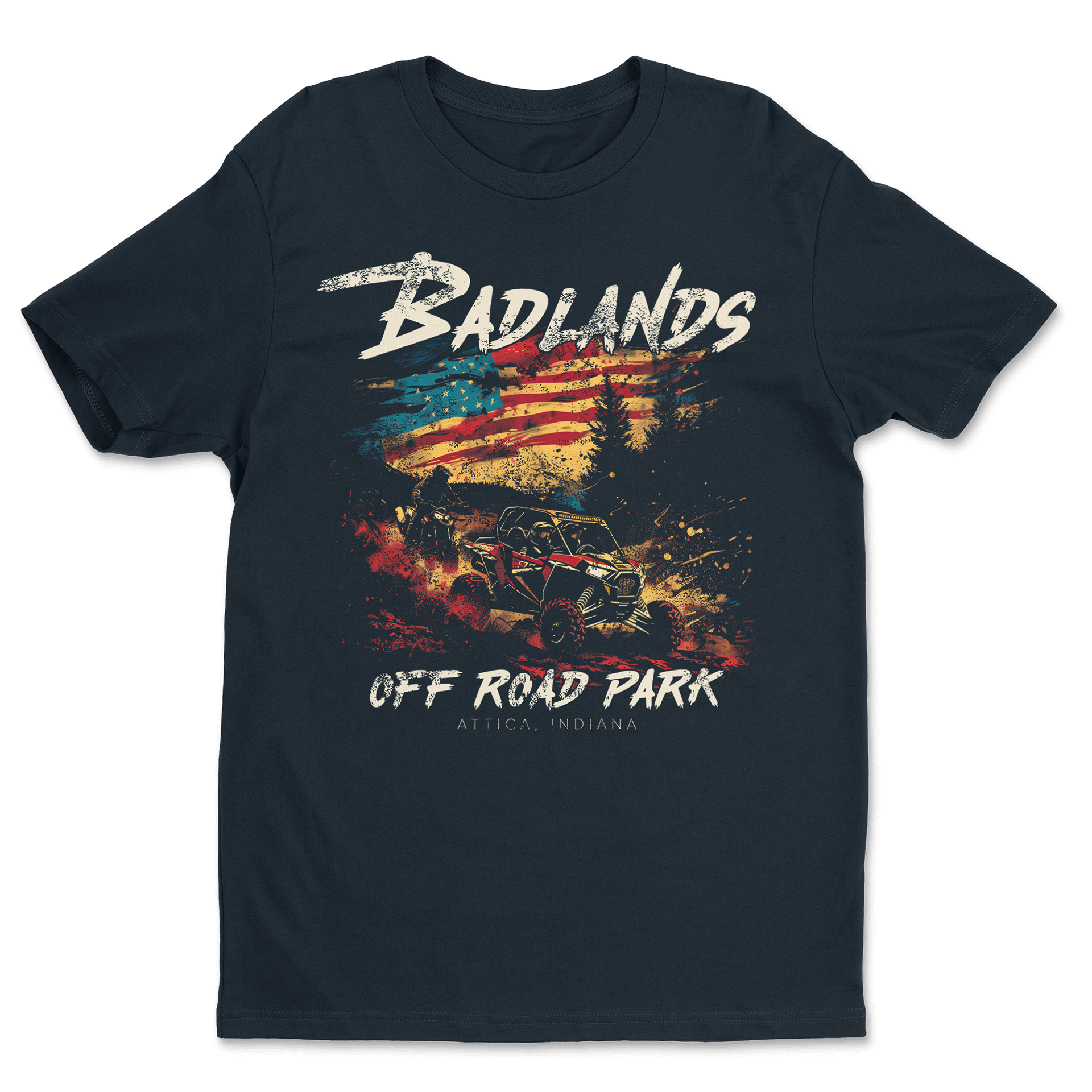
The Badlands designs focused on capturing off-road energy in a way that still prints clean. I used AI to explore action-heavy concepts, then refined the artwork so each piece stayed bold without getting muddy. The styles vary widely—comic-influenced, neon retro, and rugged Americana—which helps show how I can match different tones while still delivering detailed, market-ready apparel.
Dan Patch Days
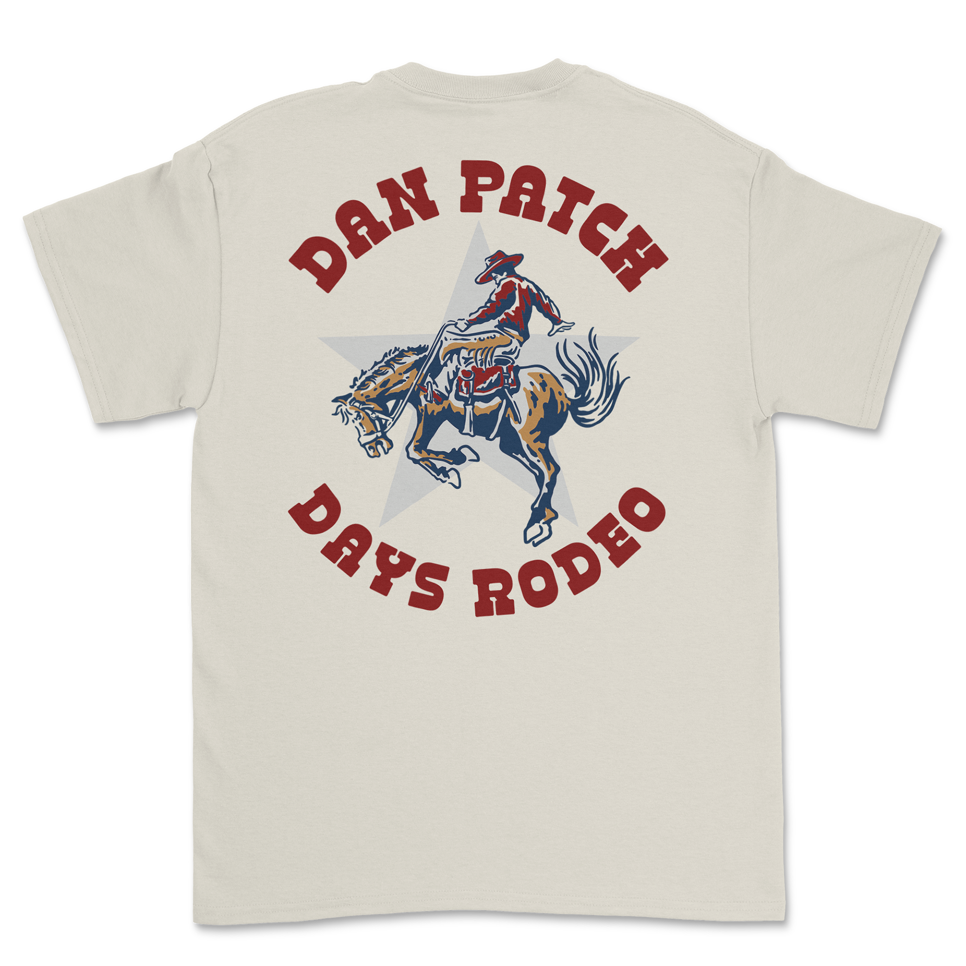
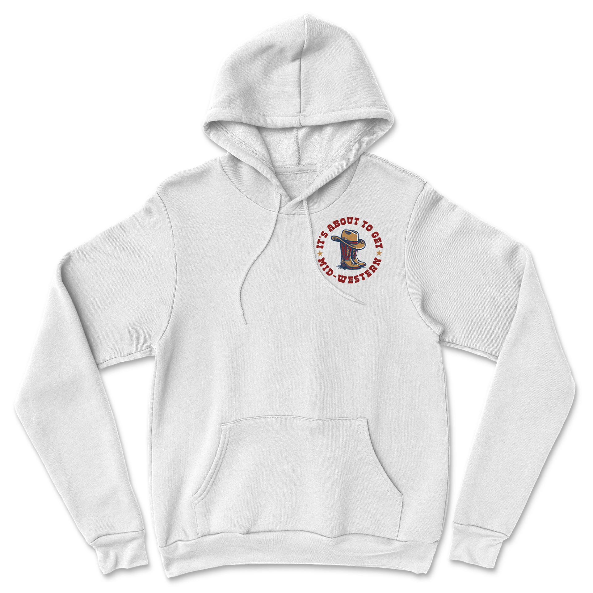
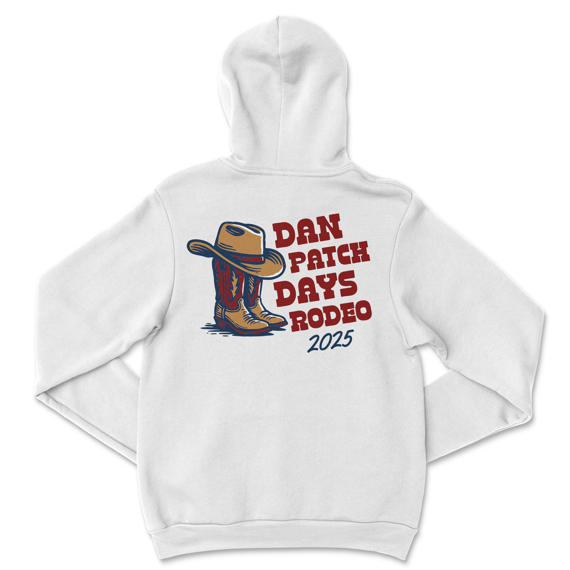
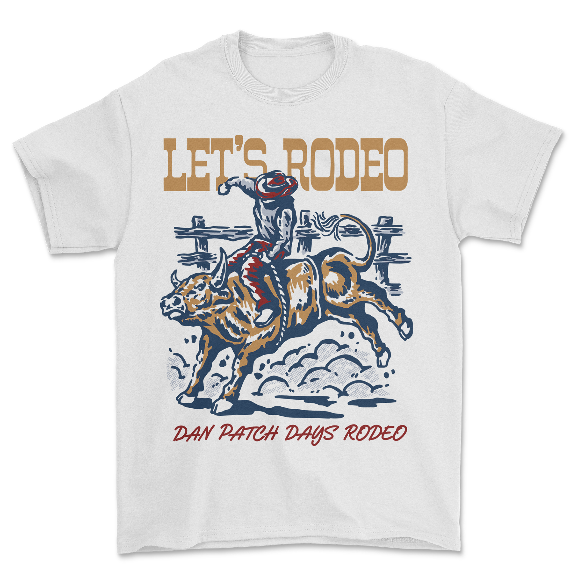
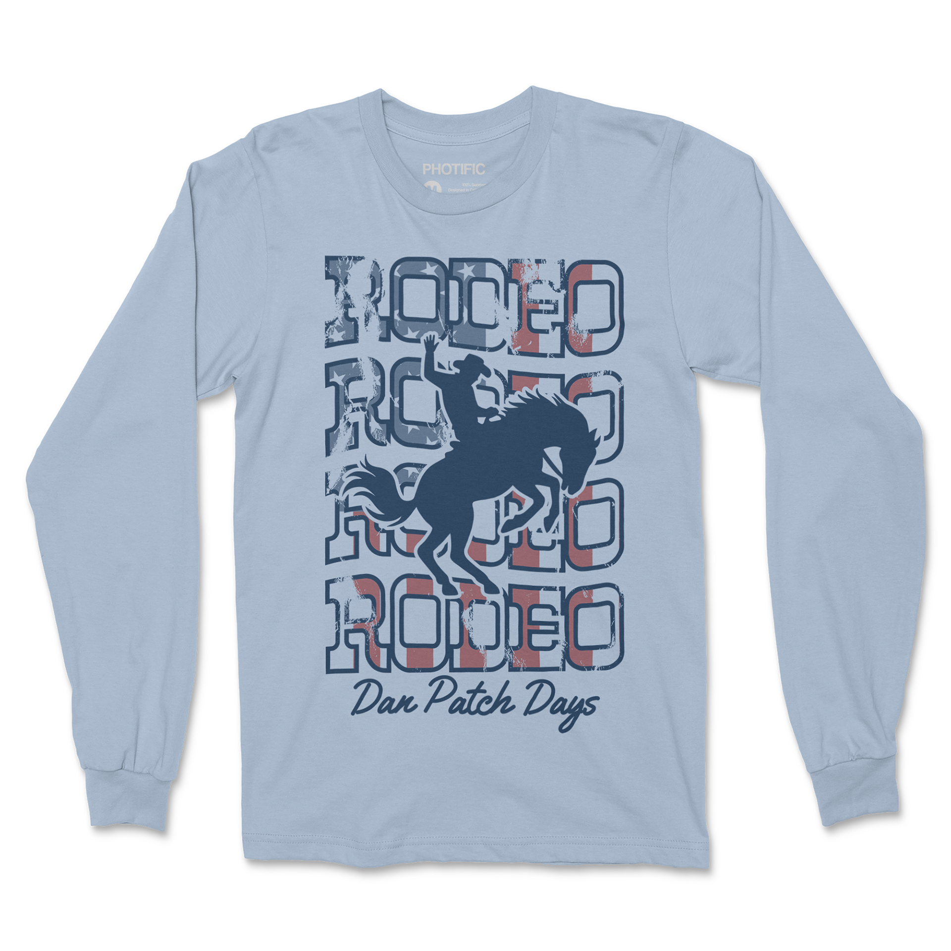
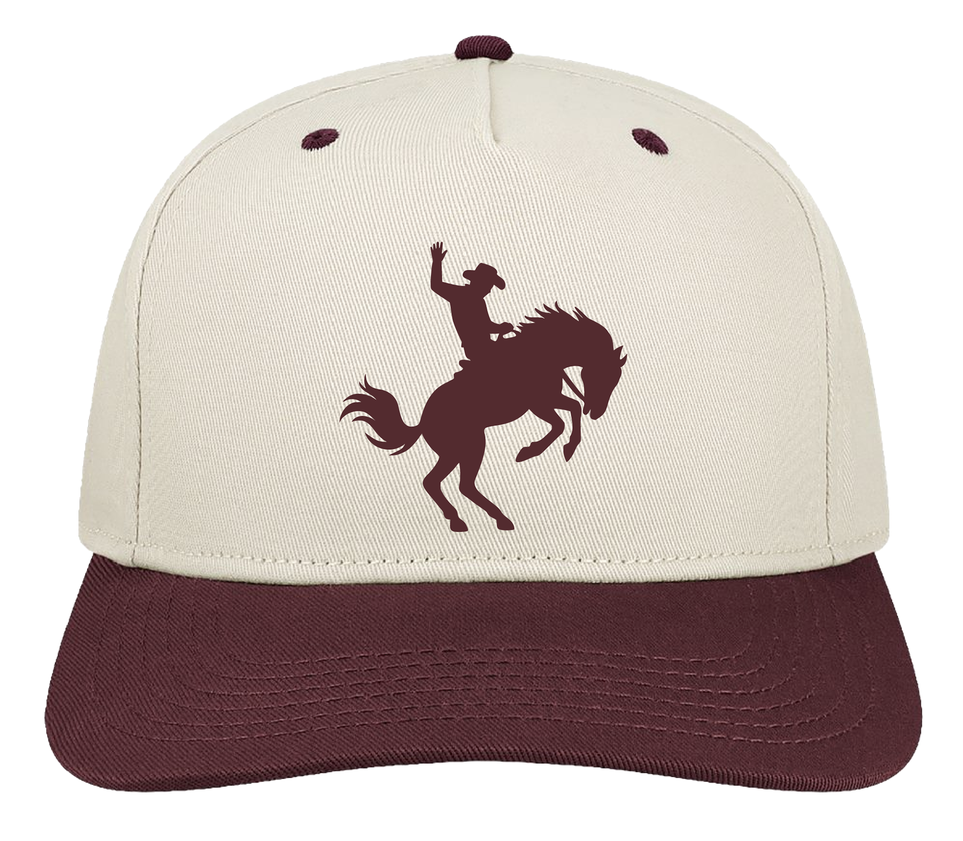
For Dan Patch Days, the goal was to mix hand-drawn illustration with vintage western typography to match the feel of a classic rodeo event. I paid close attention to print placement, line weight, and color so the designs would work across tees, hoodies, and hats. The set includes both detailed action graphics and simpler emblem-style pieces, giving the event options for different audiences and price points while keeping everything authentic and retail-ready.
Minor League Baseball
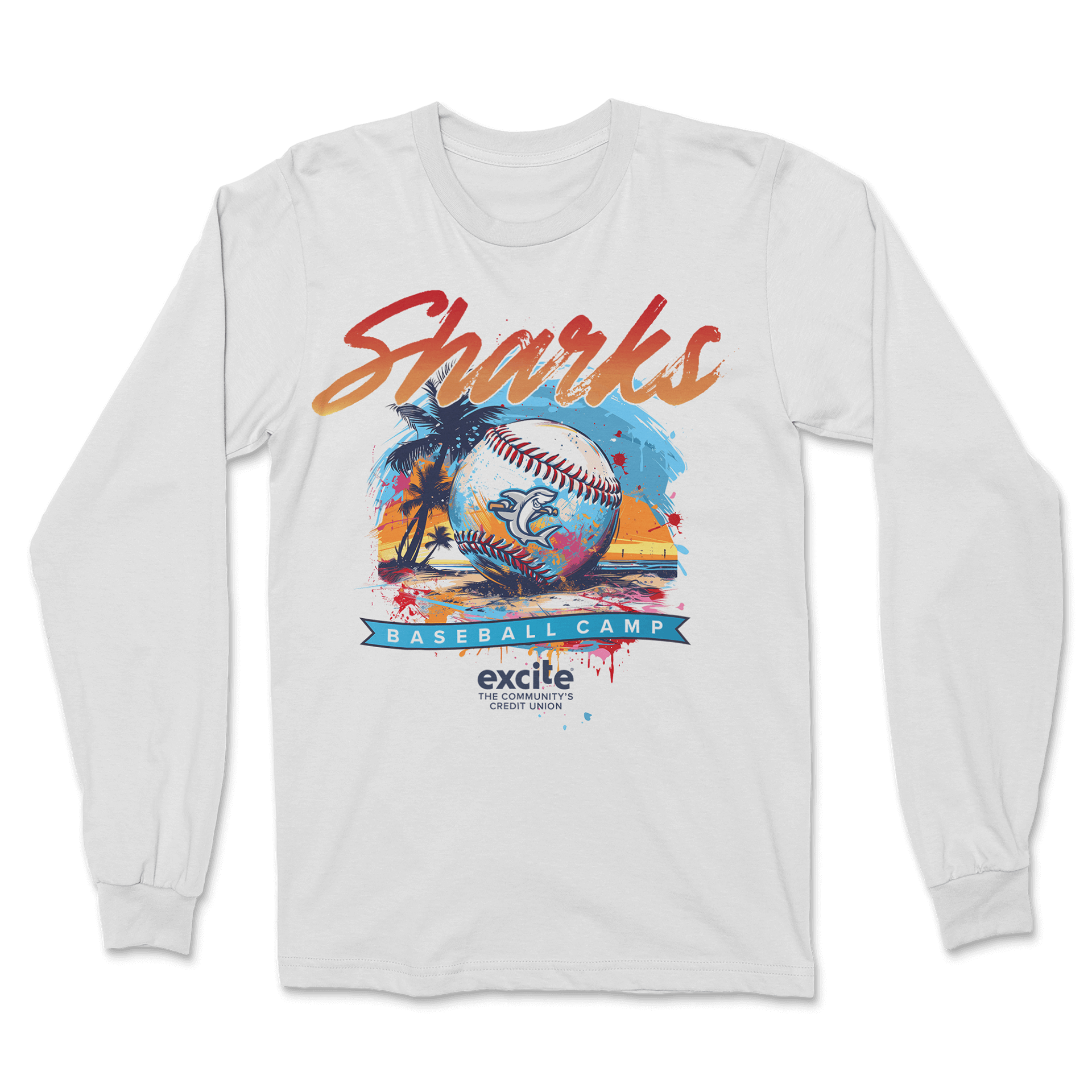
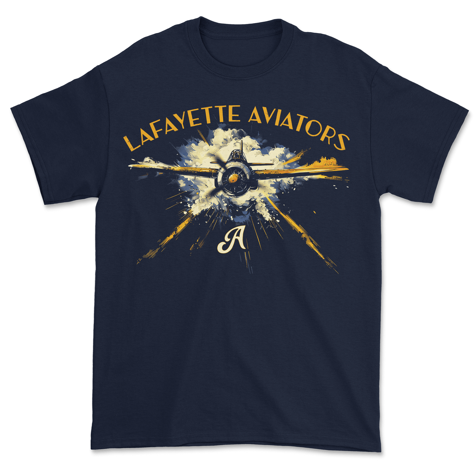
These designs show how I can jump between very different visual styles while still keeping everything clear, balanced, and merch-ready. These were separate minor league baseball teams that I used AI in the process to explore concepts and layouts, then tightened each piece with stronger type work and refined color choices. Even though the themes range from beach-inspired to vintage aviation to Western, they all share a clean structure built for fan merch and team-focused retail.