This collection shows the print assets I built for ProAxis Group and its divisions, focusing on giving the company a cleaner, more modern, and more consistent brand presence. Across brochures, business cards, catalogs, manuals, and signage, I improved layout clarity, updated visuals, and refined typography while still allowing each division—ProAxis, Viper, TruAG, and Viper Cryogenics—to maintain its own personality. Together, these updates created a stronger, more unified set of materials that better support communication and brand recognition.
ProAxis Group Sales Brochure
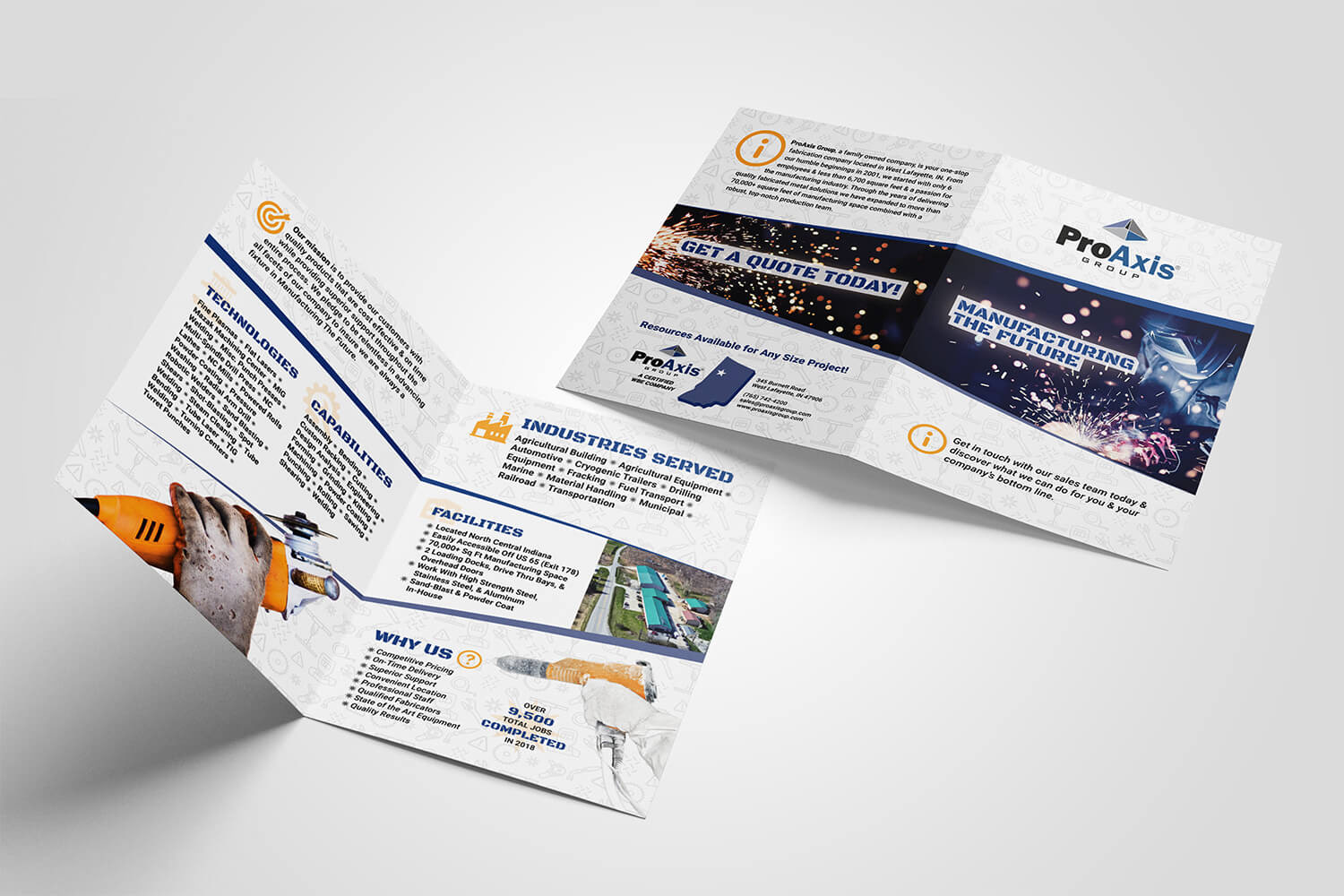
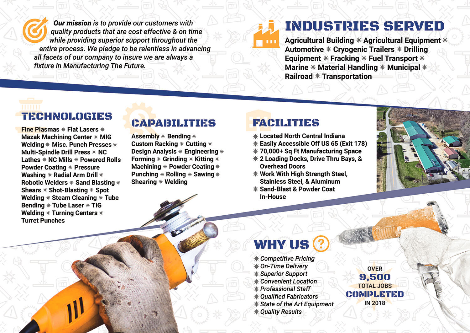
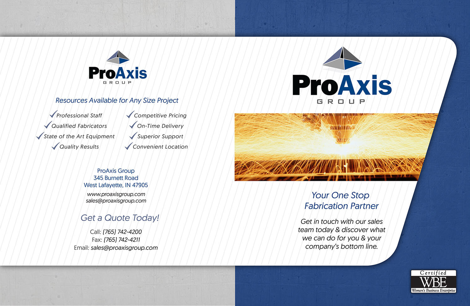
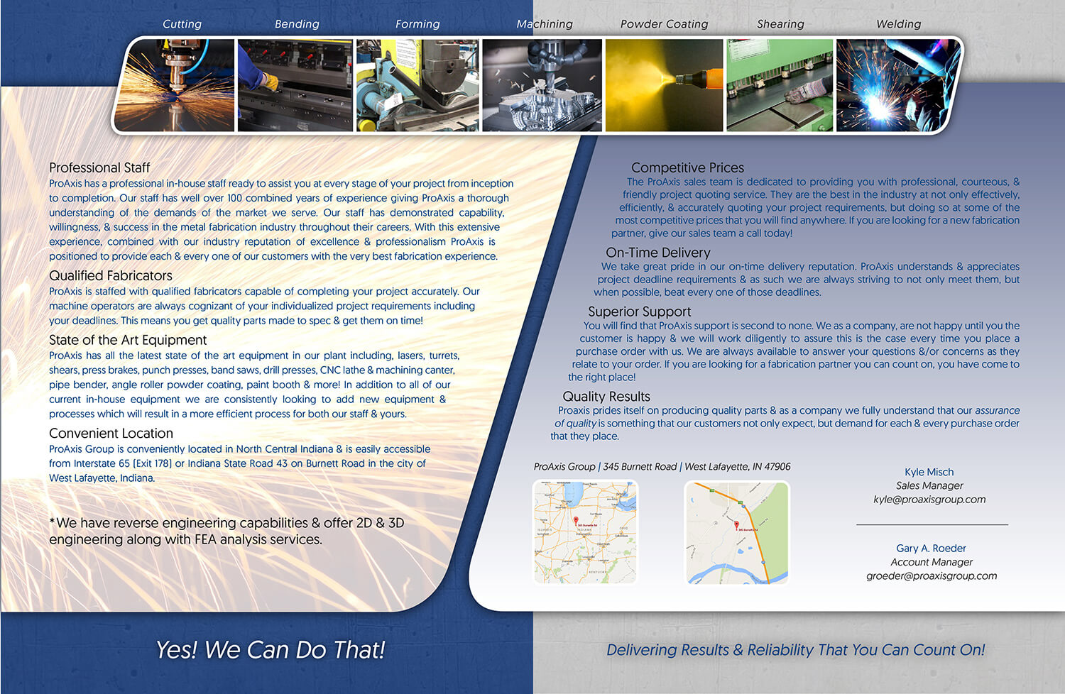
I redesigned the ProAxis Group brochure to make it more modern and easier to understand. I reorganized the layout, refreshed the visuals, simplified the messaging, and added a custom pattern based on fabrication icons to reinforce the company’s industry focus. The updated design presents the company’s capabilities in a way that’s quick to scan and easy for customers to follow.
The final pages compare directly with the older brochures, showing improvements in hierarchy, imagery, and overall cohesion. The new version communicates more clearly and represents the brand with a much stronger, more professional look.

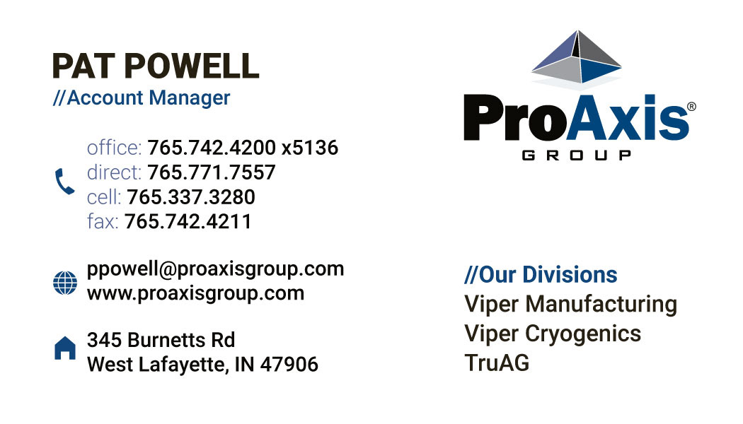
ProAxis Group Business Cards
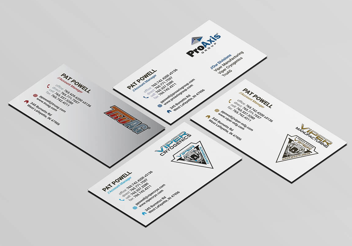
I redesigned the business cards for all ProAxis Group divisions to give them a cleaner look and a more unified identity. I updated the type, spacing, icons, and color accents to improve readability while keeping each card aligned with its division’s brand—whether ProAxis, Viper Manufacturing, Viper Cryogenics, or TruAG.
The older Katie Barr card served as the starting point. By simplifying the format and standardizing the structure across divisions, the new cards look more polished and create a consistent system that matches the rest of the updated ProAxis materials.

ProAxis Group Decals & Signage
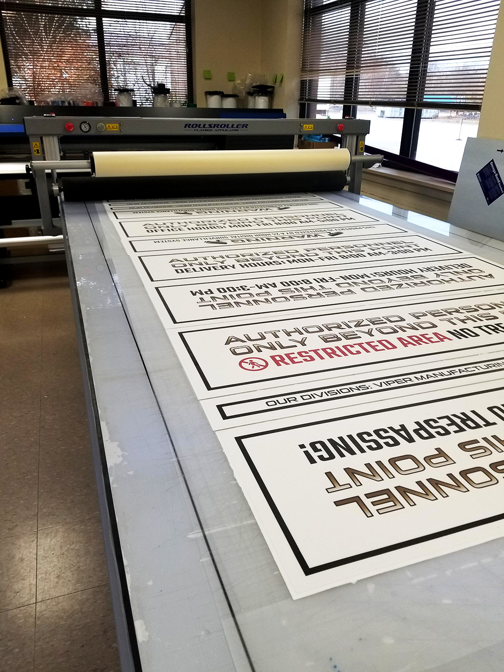
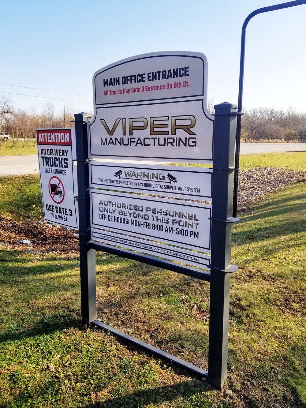
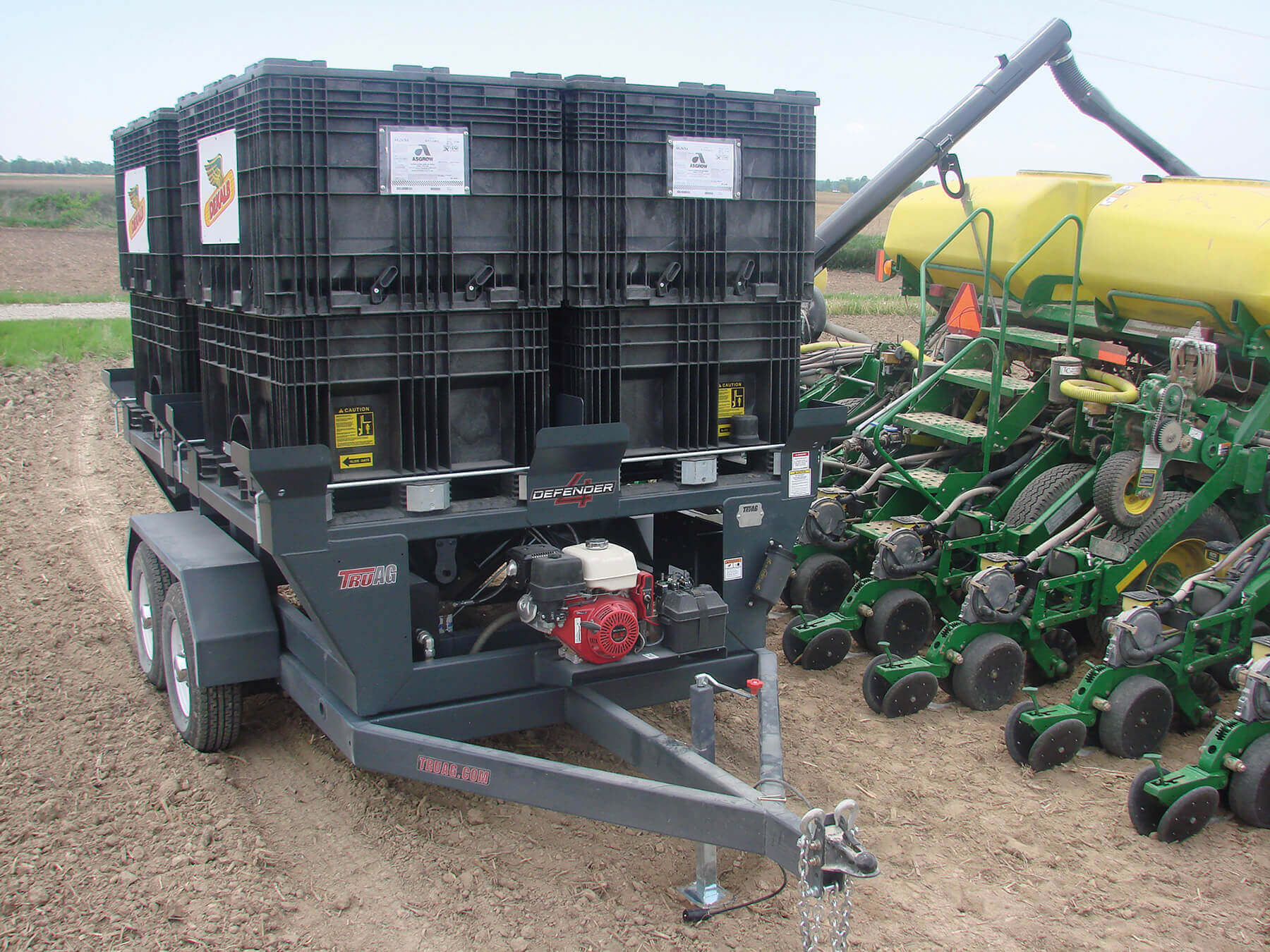
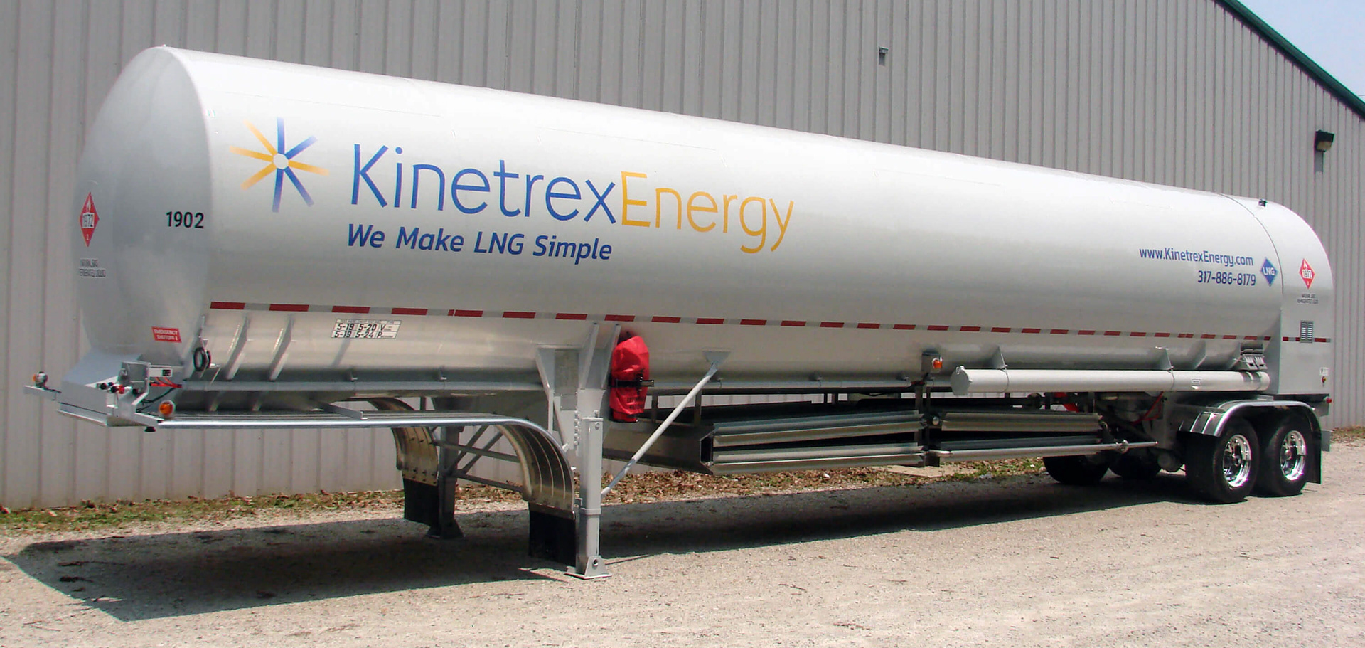
I was responsible for acquiring, running, and designing for our in-house print-and-cut machine. I handled the full workflow—printing, laminating, and cutting—to produce durable decals and signage whenever the company needed them.
I created everything from equipment labels to facility signage and large trailer graphics, giving the team fast turnaround and consistent branding. This work shows my ability to manage equipment, handle hands-on production, and design functional graphics for real-world environments.
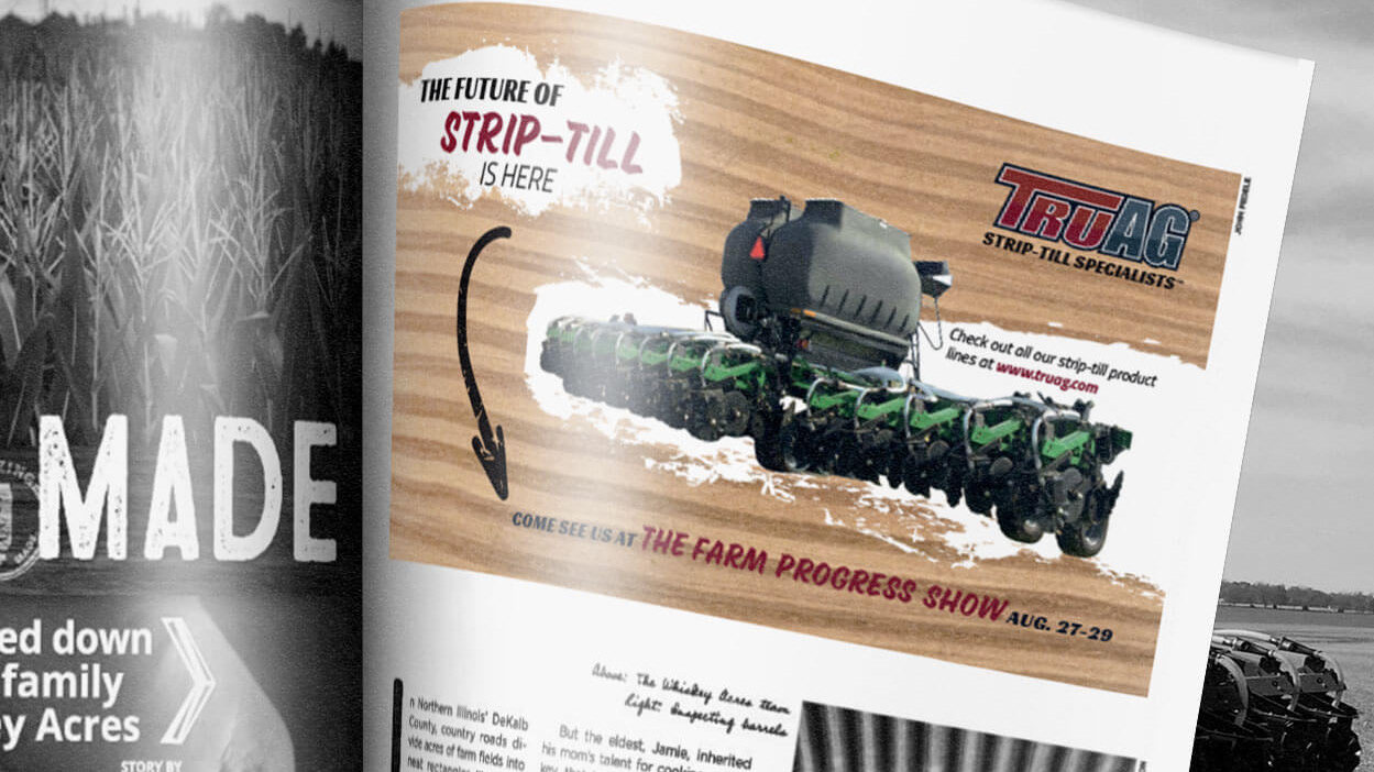
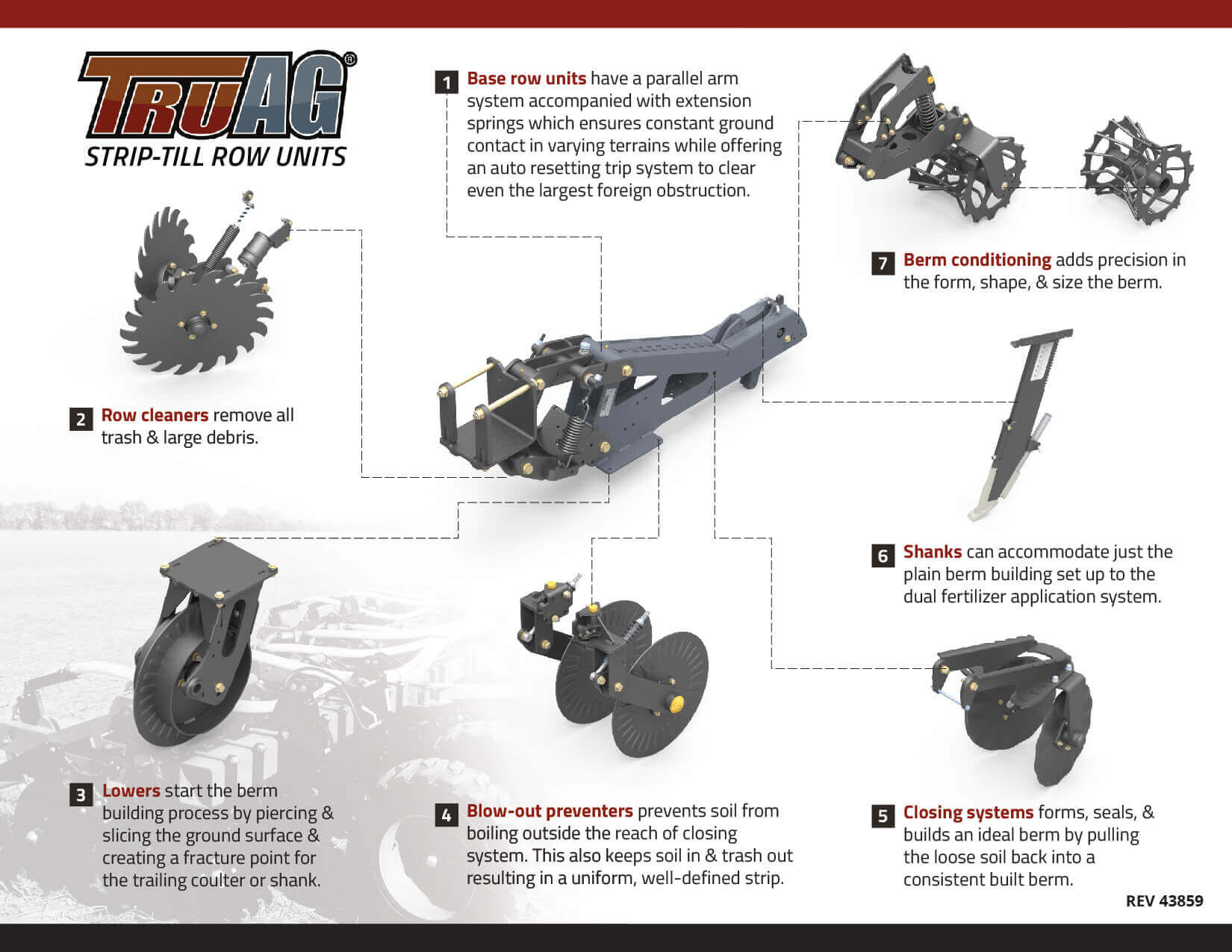
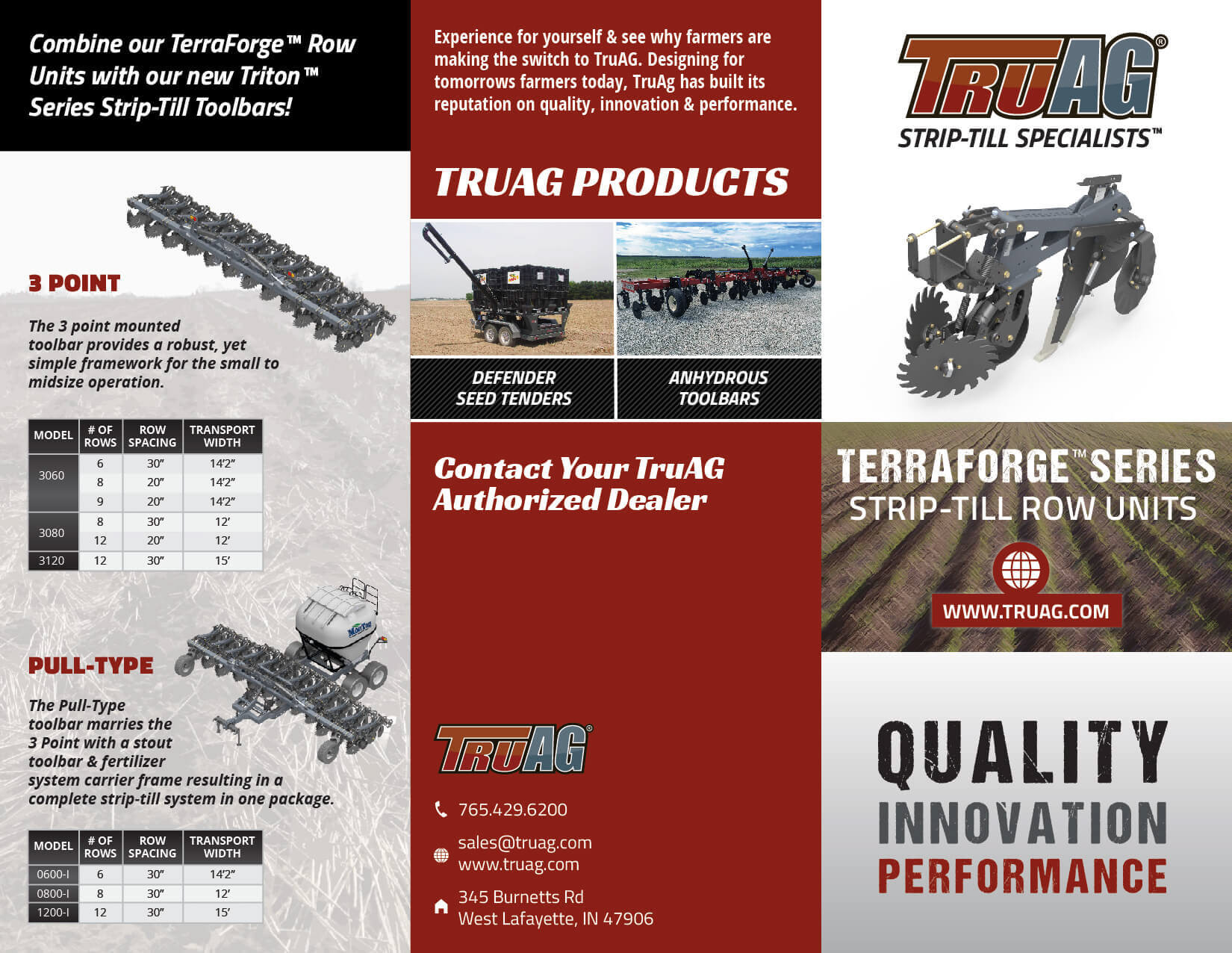
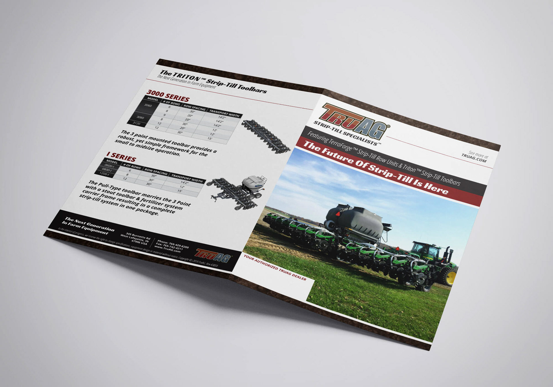
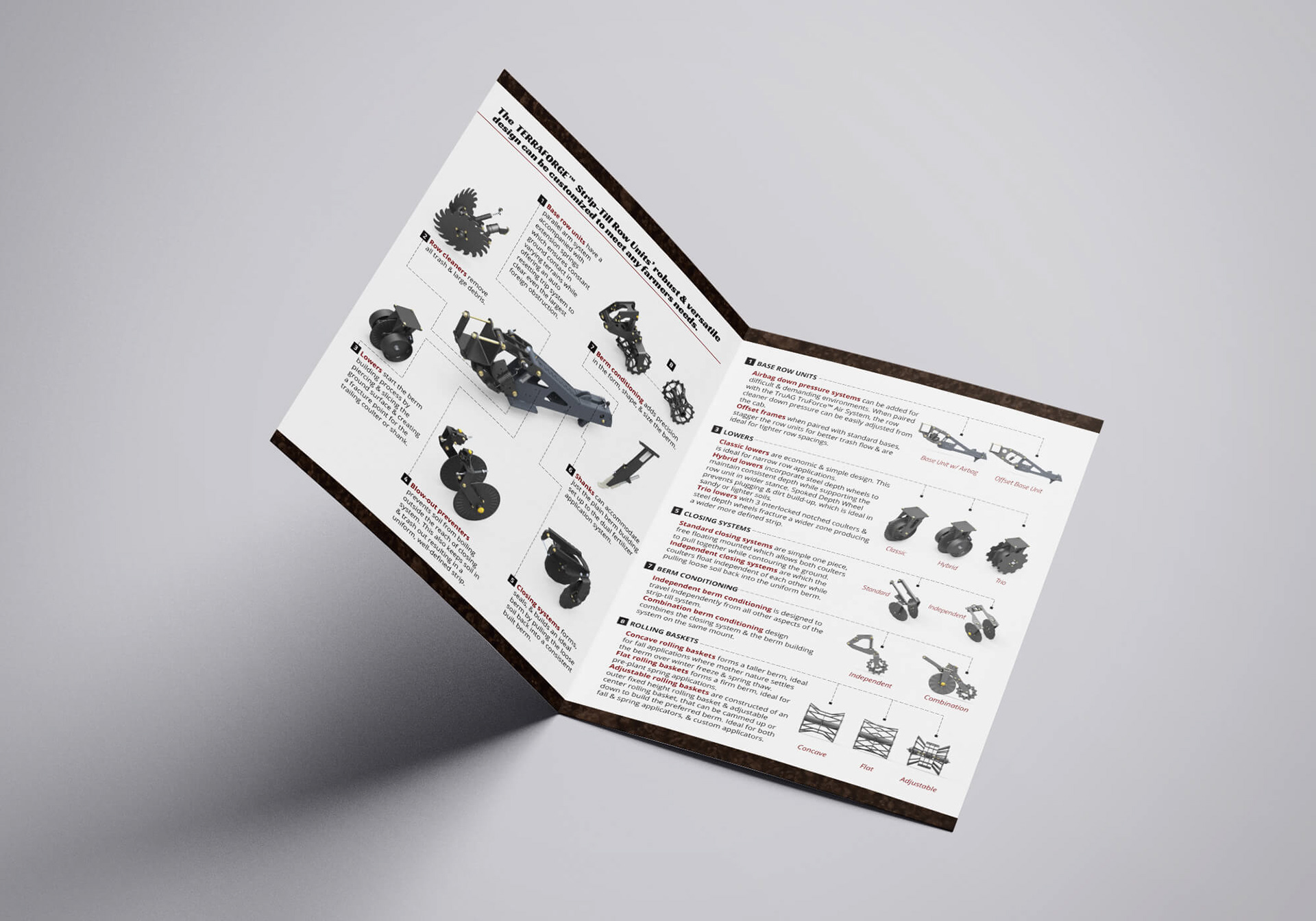
TruAG Brochures
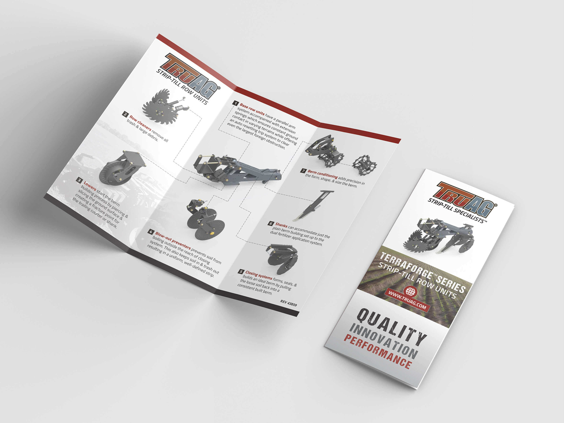
For these brochures, I designed a clean, structured layout to explain the full functionality of TruAG’s strip-till row units. Using detailed 3D renderings, numbered callouts, and short technical descriptions, I built a step-by-step guide that’s easy for customers and dealers to understand. A strong hierarchy and clear spacing keep the information approachable without losing detail.
I paired the technical content with product photography, equipment specs, and branding elements to create a piece that’s both informative and visually sharp. The brochures support sales conversations and give customers a clear picture of the system’s value.
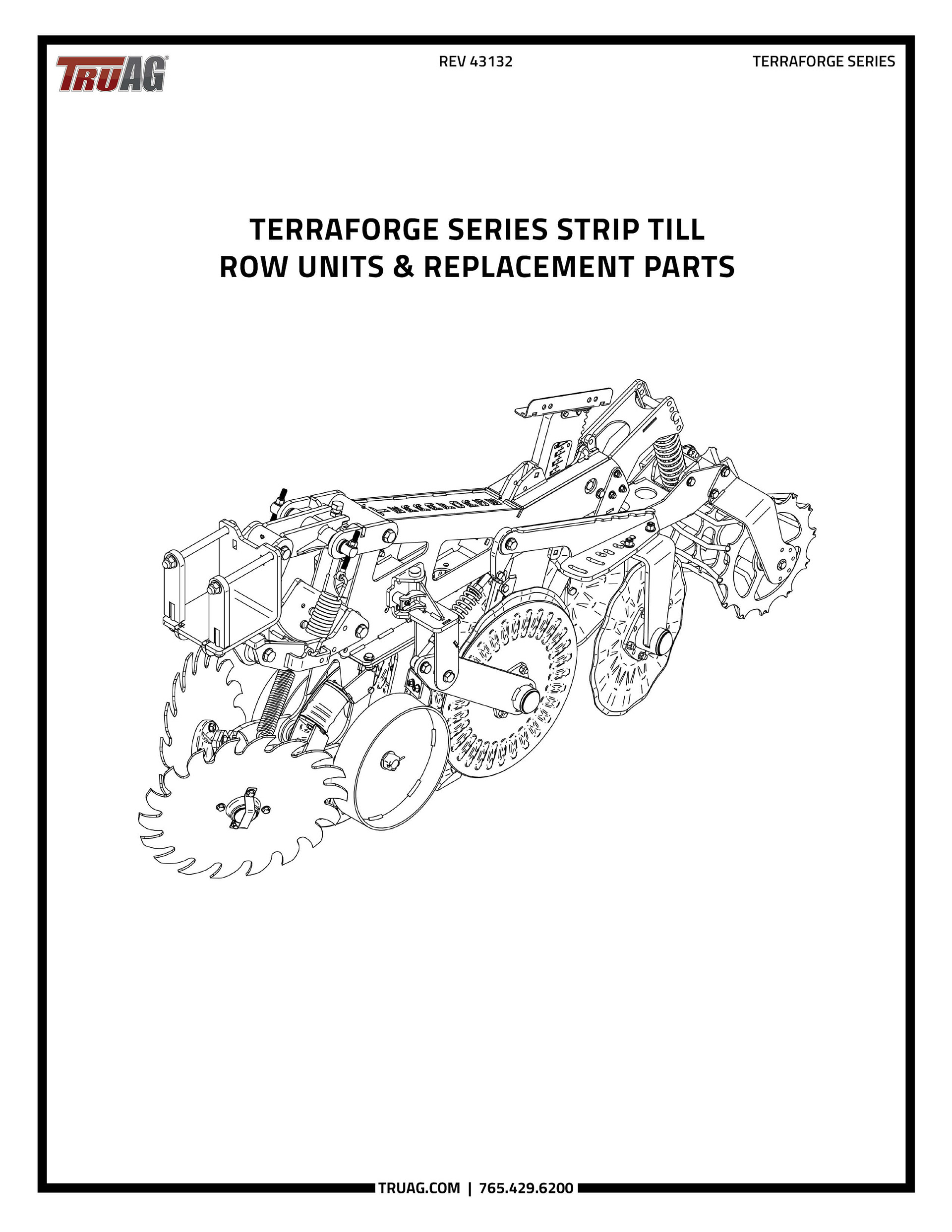
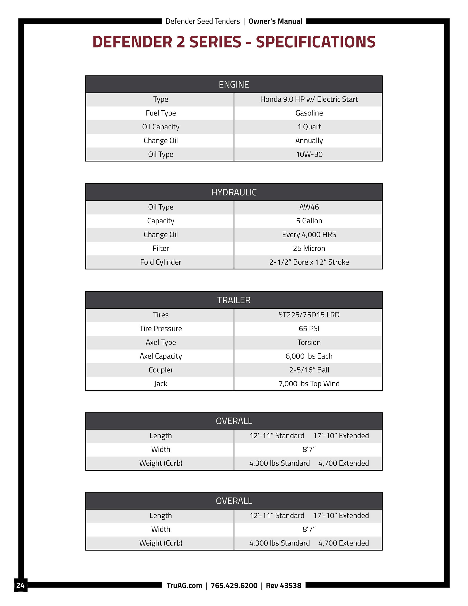
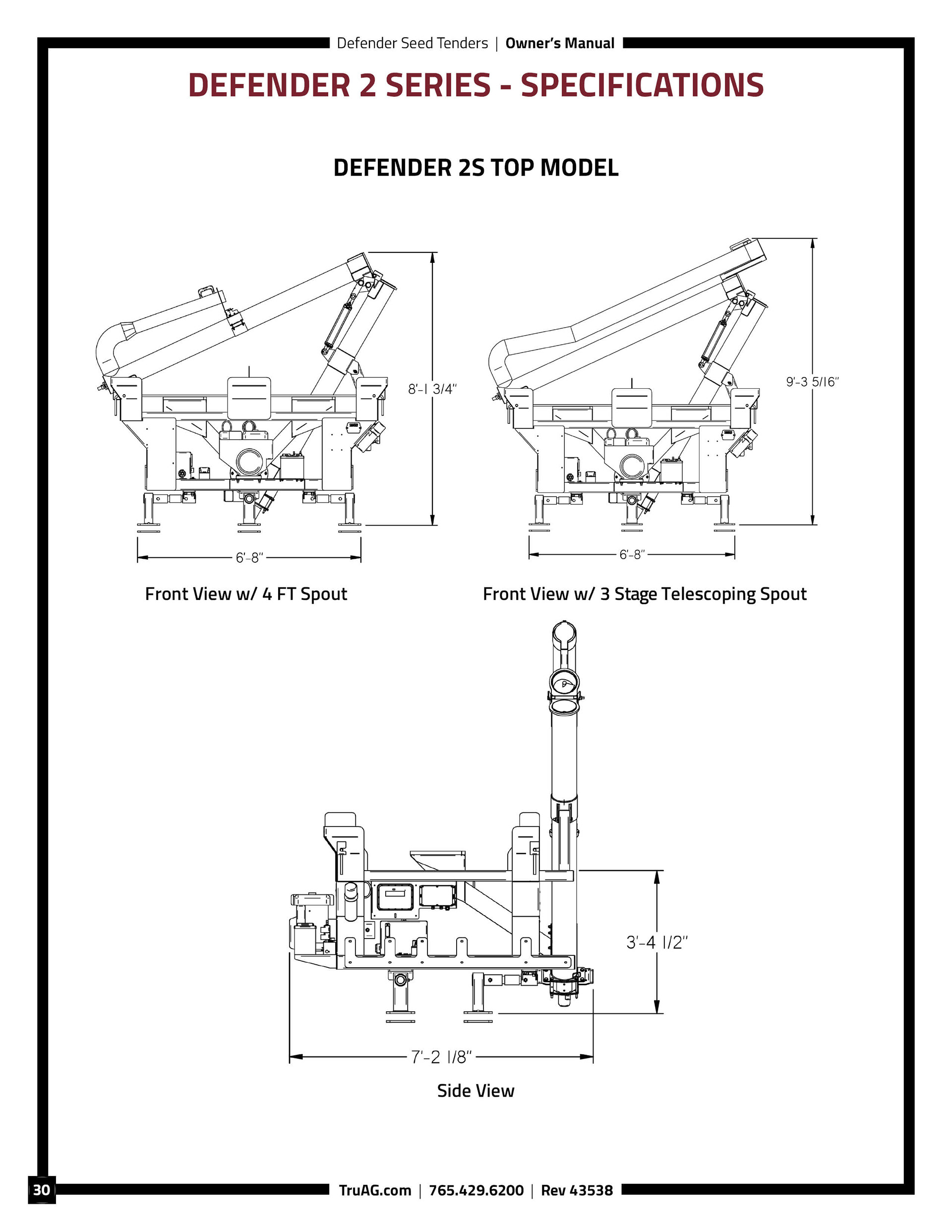
TruAG Product Manuals

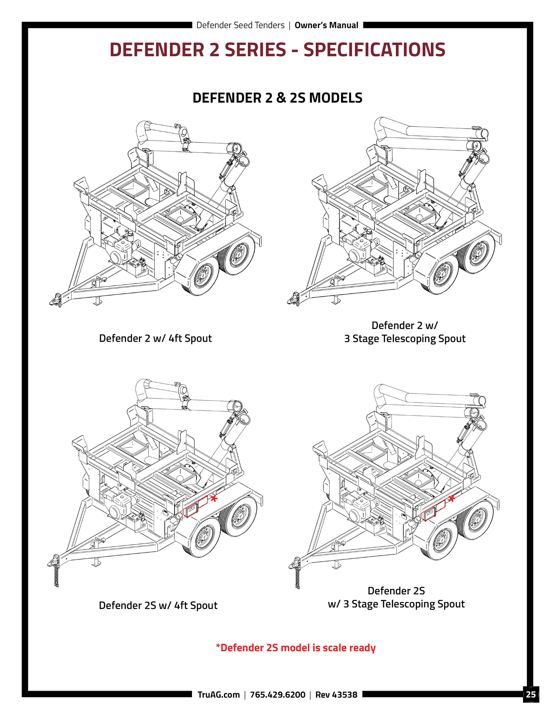
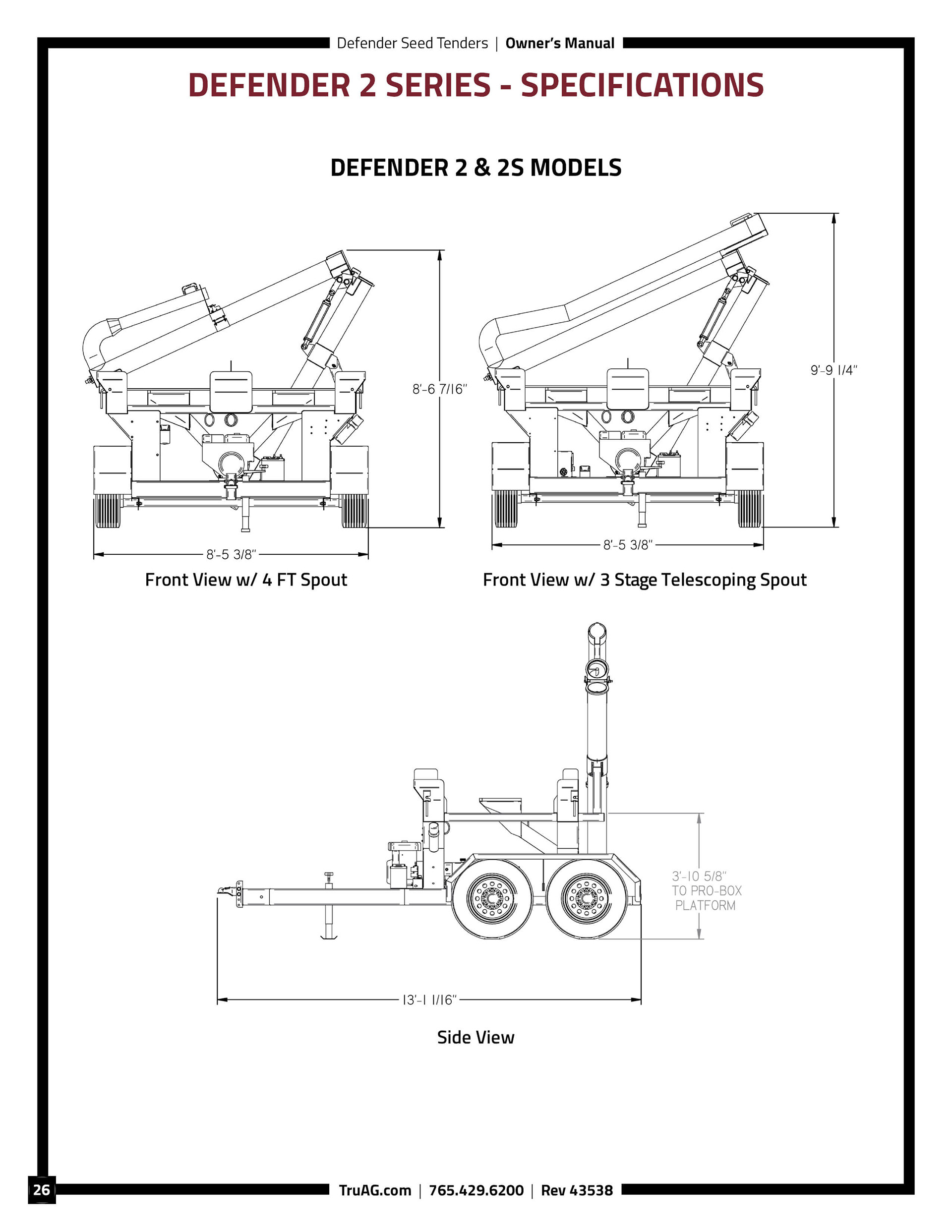
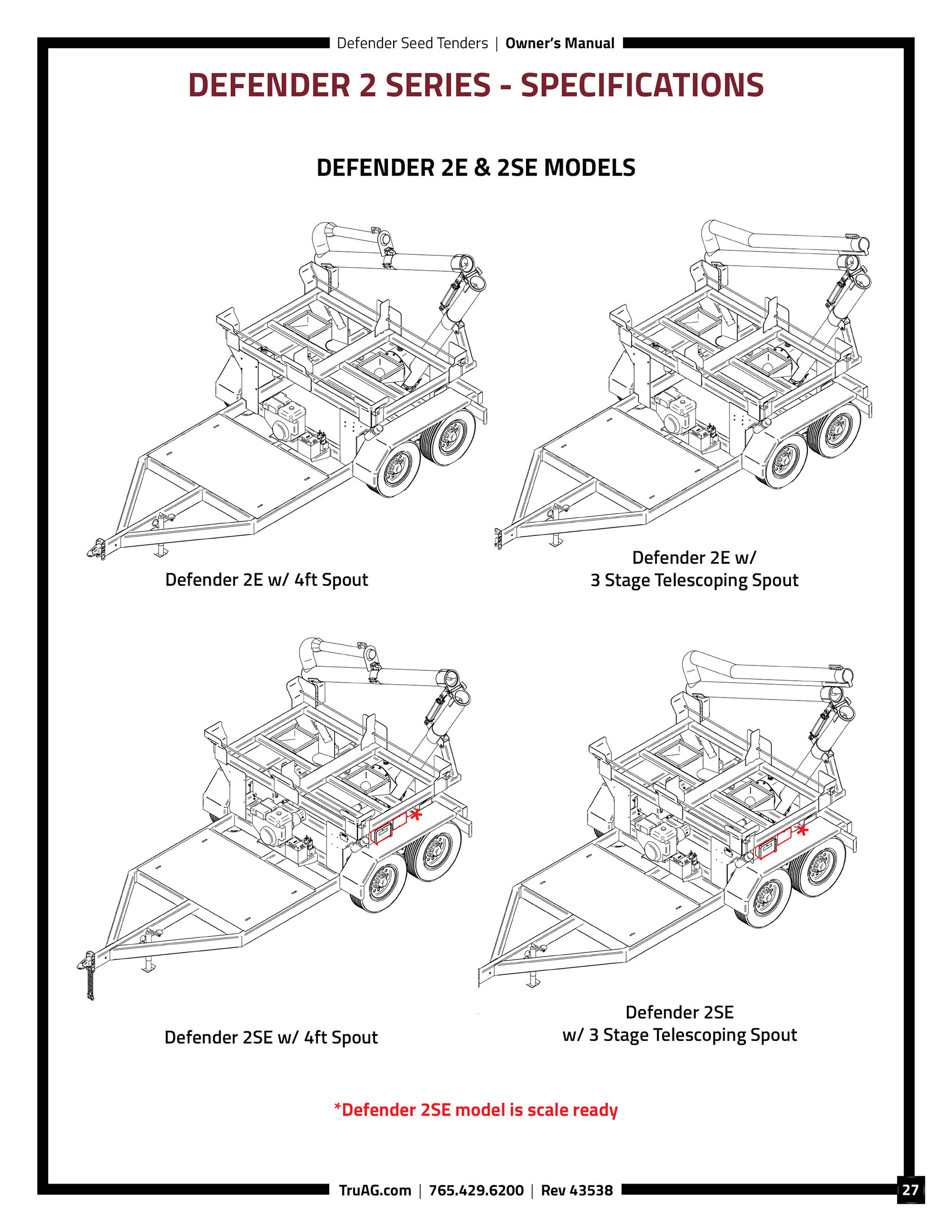
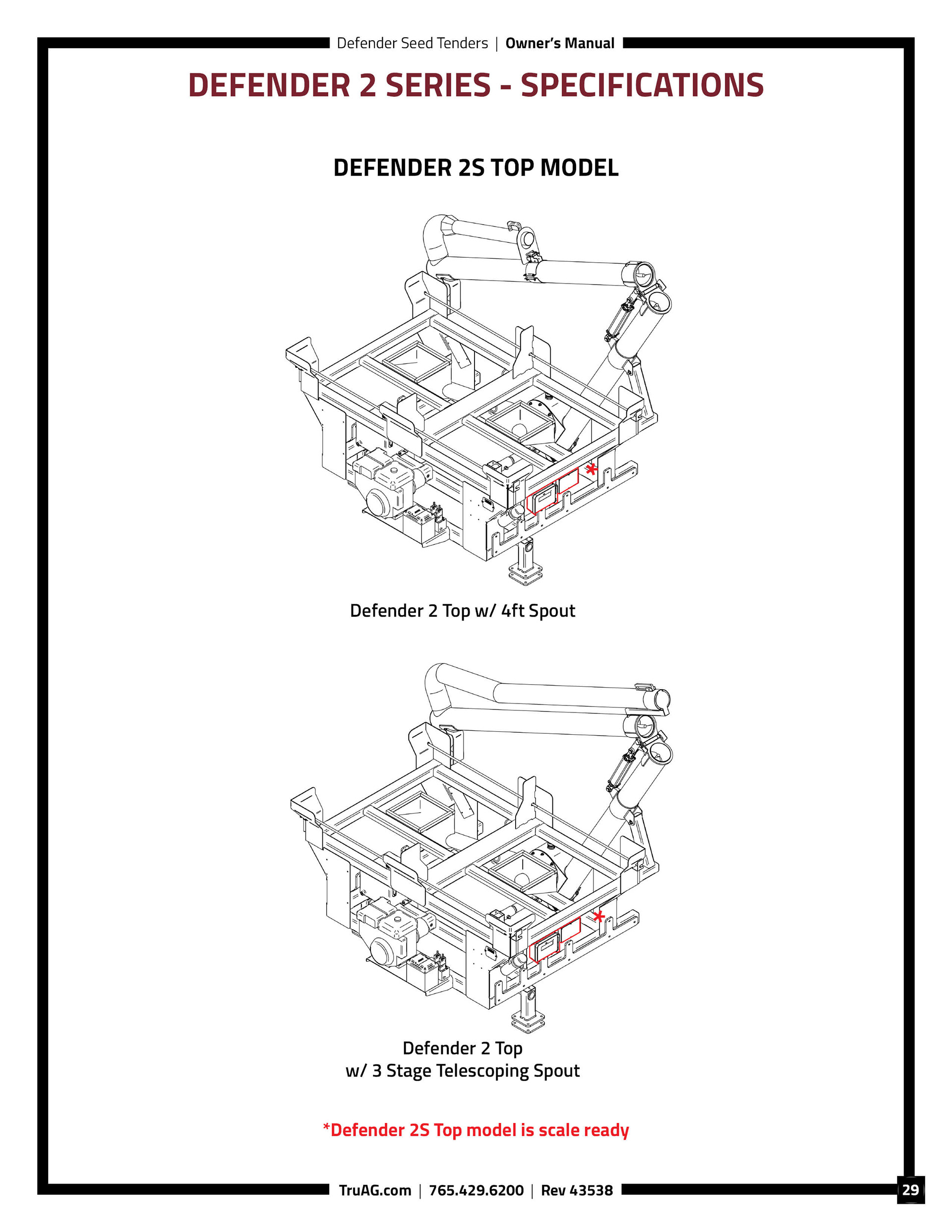
For this project, I designed a straightforward product manual for TruAG’s equipment. I organized specs, model variations, and dimensional diagrams into a clean, readable format that helps dealers and operators find information quickly. A consistent hierarchy and structured layout make the manual easy to navigate.
I formatted and labeled the exploded CAD views so they paired seamlessly with the parts lists and component descriptions. The final manual supports maintenance and troubleshooting while presenting technical information in a clear, professional way.


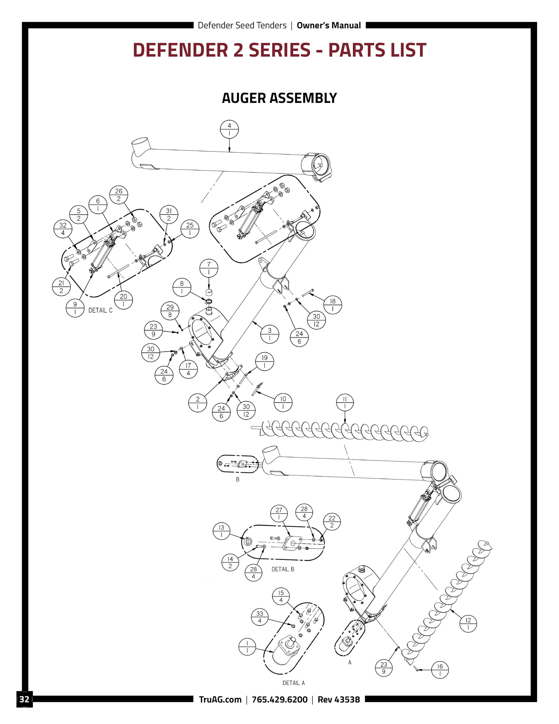
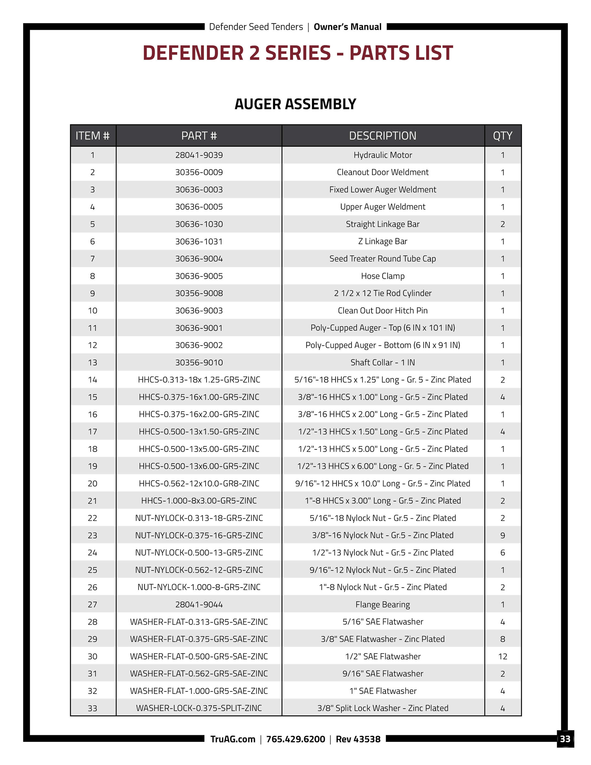
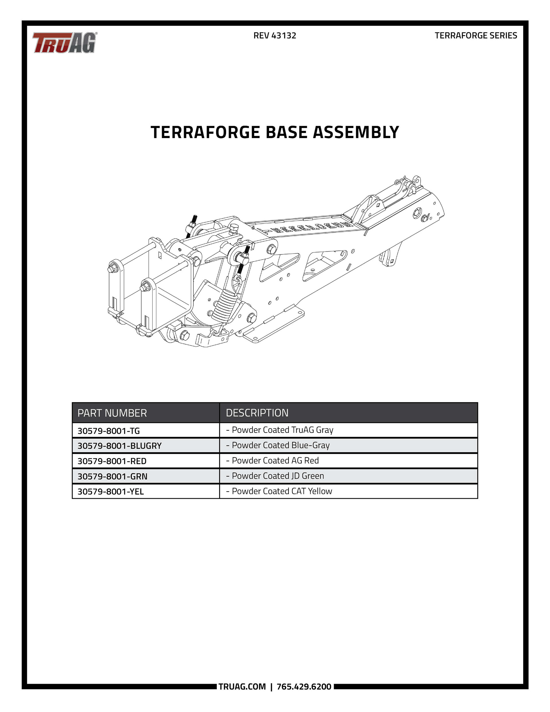
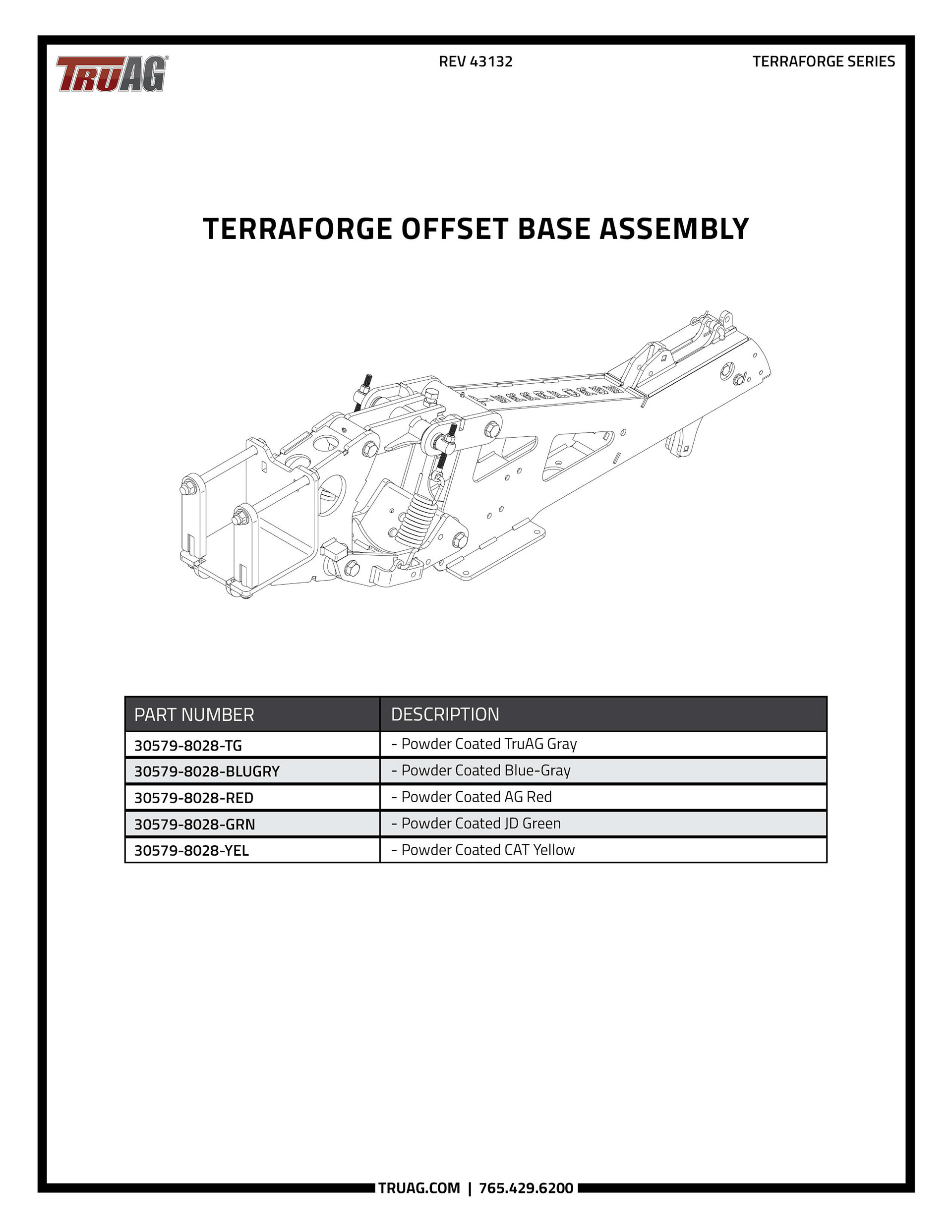
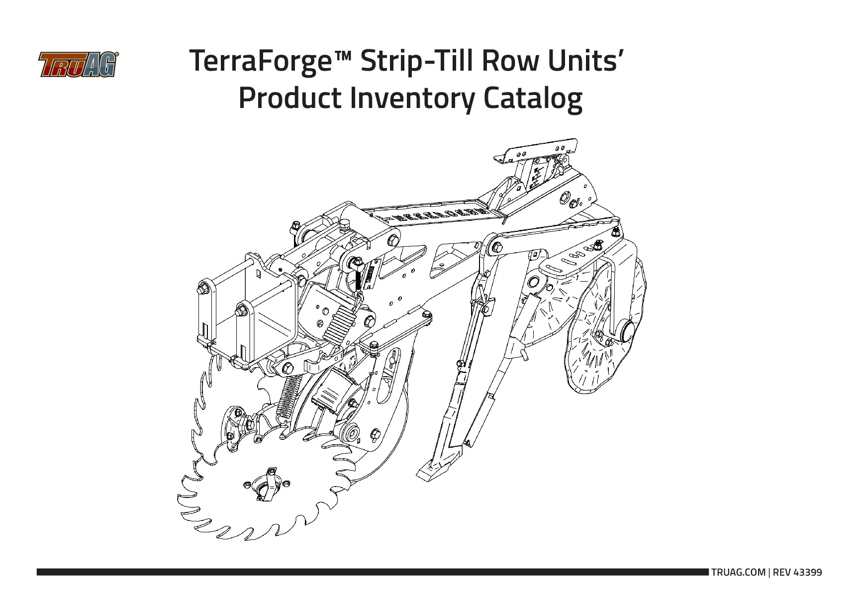
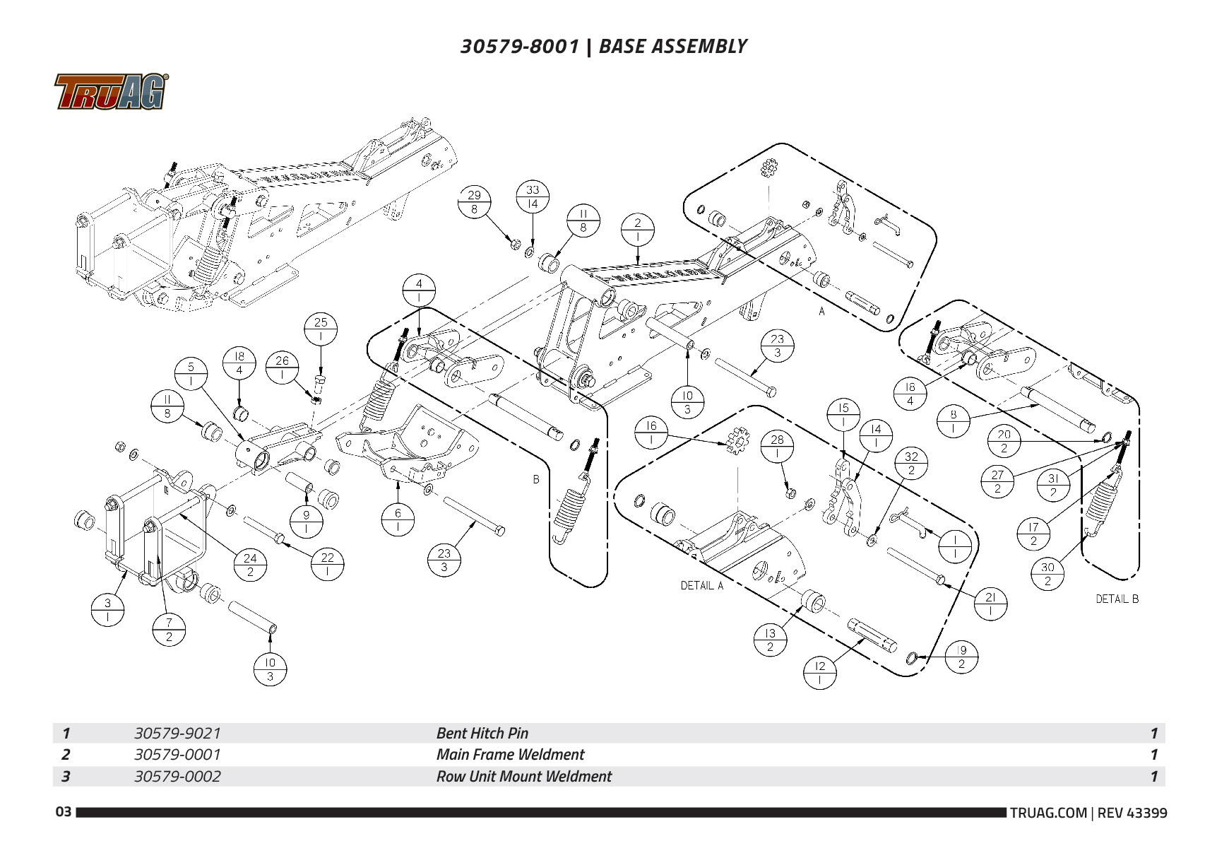
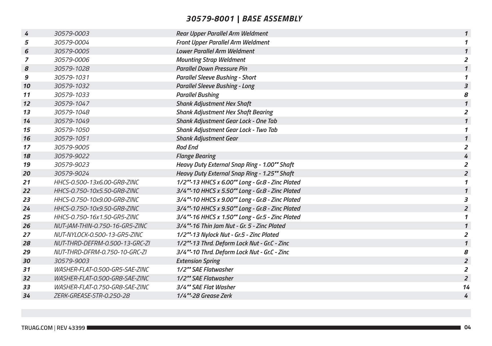
TruAG Parts Catalog
I created a user-friendly parts catalog for TruAG that pairs each assembly with an exploded-view diagram and matching parts list. Clean tables, clear numbering, and consistent spacing make it simple for users to identify components and find part numbers quickly.
I reshaped the CAD-generated diagrams into layouts with logical flow, aligned numbering with the tables, and standardized formatting across assemblies. The result is a streamlined catalog that’s easy to use in the shop, in the field, or during ordering.
TruAG Product Catalogs
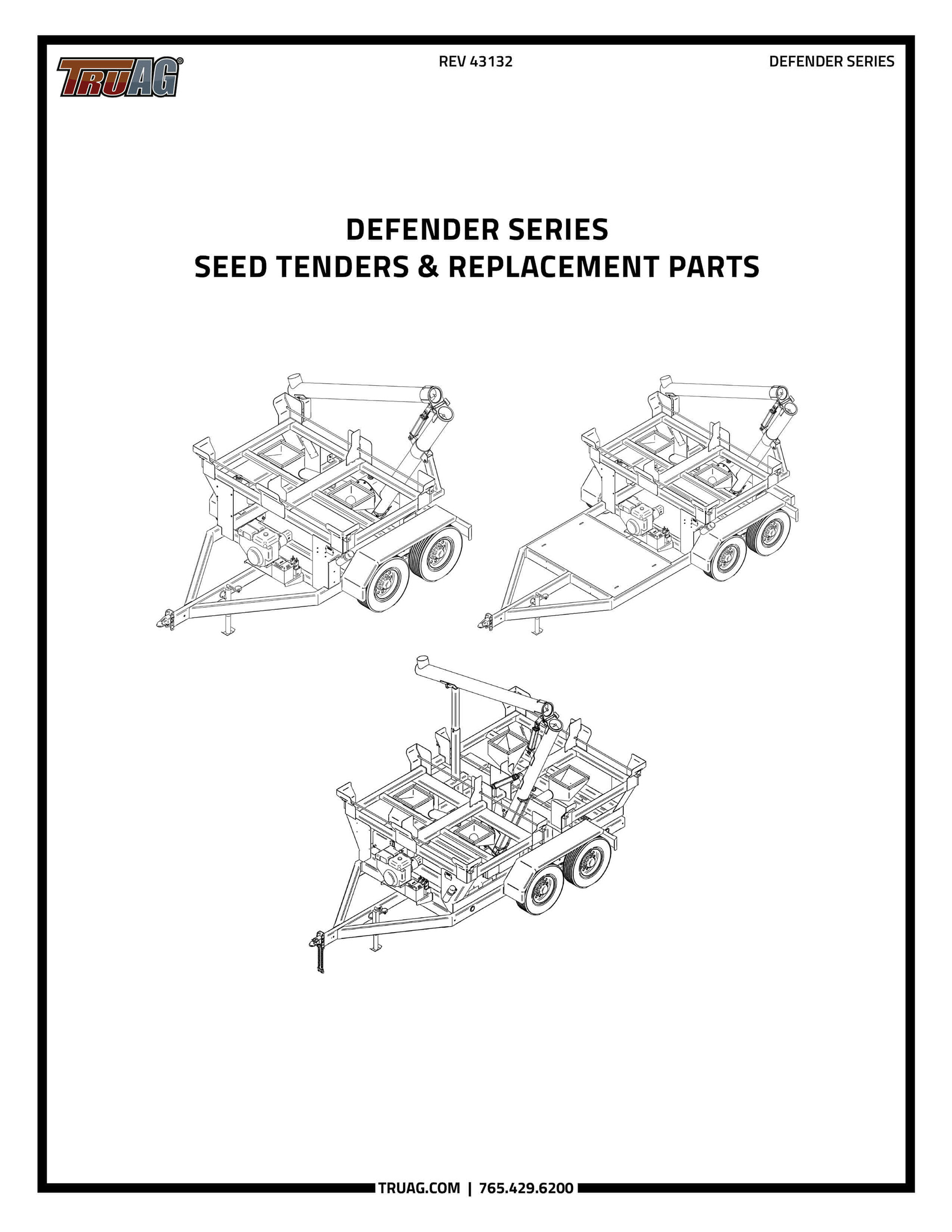
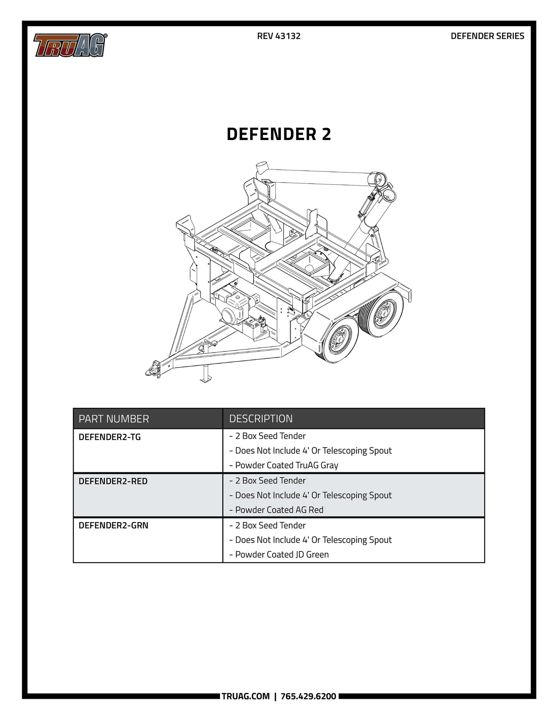
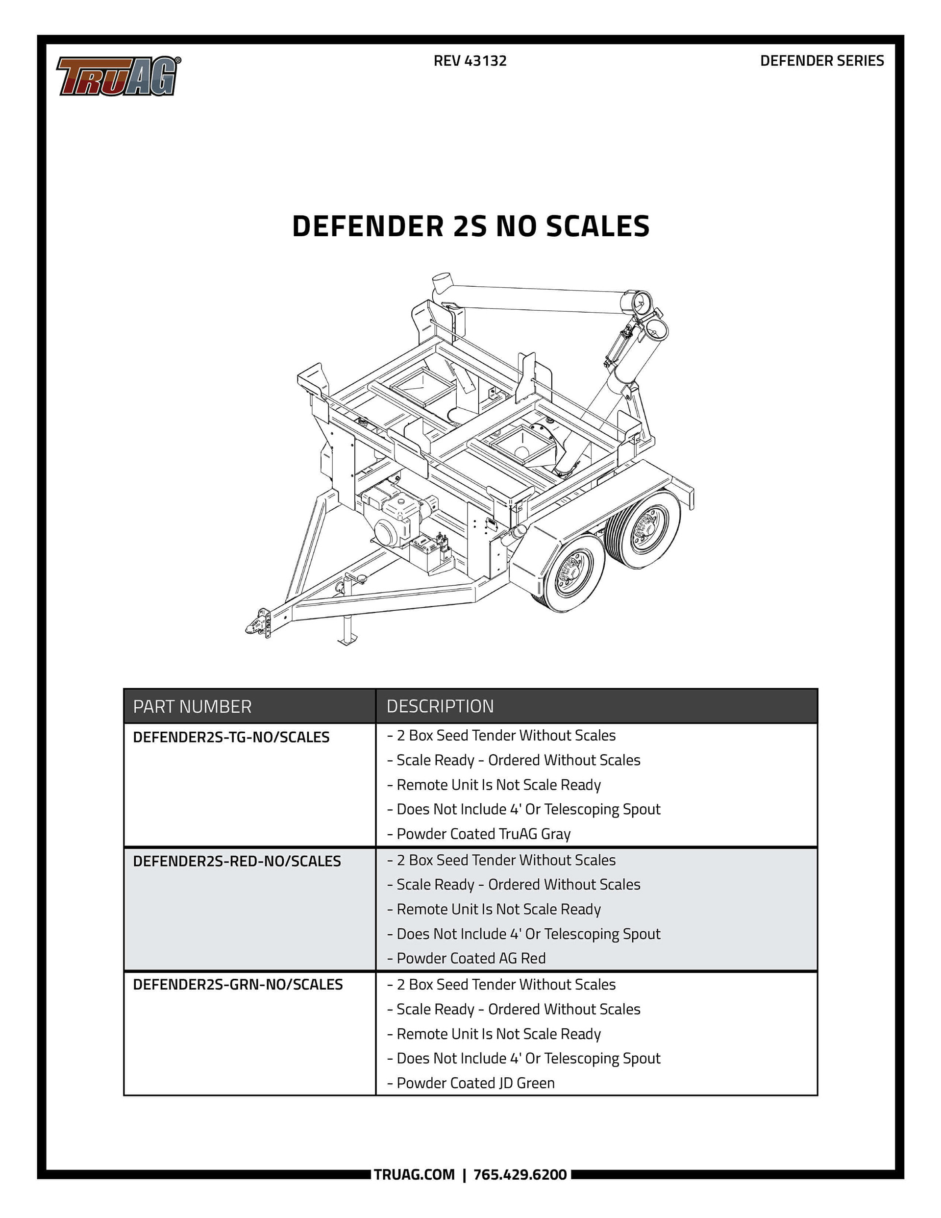
For the Defender Series catalog, I designed a simple, easy-to-read layout that pairs CAD renders with organized product descriptions. The structure helps customers and dealers quickly compare models, features, and specs without digging through dense information.
Clear typography, consistent spacing, and a minimal visual approach keep the catalog approachable while still presenting detailed technical information. It serves as a practical reference for both sales teams and end users.